Changing our attitudes regarding homeless people — a UX case study

Entourage is a French association founded in 2014 which mission is to help homeless people & resident from a neighborhood meeting to recreate social links between them.
I worked two weeks to help them improve their mobile application using a Design Thinking Process to create new features & improve others.
Let’s dive in the process!
Situation
Today, Entourage has a website & a mobile application (iOS & Android) used mainly by residents from neighborhoods that are looking for infos & would like to help homeless (80% of their users) but also by associations to announce events & by homeless people to ask for help (5%).
The problem
The main problem was that when downloading the app, the residents were arriving on an action map to propose help or answer to people looking for help. But most of them did not understand what to do with this feature and were not ready to help directly.
That is why there is a gap between the signing up rate (50K user account created), the active user per month (6K users/month in average) & the number of actions created on the app (0,09 action/user or 0,75 action/active user).
My role
To help Entourage, I had to analyze why their target was not acting on the app and also focus on future users to engage them immediately & turn them in active users directly.
Design Thinking Process
Empathize
To better understand the situation & the target, I made some researches.
- Who is Entourage’s target?
After analyzing in details Entourage’s offer, I made a survey (134 answers) & 5 interviews (45mn per interview) to better understand their target.
During my researches, I realized that 1/2 person had never approached a homeless person but that 54% of the people who answered my survey would like to change that.
Unfortunately, they were not able to act differently with homeless people at the moment because they had some obstacles :
- They didn’t know how to approach homeless people (30%)
- They were afraid of their potential reactions (25%)
- They didn’t know how to help them (17%)
In my interviews, people told me some insights such as
« Sometimes I say hello to homeless but I feel uncomfortable, like I am not legitimate, I don’t have the good reaction… that makes me feel bad. »
« 100% of the time, I feel really bad for homeless I see, but 70% of the time I do nothing because I am scared. »
Define
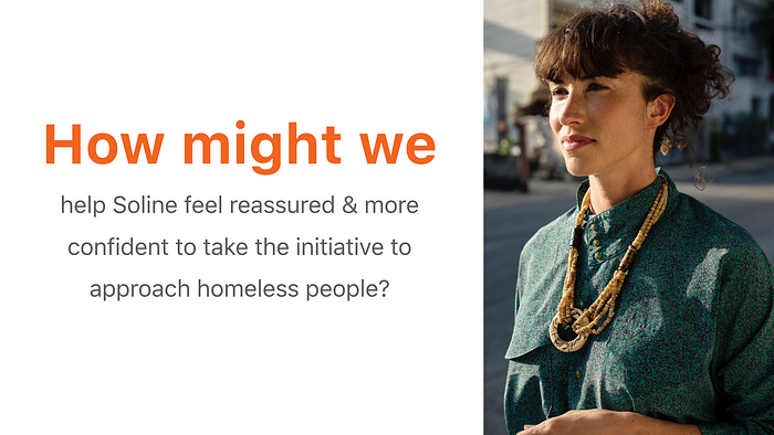
That led me to a persona who summarize who is the typical user of Entourage’s services.

To go further with what Soline was looking for in Entourage app, I made a user journey to get a more detail view of what she needed & why Entourage’s solution was not that helpful for her today.
I realized that Soline was ready to make a step & understand better what homeless people were going through. And this is exactly Entourage’s goal: help you understand better & change the way you think before being able to help.
But the problem was that when Soline downloaded the app at first, she arrived on a feature that is an action map.
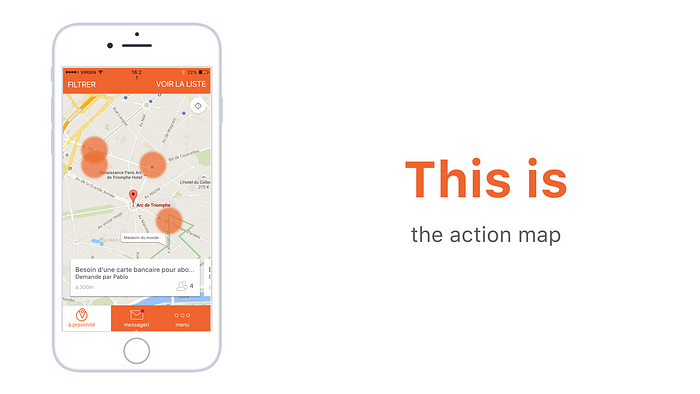
On the action map, you can propose your help or answer to people in need. But Soline was not ready to act, she was there to change the way she thinks about homeless people, understand better what they are going through. So she left the app.
This user journey allowed me to see opportunities for Entourage in Soline’s pain points & I summarized that in a problem statement:
Ideate
To find the perfect solution for Soline, I made a huge brainstorming phase with different tools:
- Crazy 8’s: the goal was to generate a lot of ideas in a few time (8 ideas in 8 minutes). I worked with the help of two coworkers on this tool so that I could have 24 ideas & a fresh point of view from people that were not so inside the project.
- Round Robin: I selected 3 ideas I wanted to dig in & with that tool, my coworkers helped me add some details to the ideas, asked some questions to challenge the ideas.
- Vote: To end the ideation process, I presented the ideas to a group of people & asked them to vote for the one they thought was the best.
The solution
Today, Entourage’s application is really dedicated to action but before being able to act, users like Soline need to get rid of their fears, their presumptions about homeless people.
To do that, I decided we needed to :
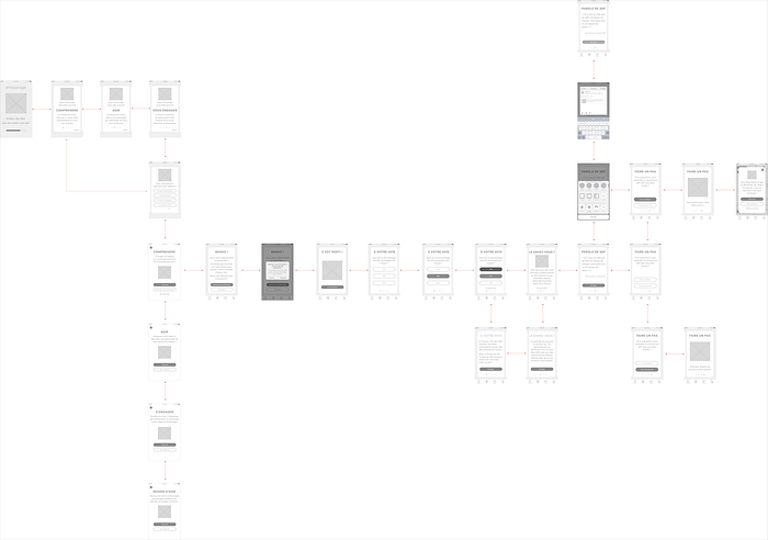
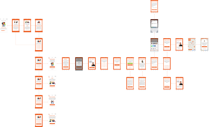
- Create a new architecture for the application to give a clearer view of what you can do with Entourage & help the user see its progress like a path. To do that, I created a brand new Menu Bar “step by step”. I renamed the actual action map feature “Agir” (act) and added a previous step to the path (my new feature) & a next one called “S’engager” (getting involved) including some elements that were before in the action map such as events.
- Propose a new onboarding to explain Entourage’s mission & help you select the right goal for you. When you select your goal, you are automatically redirect to the good feature for you.
- Propose a feature called “Comprendre” dedicated to help users like residents of a neighborhood understand homeless people’s lives in a educational way (with quizz, quotes, infos, …)
To go further before doing a paper prototype, I used some tools such as:
- Feature Prioritization (MOSCOW Method) to focus on what was important for my idea & identify what should or could be done later.
- User Stories to explain my ideas in a way that will speak to developers.
Prototype
Before doing any prototype, I thought about my feature & draw a user flow to be sure not to forget any step & interactions. Entourage App is available both on iOS & Android but I found in my research that the target was more on iOS devices so I decided to work on an iOS prototype.
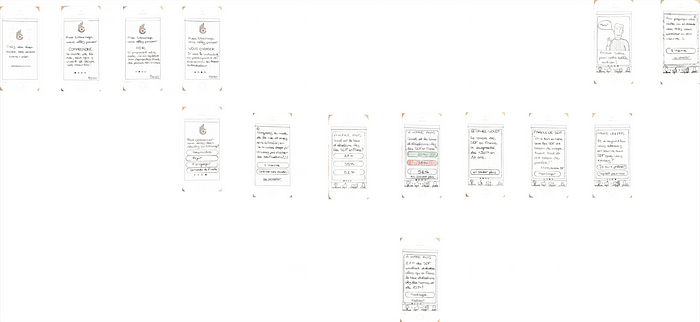
Then I made a paper prototype to test my solution quickly & improve it before jumping to the graphic design.
After I validated the concept I made a mid fidelity prototype to improve my view of the solution.
User Interface
As Entourage is an association, they have few ressources. So I thought it was essential to keep some elements of their visual identity (such as colors & typo) to make the feature quick & easy to implement & at low costs.
My idea was also to design something friendly & sincere to make people like Soline comfortable as soon as they enter the app. That is why I used a lot of illustrations. Illustrations are also great to generate proximity & better than pictures to deal with sensitive topics (like homeless people).
You will see below my style Tile, resuming the choices I made for the design of my features. As I kept colors & used pre-existing Entourage’s illustrations, I didn’t make a moodboard before.
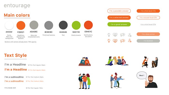
Then I created my elements in Sketch using the Atomic Design Methodology.
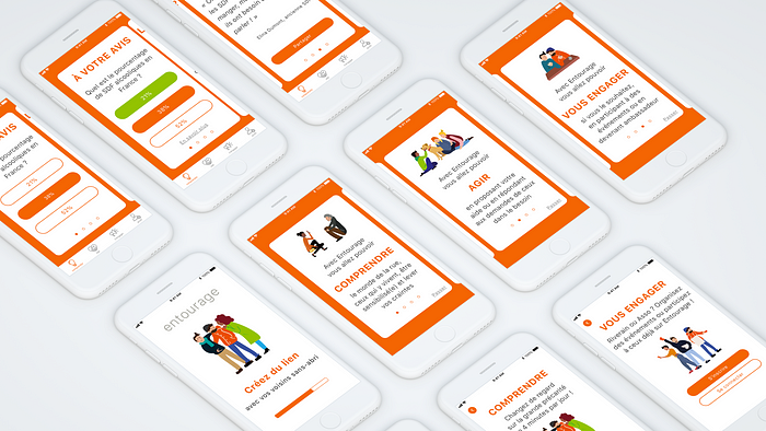
Here are some examples of the screens: I used mostly card for the onboarding & for the main “Comprendre” Feature to have a great contrast with the orange background Entourage has on its app but also to give a more playful & dynamic effect.
Only the loading screen & the login ones are in full white background to contrast with the “learning parts” of the app (onboarding & feature “Comprendre”).
The Result
Let’s dive into the prototype now! If you want to try it, you can find it here on Marvel App!
I also made a video of my prototype adding some micro-interactions I created on Principle to make the prototype more realistic.
As you can see in the prototype, The feature “Comprendre” is the only one you can have access to without signing up.
It was something really important for users like Soline because they have just downloaded Entourage to understand for now, so they don’t want to get too much involved.
Entourage team also told me they had confidentiality & security problematics regarding homeless people & association that are using the app. So their signing up process is quite long & some people are leaving the app before the end.
To maximize the potential of the learning feature, I made it accessible without account but as soon as the users will be ready to act on the action map or go to an other feature, they will be asked to sign up.
What’s next now?
- I will need to make some desirability tests on the feature & the onboarding I created.
- I will have to think about the design of the “S’engager” feature
- I would love to work more on the “Act” feature.


