Member-only story
Charity website: a UX case study
Aiming to increase donations
Overview
Medical Detection Dogs is a charity that trains dogs to help people with life-threatening health conditions.
Their website provides information about their work and allows donations to be made online. I carried out a UX study on their website to find out what the usability issues were and to suggest some improvements.
The Approach
Usability evaluation
I did a quick evaluation of the website first, to get an idea of the main areas for improvement.
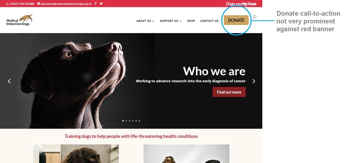
I noticed that the ‘donate’ CTA was fairly low in contrast compared to the other elements on the page. There were also a lot of choices that the user had to make when deciding how to donate.
Customer research
Ideally I would have been able to do some research into actual customer data such as what people search for on the website, which pages they spend longest on, and how many people abandoned the online donation process.
I didn’t have access to this data so instead I did some online research about people’s perceptions and comments/queries about the charity, and identified three key areas to focus my research on:
How can I apply for a dog?
This seemed to be a common topic, and also there were some Facebook posts online which suggested people weren’t aware of the eligibility aspect. There were also a couple of negative posts about being people being turned down when they applied. For this reason I wanted to find out if this information was easy for people to locate on the website.
Donate money
All charities have an objective to increase donations so I wanted to find out if users were struggling with the online donation process.
What do they do?
As this is an informational site about the charity, I wanted to find out if people could easily understand what the charity was about and how they…