Member-only story
ChatGPT and Pantone suggestions for a contrasting data color scheme
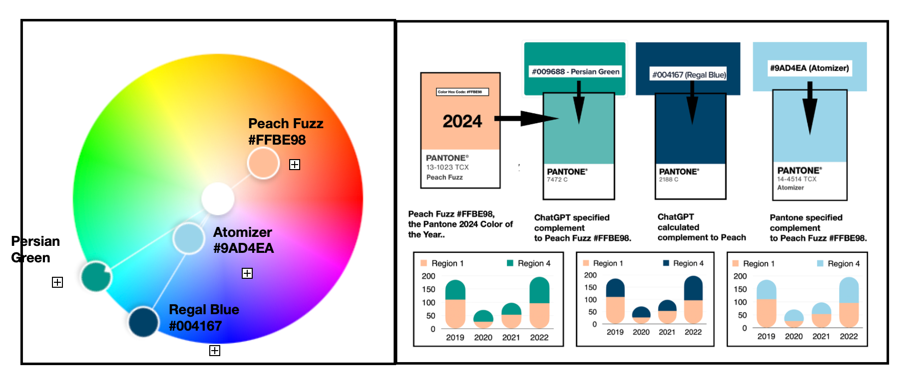
In this writing, I discuss how ChatGPT approaches locating the complement for the Pantone 2024 Color of the Year. The result is different from Pantone’s officially noted complementary color. In color theory, two colors that oppose each other on the color wheel form a complementary pair. Combining the colors in a graphic design or a data visualization can create high contrast. A complementary color combination can form the basis for a diverging data color scheme. Let’s get started by examining the Pantone 2024 Color of the Year concept and complementary colors. From there, I will discuss ChatGPT’s recommendations and how they differ from Pantone’s own color suggestion. I also apply the finalized color suggestions to a basic data visualization example.
The Pantone 2024 Color of the Year:
The Pantone company produces the Pantone Matching System (PMS) and the Pantone Fashion, Home + Interiors (FHI) System, proprietary color spaces. PMS is used primarily in graphics for printing, packaging, and digital media. FHI is used in a wide range of other industries including fashion, cosmetics, fabric, plastics, and paints. When Pantone PMS inks are applied to a physical color reproduction process, it is frequently possible to accurately match the colors from your digital data visualization to hard copy output. I highlighted this journey from digital to hard copy in a previous Nightingale writing.
On December 7, 2023, Peach Fuzz (Pantone 13–1023) was announced as the 2024 Pantone Color of the Year. Since 2000, the Pantone Color Institute began defining a “Color of the Year” from its inventory of PMS and FHI colors. The color for a given year is selected by a secret panel after considering color trend analyses that span the entertainment industry, all areas of design, fine art shows and collections, social media, new technologies, emerging materials, and textures as well as lifestyles and socio-economic conditions.

Pantone’s Color of the Year has influence on the development of products and consumer decisions in areas like graphic design, product packaging, fashion, industrial…

