Chinese Material Design
This Chinese Design Language will Make You Want to Switch.

China is known for having their own alternatives for Google, Facebook, Whatsapp and every other American service ever made. I was surprised to stumble upon a Material Design alternative, which might even be better in some aspects. In short, Ant Design is a complete Design language which has tools for Sketch, web development, UX design, animation and anything and everything around design you can possibly imagine.
UX Focused
The team who designed this language made sure they listed out the principles and values to follow at the time of implementation. There is a whole section dedicated to UX principles to remember while designing using this language. I’ve highlighted some of the principles down below:
Provide an Invitation
Ant design basically talks about call to action — both static call to action elements and dynamic one’s as well.

Static Invitation: By providing cues for interaction directly on the page we can statically indicate to the user the expected interface behavior. Static Invitations provide cues directly on the page.
Dynamic Invitations: Dynamic Invitations engage users at the point of the interaction and guide them through the next step of interaction.
— ant.design
Contrast
This is a major design principle which states that — Out of a group of elements on a page or section, an element which looks different will stand out from the group or section.
Ant design divides contrast into three categories:
- Contrast of Whole and Part

As seen above, a certain part of the card has been highlighted by using a thicker and larger font. What’s different about this is, that instead of using dividers or different backgrounds or shadows, they have simply differentiated based on the typeface. We generally use dividers in Material design to set sections apart, or a slight change in the background. They say this approach makes things more flexible and ‘rhythmic’. Well, I wont argue with that, since it definitely seems to work.
- Contrast of Major and Minor Relationship
This one’s nothing new; help the user make a decision by highlighting what is more important.

What it does say about actions which are ‘neutral’, should be left alone with no highlighting. This basically means — Don’t highlight elements where the decision of the user doesn't need to be promoted or guided.
Here’s an example to showcase that:

The buttons are very basic and barebone. As a user, I’m not being called to click those buttons. I can take my time, read through the text(I can’t read mandarin), and then carefully take a decision. Smart.
The Usuals
Like all the other design languages/systems, Ant design also has all different kind of colors, patterns, fonts, layouts, motion and all the other guidelines which make it a complete language.
Here are some staple stuff, which actually caught my eye:
The Colors
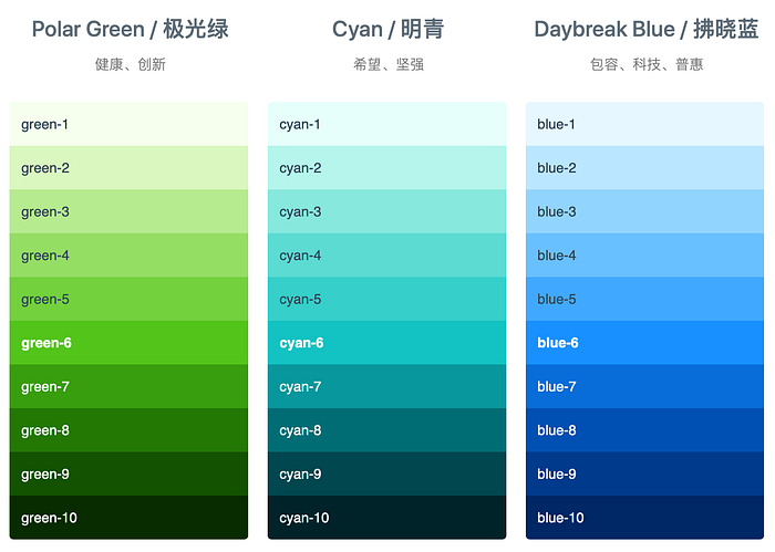
The colors themselves seem similar to the Material design color palette. What really made me look, were the names. When I see a design language with unique color names, I am instantly enthused about that language. I am particularly eager to use this language in one of my future projects. I mean, ‘Daybreak blue’ is different from ‘Geek blue’, interesting, isn’t it? Rather than just saying orange, they call it ‘Volcano’. Kudos to the design team to think of such a twist 👏🏼 .
Everything Material Has and Doesn’t
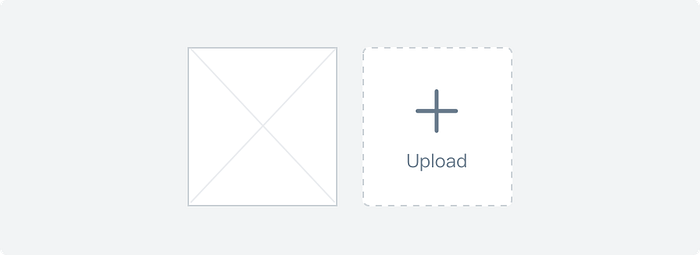
You’ll instantly relate this language with material design, especially when you’re surfing through the components, Ant has every guideline that Material has, and then some. Rather than just giving elements to use for different scinarios. Ant design specifies design for different scenarios like uploading a document to the cloud, sliders/drop downs/input fields for different purposes are also described in detail.
Some Bottle Openers
Use Any Version You Want

In Ant design, you can go back in time to any version of the system. So it’s almost like you have five design languages in one system. I don’t recall any other UI design language which offers such a feature.
So Many Libraries
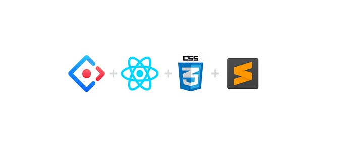
Ant design has a multitude of third-party libraries ready to be used with React and CSS. Since native apps are becoming more common, having a design language that can cater to such apps is great. Also, developers will be able to implement the designs into code faster and more efficiently.
Sketch Plugins for Days
Check this video out (It’s in Chinese, but it’s pretty self explanatory)
Having a Sketch plugin for a design language is like a blessing. You don’t have to download icons, copy over color or make grids based on information on a screen. Most of the components will be readily available and won’t break your focus while you’re designing. This addition in Ant design is called ‘Kitchen’, as in kitchen with all the tools and ingredients in one place.
UI Kits and Templates
Ant design provides UI kits for various needs like web design, mobile app design and landing page designs, all in one place. Here’s the link to the Landing Page Kit designs : https://landing.ant.design/docs/download
Ant Design Homepage: https://ant.design
Hope you liked this article, If you did, do clap and share this article. Follow me for design articles every month!

