Choosing a custom typeface for our brand and design system

Two years ago, I joined a team tasked with building a design system for Expedia from the ground up. Our main goal has been to deliver a cohesive experience to our users across touch points while working with an established brand that has equity; in particular the colors and logo.
The Expedia logo was created in a custom typeface called Expedia Sans. This typeface predates me but — from my internal research and understanding — the company hired a type designer straight from DaFont.com to create something that evoked Johnston: a humanist, sans-serf, transportation inspired font. The glyphs were crafted with a singular focus: Advertising. Some important features of Expedia Sans are: one weight; inherent kerning is awkward; it’s not well suited for numeric heavy layouts; sets poorly at small sizes; does not render well on small screens or in large paragraphs. Because of these constraints, we chose to render our UI in system fonts, which reduced cohesiveness across platforms.
One can’t deny that Expedia Sans has a distinct visual appeal which is well suited for our logo¹. But the old typeface that has been used for decades in advertising was not designed for UI. Choosing a custom typeface meant finding something that can work across advertising as well as our design system, which supports three platforms: React web, iOS and Android.
Given this set of constraints, I set out to find a typeface that was well-suited for product and advertising including print and digital touch points. I focused my search to 3 distinct priorities:
Functional for UI
- Well suited for low-contrast and varying screen resolutions
- Well suited for display and text sizes
- Similar metrics to system fonts such as SF Pro or Roboto: x-height, kerning, hinting, glyph design, and relationship to leading
- Variety of weights including: regular, medium, bold
- Reserved character: omitting fine/stylized details
- Numeric centric: supports tabular lining figures and stands up in numeral-heavy layouts
Expresses our brand
- Similar characteristics to Expedia Sans
- Pairs well with Expedia’s logo mark
- Connects to the brand tone of voice: casual and friendly
- Distinctive and unique in the market
Global support
- Latin languages
- Cyrillic and Greek languages
- Currency support
- Nice to have: CJK languages
My list of considerations grew as I expanded my search of typefaces, originally tabular lining figures for numeric heavy layouts seemed obvious. But I quickly realized not all typefaces are created equally and this was a huge priority for our product. I also realized we may never find a custom typeface that has all the languages we support — particularly CJK languages. This made the need for similar metrics to system typefaces more crucial, as we would want the same spacing and relationships if we needed to use a system font as fallback.
What could a custom typeface look like for Expedia?

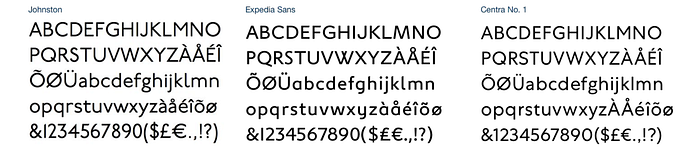
If we were to keep Expedia Sans in our logo, I needed to understand the decisions made in constructing that font. I studied the distinct glyphs and characteristics of Expedia Sans and its ancestor, Johnston. Since it was based on a humanist sans-serif, I knew I could narrow to that category immediately.

Expedia Sans is a custom drawing from the typeface London, which was based off of Johnston, the typeface for the London Underground. Rooted in travel and transportation history, Expedia Sans has good intentions as a humanist sans-serif, but does not work at small sizes.
My typography, design background, and network helped me source a huge list of foundries and typefaces to explore. I downloaded² everything I could get my hands on and paired it with different weights, relationships, and in UI mocks.
Now’s probably time I caveat this whole article to say — Nobody really asked for this work to be done. Leadership was not bought in on the idea of custom type in UI or buying a custom typeface. And due to our org structure, it required getting buy-in from both product design leadership as well as marketing and brand teams. But, as most design systems often start, my team is a group of strong individuals who knew there was a better path forward and would move without waiting for permission. With this constraint in mind, I tried a variety of boutique foundries ($$$) and open source google fonts (free) and narrowed to group that included this range.

Why Centra no.1?
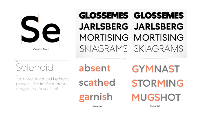
Centra mirrors the unique, decorative nature of Expedia Sans, while increasing utility across sizes, resolutions and layout needs. It is expertly crafted to account for small sizes and screen resolutions, while still looking great in large display type.
Centra’s functionality in UI
- Well suited for varying screen resolutions: Centra was designed with digital products in mind
- Well suited for display and text sizes
- Similar metrics to SF Pro or Roboto: Centra’s x-height and width align similarly to system fonts
- Variety of weights: Centra includes 8 weights and 16 total fonts
- Reserved character: as Sharp Type puts it, Centra is “a study in utility and restraint”
- Numeric centric : Centra supports tabular lining figures for dense numeric layouts
Once we worked with leadership to get buy-in for a custom typeface, Sharp Type extended the glyphs to capture all of the currency symbols needed to support our business. The process from discovery to purchase took about four months, and another four months to ship across our web and native platforms.
Once we worked with leadership to get buy-in for a custom typeface, Sharp Type extended the glyphs to capture all of the currency symbols needed to support our business. The process from discovery to purchase took about four months, and another four months to ship across our web and native platforms.

Additional considerations
Multi-brand: Expedia and our design system support a number of brands (including Orbitz and Travelocity), yet Centra is solely meant for Brand Expedia. This meant that the relationships and metrics between custom and system fonts had to be similar and easily swapped out. This also meant that through our design system tokens, we would package the font to only render on one brand. Tokens have enabled us to target a specific brand with the custom font and enables other brands to add custom fonts later on.

Internationalization: CJK alphabets are not supported within Centra, therefore our system falls back to platform and language specific fonts.
Accessibility/customization: We limited the ability for Android users to customize their font (sorry script and Comic Sans users). We still allow users to change their type size.
Performance: A custom font can add up to 2–4MB to the app size. On the web, browsers may not render text until the font file is downloaded upon first visit.
Whats next?
Now that Centra has shipped across all three platforms in our design system and with the support of our brand team, we’re pushing leadership on Centra’s use in our brand assets. Maybe one day soon, you may see an update to the Expedia logo :)
- …Or so the head of marketing told me.
2. Here’s where we go off-roading a bit — participate in illegal activity at your own risk. Almost any typeface can be found on the internet if you search hard enough. I do not condone using illegally acquired typefaces in published work. Typography is a serious skill and type designers should always be compensated for their valuable contributions to our craft — finding samples to test quickly was essential in my quick research, mileage may vary.

