Chrome DevTools: Accessible Colors
👋🏻 Hey all you wonderful developers out there in and around the interwebs! How is everyone doing this fine day? Good? That is what I like to hear. Today I am going to share a little bit of knowledge around the built-in color contrast checker inside the color picker INSIDE Chrome’s DevTools.
This is surely an accessibility win if I have ever seen one. I coach all the developers on the teams at work to use this tool when checking if colors meet contrast in the browser.
Why care about color?
That is a great question. And what do great questions deserve? Great answers, you got it!
Color contrast is important because a user needs to be able to visually distinguish what is in the background, to what is in the foreground. For instance, if you have a white background with light gray text on top. That text would not be good color contrast. The text would start to blend in to the background.
Now, if you had a white background with black text, like here on Medium, that is an example of amazing contrast. The foreground or text pops off of the background color. Therefore, the content is easily readable.


Background
Before this tool was introduced, there were a few options out there to run color contrast checks on your experiences. I have used the WAVE extension from https://webaim.org/, you can get the extension in the Chrome store. There is also a contrast checker on their website to use.
Lea Verou also released an awesome tool to check color contrast on the web. You can find that here http://contrast-ratio.com/.
Now with the new built in contrast checker in the color picker, we can change colors on the fly to see if they pass WCAG (Web Content Accessibility Guidelines) AA or AAA conformance. I have to say, it is an amazing time to work on accessibility when their are great tools out there just waiting to be used.
Wait, what is this AA and AAA stuff?
Level AA and level AAA are levels of accessibility conformance that are a part of a bigger level of conformance reqs. For more info on that, go here. Specifically we are targeting color contrast ratios in regards to AA and AAA.
The best way to explain the meat and potatoes of AA and AAA is below from the W3.
Contrast (Minimum) - Level AA
The visual presentation of text and images of text has a contrast ratio of at least 4.5:1, except for the following: Hide full description
- Large Text: Large-scale text and images of large-scale text have a contrast ratio of at least 3:1;
- Incidental: Text or images of text that are part of an inactive user interface component, that are pure decoration, that are not visible to anyone, or that are part of a picture that contains significant other visual content, have no contrast requirement.
- Logotypes: Text that is part of a logo or brand name has no minimum contrast requirement.
Contrast (Enhanced) — Level AAA
The visual presentation of text and images of text has a contrast ratio of at least 7:1, except for the following: Hide full description
- Large Text: Large-scale text and images of large-scale text have a contrast ratio of at least 4.5:1;
- Incidental: Text or images of text that are part of an inactive user interface component, that are pure decoration, that are not visible to anyone, or that are part of a picture that contains significant other visual content, have no contrast requirement.
- Logotypes: Text that is part of a logo or brand name has no minimum contrast requirement.
What about level A?
Level A is something you should just automatically hit in my opinion. If you are using proper colors without a full understanding of contrast, using alt attributes for your images, and writing semantic markup, level A should be met. I call these, “easy wins”.
Diving In!
Let’s take a look at how we can use the contrast checker to make sure we are using accessible colors for the web.

- Open up the DevTools in Chrome and select a color to inspect in the view. To inspect a color, select an element on the page and in the styles pane look for the
colorproperty. Next to that color property there should be a small color swatch box. When you click on that, the color palette opens.

2. Click on the area in the color picker that says “Contrast ratio:” it should also have a number and green check marks ✔️ or a “No” red symbol 🚫.
🤔 One check mark means it meets the minimum recommendation for contrast ratio, two check marks means it meets the enhanced recommendation for contrast ratio, if you were curious.
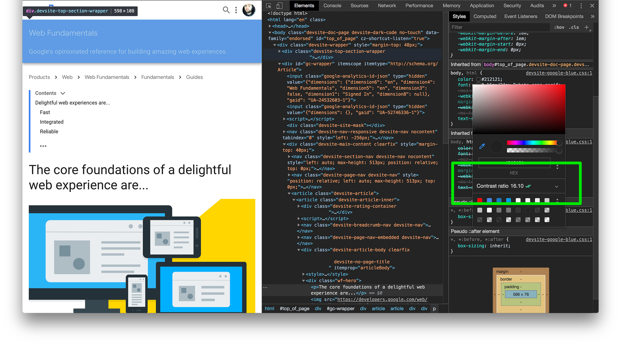
You will notice when you click on the the drop down, it shows whether or not you hit level AA or AAA and when you look at the color swatch panel there is a white line that runs across it. What this white line means is that any color above will not pass recommendation and any color below will pass. You can play with different colors to see what aligns with recommended standards for color contrast.
Give this tool a shot and play with different colors to see what works best for your experience before moving anything in to production. It is also a good idea to get your marketing and design department on board with this as well so they can test colors in the browser to see if they pass the recs.
Wrapping Up
Accessibility is gaining a lot more visibility in the industry by amazing developers like Marcy Sutton, Alice Boxhall, Jen Luker, and Rob Dodson. Plus many, many more around the globe. It is our job as humans building the web to take ALL users in to consideration.
Color contrast is one of the ways we can make the web a better place. Being cognizant of the proper colors, psychology, and language of colors, can make for an amazine, accessible user experience for everyone involved.
Do your part and be accessibility cognizant!

