Clubhouse: a UX Breakdown
The best way to learn is to learn from the best. This is the first of the product breakdown series where I’ll try to break down the features, decisions, and tradeoffs made in the process of making Clubhouse. Instead of criticizing the app for not having certain features, we’ll try to understand why certain decisions are made.

Well informed UI:
This is one thing that I love about Clubhouse. It keeps the user informed. Error messages at the top, info to push the user to use the real name. But one thing that blew my mind is this button.

Whenever someone wants to leave a digital space they’d always have hesitation that everyone in that space might notice them leaving. This “Leave Quietly” button lets the users know that no one will be notified when they leave. It encourages the users to go out explore different rooms. This is a great example of how impactful UX Copy can be.
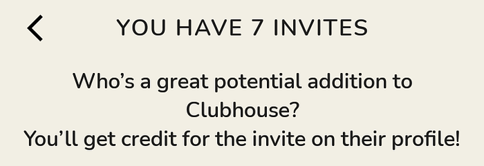
But, the one place where I feel the UI is not communicated properly is this

Here I’ve seen a lot of people getting confused & I did too to understand whether I’ve invited the selected people or not. The share button at the top makes it even hard. Maybe a section that shows invited people at the bottom or clear animation or better feedback after clicking on someone will be helpful for the user to understand.
Safety & Security:
This is where we can clearly see the effort put by the team to make the app safe & secure. Especially because everything happening here is live. So, it is important to make sure that the users feel they are in a safe environment.
Invitation system: Because of the fact that everyone needs someone to invite them into the application and the accepted person’s name is shown in the profile always, the number of fake ids can be reduced significantly. Because we can easily track down the person who added the fake id to the platform.
Room Search: I believe safety is an important reason why they don’t let the users search a room & join. For someone to join a room they should be connected to the room in some way. This approach helps the app to stop strangers from joining in random rooms and ruin the experience for the users. Because people with some personal connection will mostly be behaving kindly.
Room Experience:
In-room experience is where I faced some problems & have some mixed feelings.
I really like the way Clubhouse has a dedicated section for people who are followed by the speakers. This makes it easy for moderators/speakers to identify people and get them up to the speaker section.
But I also had a tough time scrolling through the room. Especially finding out who is speaking was a hell of a task. People who are on mute were clearly communicated but not people who are speaking.

Maybe showing people who are speaking at the top just like Google meet with some speech animation might help solve this issue.
After a certain time in a room, it provides an option to follow the club or speakers. Even though it is very handy to let the user follow, there is no option to close it. It feels like forcing the user to follow. It also reduces the room view.

Gamification:
Clubhouse utilized the Exclusivity/Scarcity gamification technique really well. Being invite only application makes it look really exclusive and encourages people to know what’s in it.
Another place where the same kind of technique is utilized is the Invite friends page. This is the one place that most users try to stay away from. But in Clubhouse the number of invites is not in abundance.
By making the invites limited, it encourages the user to invite others. And it also ensures the reliability of the invites. People won’t invite everyone randomly. So, this technique helps in both ways.
Also, I like the sidebar navigation very much. Because it is showing people who are online and create room option there itself, people get motivated to create room and start interacting.
Visual Language:
The visual language of Clubhouse gives the product a character of friendliness with the usage of its colors, rounded corners, and fonts. This encourages the user to interact with each other.
This is what I observed by using this app for a couple of weeks. Please let me know what you think about these.
Also, I’ve created a club for product enthusiasts to discuss and share knowledge with each other. Please follow that club. Will make the active peoples members and we can start creating rooms to share the knowledge with the community.
Thank you for reading till the end.