Cognitive Overload & Feature Discovery in Mobile UX
I’m a dabbler in matters of neuroscience and cognition, I listen/watch things from Sapolsky, Dennet, my kindle is loaded with Sam Harris, Metzinger and love to torture my Sunday breakfast partners about what our fear of snakes teaches us about App design.
A little knowledge is dangerous, but can be applied to Mobile App design and human interaction — particularly how Apps help us and stress us. From years of mobile product experience, I believe a design’s balance cognitive overload and resultant stress should be a major counter-balance to a Product Manager’s KPI’s to moooaaaar session time in the App.
Cognitive overload from mobile devices is an “un-understood” problem for users.
The results of a recent survey of 14,000 people revealed statistics that imply “the more competent you are with Apps, the more trapped you are”.

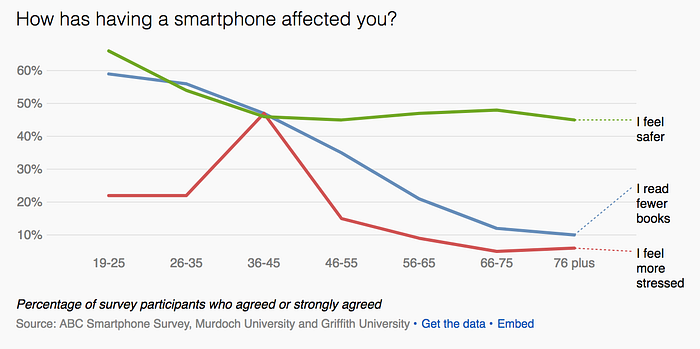
The clear sufferers (“I feel more stressed”) are the most powerful adopters — the 26–55 year old range and in particular 36–45. These people are mid-career, mid-family and if they are like me they have more than 5 chat Apps with business and social conversations appearing in all of them. The chat is happening while dropping the kids at soccer and their colleague on the chat wants an immediate response (they are sitting at their desk).
Older age groups likely have less Apps on their phones and less competing social signals.
The problem is “Un-understood” because we are all frogs slowly being boiled in the pot — more Apps, more usage and the stress (temperature in the frog metaphor) will keep increasing. Each App has initially been optimized for single purpose flow but:
- Shouting: each App now contains notifications forcing the user to context switch (at massive impact to flow and stress production). Moreover, Apps compete exacerbating the stress.
- Feature Discovery: any successful App has more than one feature which the Product Manager wants to introduce to deepen engagement and utility.
- Visual Clutter: Features need to be JTBD-focussed when a user wants them, otherwise “out of the ways” when not. Its well understood that desktop design does not map to Mobile App design, but users still expect the same features in the Mobile App.
I propose a solution for designers that leverages the existing cognitive processing hardware humans have without creating overload.
What snake detection teaches us about layers of cognition
A fascinating example of visual cognition is the “Snake Detection Theory”. Simply stated: when we were monkeys, snakes (or their giant predecessors) were an evolutionary threat.

Our evolutionary response was:
- natural selection: the survivors (us) developed visual detection wiring to accelerate response to “snake-like” shapes hidden in the leaves.
- Signals sent to the adrenals (all the way down in the kidneys) trigger life-preserving flight/fight response.
- This acts waaaaaay faster than prefrontal cortex (PFC) rationalizing, this which spins up a few hundred milliseconds later and provides more sophisticated analysis of the threat. (“ahh, its just a stick”).
- today we retain that biological ability and will startle if a rope or stick is lying across our path.
Another layering example (unrelated to stress) is our in-built facial symmetry detection as a gene preservation trait. (“If I can mate with this symmetrical partner then my offspring will have greater chance of doing the same”).
So our visual machinery has innumerable layers processing below our consciousness: performing edge detection, pattern matching, classification etc. App designers can take advantage of this knowledge and apply it.
Layering for Cognition
The solution to cognitive load in Mobile Apps has been to “dumb-things-down”. A well-designed mobile App should assume the user’s IQ is halved: recognition that mobile Apps serve people on the run, getting out of cars, crossing streets — these activities split their attention and effective IQ. Therefore UI JTBD is a primary design goal.
This does not mean the App should be less rich or have subtracted (or unbundled) features. Through the user’s journey, feature discovery can be done outside the initial use-case — enriching value to the user.
I propose user’s already understand the presence of a “signal layer” that is separate and distinguished from App design and solves the need for:
- New feature discovery
- Unused feature discovery (per user or audience)
- Time based or promotional features (see our example of Facebook Messenger’s changes on St Patrick’s day)
In our blog, we cover a lot of tear-downs and examples where Facebook, Google, LinkedIn are already using a well-understood layer that users’ recognize and process automatically.
Just as the human brain has high speed “Snake Detection” that executes well before the PFC gets involved — by “layering” in a UI design we are consciously reducing cognitive stress. Users already understand this layer and costs zero processing power, context switching and interruption to flow to be aware of them.

Users automatically know they exist and can return back to them as clues, guides and signals from App complexity. This is a far better solution than notifications, visual cluttered UI or removing the feature from the mobile UI completely!
Common Signal Layer elements
The good news about layers is that we use them already. We just don’t have an organized way of talking about distinguishing engagement (or journey) elements from App objects at the design phase.
Here are some common engagement object in Mobile and Web UIs.
Modals — the classic disruptive stop to flow. (“do this now”).
Tips — less intrusive “clues” that should be presented contextually to aid a users understanding
Placeholders — the light gray text that provides a clue in an empty text field. This is a nice use of screen real-estate to offer help without visual clutter.
Launchers (tooltips) — graphic clues that offer expanded help to the user in the context of a specific object, field or actions.
These objects cognitively sit in this signalling layer above (or distinct from) the application function. Great Apps have a layer of content and a layer of guidance (“signalling”). See our tear-downs for examples.
As an example of low cognitive load, lets take a look at how Launchers play a role as a “signalling layer”.

Launchers are one of the most common tool-tips and universally understood, its usually small, unobtrusive but in a moment of confusion, the user knows there is access to more information.
Another variation of this is the standard “Look at me” button:

- PRO: (1) its function is understood as a clickable element. (2) using bright colors triggers cognition
- CONS: (1) the downside is the screen-estate and (2) conflicts with the App’s own features. (3) The button starts is perceived in the “App Design Layer” and that probably not what you want.

This “badge” pattern is also now understood by everyone, even your grandmother. We all cognitively know Netflix telling me, (or even urging me) to find out what special gift is awaiting me when I touch the badge.
Experiments without disrupting Product Roadmap
When we design with signalling layer approach, these elements are de-coupled from the “App design layer”, this opens up new “growth hacking” flexibilities:
- can target to audiences (or even individual)
- different A/B split variants can be tried at will
- iteration can occur
All without requiring the involvement of the core development talent or roadmap disruption. “Signalling layer” elements are not interesting or challenging to developers, nor does it usually get the appropriate support from the product analytics. It makes sense to decouple them from “App design layer” features.
Summary
App designers and Product Managers can organize their thinking into layers:
- Design and Experience Layer (where all the code gets done)
- Signal and Engagement Layer (which maps a user’s journey and orchestrates what “nudges”, clues and help move a user into deeper engagement and understanding of the application).
Launchers (as an example) are like a great waiter at a great restaurant….A launcher never over-services, never shouts, is available when needed and delivers the goods , the benefits are:
- there is low cognitive tax on the user.
- features are still discoverable
By leveraging discoveries in cognitive science we can make less stressful, shouty applications that still have rich feature-sets.
- Get the Job Done
- Get out of the way
- Measure the success
- Keep out of the Code


