Member-only story
Making a ticketing system accessible for colorblind users — a UX case study

ATG (The Ambassador Theatre Group) is known to be one of the largest ticketing vendors in the U.K. that offers tickets for large performances such as The Lion King musical and the Harry Potter series. Although ATG offers tickets for these big shows and has made it available for a wide range of audiences, their online booking experience was not created to be inclusive for all types of people.
In this case study, I want to address certain problems that have aroused this proposal and offer solutions on how we can improve accessibility for people with color blindness using the ATG booking experience as an example.
Disclaimer: I am not a colorblind expert. This case study was initiated for learning purposes. It is simply to go over the basic knowledge of different types of color blindness, what designers should be considering during the design process, and as well as raising awareness for designers to design for accessibility. All images are simulated only. Color Vision Deficiency varies by individual.
Colorblind 101
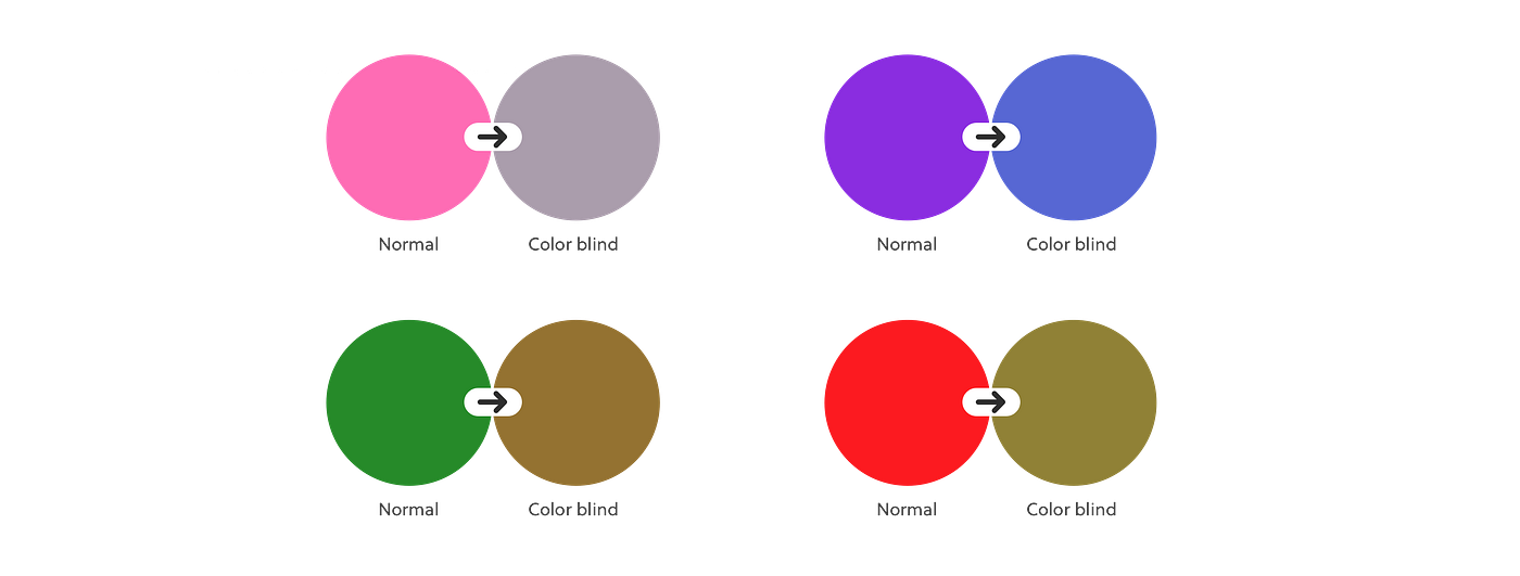
Before getting into the problems of ATG’s booking system, let’s cover a basic understanding about color blindness. Color blindness is having the difficulty of distinguishing certain colors. It is known as Color Vision Deficiency and varies by individual. Below are some common types of color blindness.
Protanomaly is having the reduced ability to see red light. Protans (people who have Protanomaly) have difficulty distinguishing the difference between blue and green colors, as well as red and green colors.

Deuteranomaly is a reduced sensitivity to green light which is the most common type of colorblindness (Red-Green weak).