Color psychology & visual hierarchy for UX & behavioral design
One of the critical applications of color in UX and behavioral design is using it to control where people look.
If people don’t notice your navigational system, your technology won’t be usable. If people don’t see your persuasive words, they won’t persuade. And if your technology is both unusable and unpersuasive, you have a disaster on your hands.
In digital psychology, one of the fundamental skills you need to master is the art of controlling where your users look. In most design work, we control user attention by increasing and decreasing the salience of visual design elements.

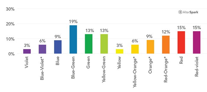
Figure 13. Visual salience of colors
What is salience you ask? Salience describes how noticeable something is. The term “salience” is often used by neuroscientists and psychologists to explain what makes things stand out. In other words, the term is used to describe the neurological and psychological factors that shape human awareness, perception, and focus, which are prerequisites for getting into users’ short-term memory, with the ultimate goal of planting your message in their long-term memory.
More cowbell

Let’s face it, interactive designers can find themselves stuck between crazy demands and irrational people. You know designers, the monkeys in the middle of all those ridiculous demands, such as move that up there, no move it down, now make it green, no pink, no purple, no red. Make that redder, reddder, reddddder? More cowbell, I WANT MORE COWBELL.
The way we balance between these competing demands is by prioritizing our business priorities, which makes it easier to design our technology. Put another way, if you can’t define your outcome goals clearly, it’s impossible to prioritize your page-level design, because you won’t have any basis for establishing what’s important.
The way we prioritize site-wide navigational structures and page-level content is through a combination of design and editorial rules, that we apply in a structured way, so as to control the salience of every user interface element.
A good graphic designer can turn down, or pump-up the volume of different page elements, while a master can make subtle micro adjustments that give the whole design a smooth feel. It can take months or years to fine-tune an ultra smooth-flowing digital process or optimize an extremely high converting landing page.
When the visual hierarchy is fine-tuned and optimized, your technology will feel effortless.
Color palettes with salient hierarchies
To develop a color palette that supports many design goals, you’ll need to know which colors attract the eye more than others. This will help you develop a color palette that’s not just aesthetic and brand-sensitive, but one that is also functional.

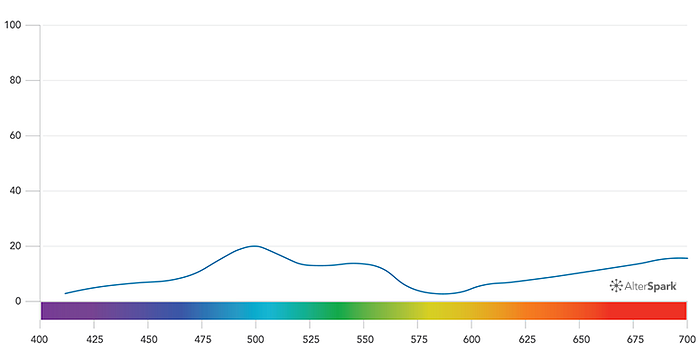
Figure 14. Arousal level by color averaged
Since color plays a strong role in design, people often ask which color is most salient. Is it red? Is it green? What’s the magic color?
Before I tell you the magic color, remember that the visual hierarchy of any color palette is easily manipulated by modifying the saturation, shade and tint of each hue, so you can structure any combination of hues with any visual hierarchy.
However, when it comes to the relative performance of colors when matched against all others, we summarized Camgoz, N. (2000) which shows those colors that perform best against all others.
Rena and I extracted the data from this study, extrapolated missing values, and translated the research into the color chart in Figure 13. Note, I estimated a few missing colors by averaging the values from neighboring colors with similar wavelengths.
I use this chart to inform my decisions on accent colors. When it comes to fine-tuning the priority of page-level elements, I use it to inspire my placement of adjacent objects, when trying to create priority among UI elements.
I also use it to inspire ads with various levels of attention-grabbing, and when trying to outshine competitors in 3rd party sites.
SOURCE PAPER:
Cugelman, B. Cugeman, R. et al. (2019) Color Psychology. AlterSpark.
https://www.behavioraldesign.academy/color-psychology/visual-hierarchy

