Common UX writing mistakes UXers stumble upon

We all make mistakes, that's a fact! But you shouldn’t punish yourself by saying; How could I do this? What is wrong with me! Why didn’t I see this before? or how the hell did I miss this? You don’t have to curse yourself the entire day for a simple typo or drown yourself in shame of misused punctuations. It happens to all of us, and sometimes to the best of us. But, there is always a way to fix it.
Designers, UX writers, Developers, Product Managers, and Marketing folks; UX writing mistakes can be very confusing and taxing to find at times, but these tiny mistakes; makes or breaks your product. I would like to thank my Design team at Innovaccer for discussing some of these problems during our ‘Design system open hour’ every week, which led me into putting these points together for UXers out there who might be facing the same problems.
Here is a list of some common mistakes, which you must have stumbled upon.
1. Avoid using ‘Lorem Ipsum’ for good
Even when you are building a mock-up product, make use of real content. Because real content makes your design look better and gives it the context it needs. Placing ‘Lorem Ipsum’ on your product will make your designs look alien, odd and empty. Next time when you are designing, just throw in some real words and see the difference for yourself.


2. Walk pass the ‘Passive Voice’
Users struggle with passive voice. It sounds very verbose, ambiguous and odd. Your users understand you better when you use the active form. Here is an example for you.


3. Avoid inflated sentences
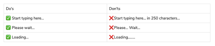
Inflated sentences in the product looks like a task to users, its tedious, really long and uncalled for. Not everyone is going to read everything if you want your user's attention, make your product content concise, short, and crisp. Actually, you don’t need what you don’t need. Write, to make every word tell. Period!


4. Overused phrases Oops…
The no. 1 overused phrase you often come across is ‘Oops… something went wrong’. Yes, something did go wrong that we didn’t come up with anything else rather than this phrase which is overused, abused and God knows whatnot.

The second most abused phrase is ‘Error 404’ Page not found…
Actually the phrase is not found yet. Have you ever thought that why that ‘phrase’ oh sorry the ‘Page was not found?’
We are kidding! Let's find a better phrase that can be found as a good replacement to this overused phrase and not abuse the same phrase again and again. Alright?
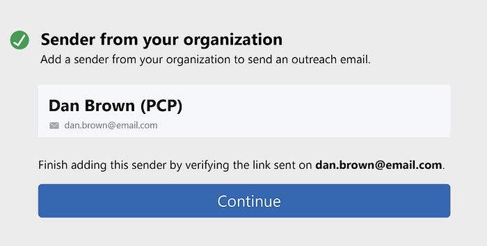
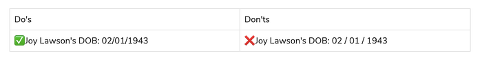
5. Period or no period after the email address?
Everything about email address is very confusing. There are challenging names, tricky spellings, special characters, numbers, dots in between and at the end of the email address which can be easily confused with a period.
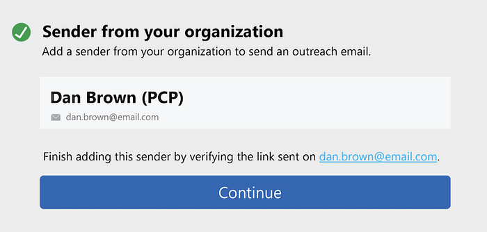
Do we put a period at the end of the email address or do we leave it open-ended? Here, let us clear it for you. There is no hard and fast rule for this but look closely, doesn’t it look odd and confusing? Here is an example for you.
You might just think it is a part of the email address. Or Is it the end of the sentence? It does bother you right? You see it’s unclear.
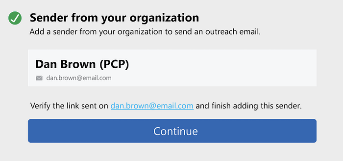
Ideally, we avoid using period after the email address. You either use a hyperlink and then add a period to make it look like a sentence or just rephrase the sentence so that the email address comes in the middle living no space for confusion. Look for yourself.
6. Punctuation? Or Punching a hole in your product content?
If you get chills thinking about punctuations or get super confused with them, then go back to your writing guidelines. Or in that case, if you don’t have one, read someone else’s writing guidelines. Someone must have mentioned about these confusing punctuations; when, where, why and how to use them.
For starters we have put down some day-to-day punctuation mistakes for you:
A) Ellipsis
Ellipsis is never two never four and never ever an endless chain of dots. It is used to show omitted words with just three dots in the end.
B) Slash
There is no space between a slash and words or numbers. Always remember that we don’t use punctuations for visual appeal it has a purpose.
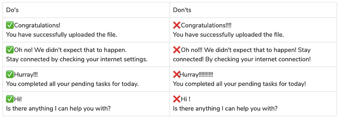
C) Exclamation point
Always use exclamation points sparingly. An exclamation point is usually used after an interjection or to indicate strong feelings or high volume, or to show emphasis, and often marks the end of a sentence. They don’t have space in between them, words or numbers.
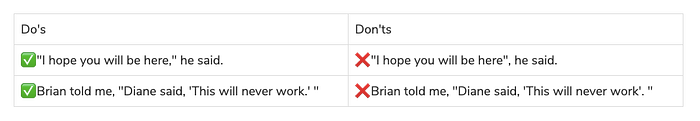
D) Use Quotation marks to ‘Quote’
Use it to show someone else has said it and you can say it too. Single quotation mark is used for a quotation within a quotation. Remember ‘period’ and ‘comma’ go inside the quotation marks.
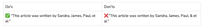
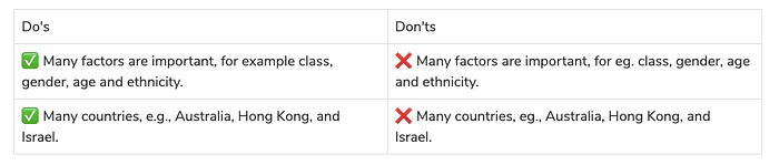
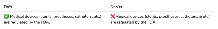
E) i.e./e.g./etc./et al.
Do not take them for granted. They are not fillers!
Example of et al.
Example of i.e.
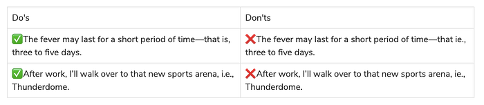
Example for e.g.
Example of etc.
F) Comma
Like the period ends a sentence. A comma denotes a soft pause or a smaller break in the sentence. There are various usage of commas but most of them are applied wrongly or misused. Let’s see how commas matter and can save lives!


7. Pay attention to your content hierarchy
Content Hierarchy is important, keeping same content in both headline and body copy will make your product look weak. It will jeopardise your brand's credibility. You can’t just rely on good-looking designs if your content hierarchy is weak. Always design keeping in mind the reverse pyramid model, it will give your content, structure and aesthetic appeal it needs.


8. To Capitalize Or not to capitalize?
Now this one looks really simple, but actually it’s pretty confusing. Even writers get it wrong sometimes. Yes, it's not all that simple. All you need to know is capitalization comes with a lot of instructions. Let’s see what to capitalize and what not to capitalize.
Capitalize:
· When you begin a sentence.
· Proper nouns such as product name and features.
· Avoid using it after a colon.
· The first word of the Quote.
· Names, job titles, company or organization name.
· Days, Months, and Holidays. But not seasons!
· People, cities, countries, nationalities, languages and places.
· Time periods and events.
· Acronyms and initialism.

Here, a bonus chart for those confusing times, to spot those slippery capitalization words.
Capitalization chart for crystal clear clarity

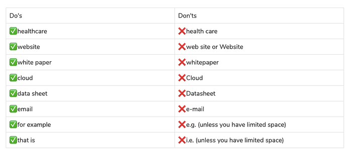
9. Everyday confusing words
10. Acronyms & Abbreviations are not the same
Acronyms and abbreviations are two different things, they can never be the same. FYI, You need to be cautious when you are placing these in your product. Listing some common mistakes for writing abbreviations and acronyms.
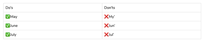
Never abbreviate months of the year which has four or fewer letters, e.g. May, June, and July. They are always spelt by their full spelling.
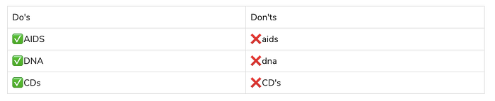
No need to spell out acronyms like HTML and URL. Spelling out ❌ Hypertext Markup Language or ❌ Uniform Resource Locator is not going to help your users in any way or make your product look resourceful. Your users are accustomed to the term ✅ HTML and ✅ URL and they easily understand what it means. Also, avoid using apostrophes to indicate pluralization of some acronyms.
11. Long copy for CTA buttons
We get it, long copy lets you tell more. But the primary function of a CTA button is to get conversions, reach goals and initiate an action. You don’t need a sentence to do that.
All you need is some action-packed words.
✅ VIEW DEMO
✅ START NOW
✅ LEARN MORE
Microcopy
Seriously, who needs more when you can get the job done in maximum two to three words.
✅ GET STARTED
12. The problem with orphans!
The problem with orphans is that it makes your designs look incomplete, just like this example which is hanging alone.
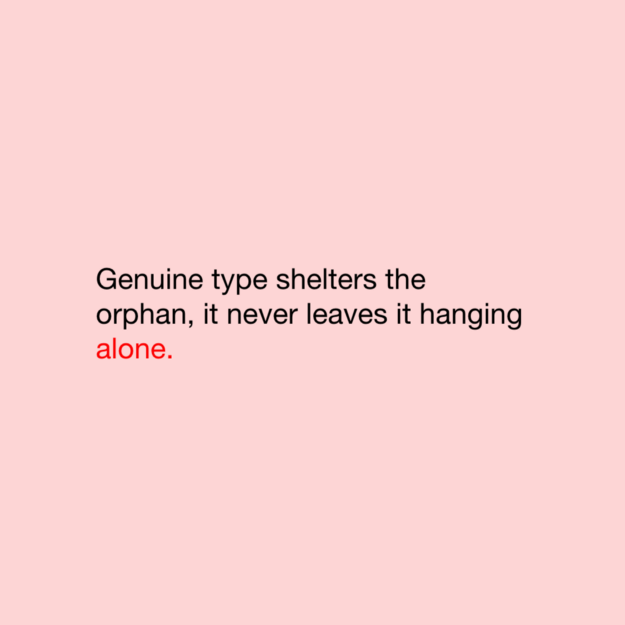
It’s bad for your product content and designs too. Always pay attention to it.
13. When to go bulletproof
Bulleted lists are good for catching attention and listing points. But these silly mistakes can sometimes grab negative attention as well.


Keeping these rules in mind can make your bulleted content, look polished and accurate. It can give you the appropriate attention it needs.
14. Lowercase is not sentence case
Yes, you heard me loud and clear lowercase is not the same as sentence case.
✅ This is sentence case.
✅ this is lowercase.
🙏🏻 Sentence case ≠ lowercase
There is a minor difference but this can change the game of your content. Be cautious of what you put on your product content. Remember, we generally use lowercase for writing an email address or URLs.
✅ danbrown@gmail.com
✅ www.medium.com
15. ‘An User’ or ‘A User’
Have you ever noticed that we never say ‘A hour ago’ instead we say ‘An hour ago’. Why is that? Because when we write, the articles are used on the basis of the vowel sound and not just the letter. ✅ ‘A User’ is the correct usage because ‘User’ sounds like it starts with ‘Y’ which is consonant.
So, focus on the sound of the letters and not just mindlessly put ‘an’ wherever it’s required.
Remember, mistakes have the power to turn us into something better than we were before. UXers we urge you to learn from your mistakes and create a better version of your products.


