Contrast psychology: Designing with contrast
A guide to understanding the working of contrast, its significance in design, to use it to your benefits or at least notice and appreciate.

When asked about contrast, some of my friends said — ‘Black and Orange are contrasting colors’, ‘Contrasting [colored] clothes look better together’, ‘In general, contrast means opposite’.
Of course, all of these are correct responses. [According to Google] Contrast is — the state of being strikingly different from something else in close association. While this idea extends to almost every domain involving human interpretation, we often limit the idea to colors and visuals only. What if I were to say…
Contrast is responsible for the way you eat your bread (outside-in) or that Jim-Jam. Contrast is the reason why you enjoy your songs in the particular way you do. Contrast is the reason you overspend without realizing.
Let’s understand contrast with some practical examples extending to a variety of domains.
Practical examples
- In literature, writers often deploy contrasting ideas in their poems and writings — to make it more interesting. Examples are some Figures of Speech like Antithesis, Oxymoron, Irony etc.
- Music producers often compose their music and tunes with what they call Unity and Contrast. Composers would need to first focus on establishing unity, and then break it up with a little contrast — and when that gets old come back to creating unity — in truth the best compositions develop unity and contrast simultaneously.
- Even the Marketing and Salespeople extensively use the Contrast Principle to their benefit (described in the next section).
- Also including some delicious examples here. The crisp-soft combination in food like Sandwich and wafers, Oreos in smoooooth silk chocolates etc. are much loved. Recall tons of foods with contrasting values!
So, contrast is universal and applies well to domains other than just Art & Design. But why does it work?
How does it work? — Concept of anchor
Contrast Principle — Simply put, if the second item is fairly different from the first, we will tend to see it as more different than it actually is. Well, it’s fairly apparent at this point.

In this image, the human mind inevitably perceives the shade at the left end of the inner strip to be lighter than that at the right end. This is because we cannot help but compare them with the gradient in the background and hence, perceive the same shade of grey as lighter against a dark background and vice versa — an obvious example of the Contrast Principle. One of the explanations to this is the Anchoring Effect.
Anchor
To simply put it, the idea of an anchor is similar to what we know as ‘first impressions’. The first piece of information that we encounter is set as an anchor and is used as a reference for further decisions. This means can anchor influences our decisions once it is set.
Consider the above optical illusion. The background gradient sets the anchor and we compare the inner strip with the background color at the different points giving us the illusion of shades of in the inner strip although it is made of only a single solid color.
A few more interesting examples to understand it better.
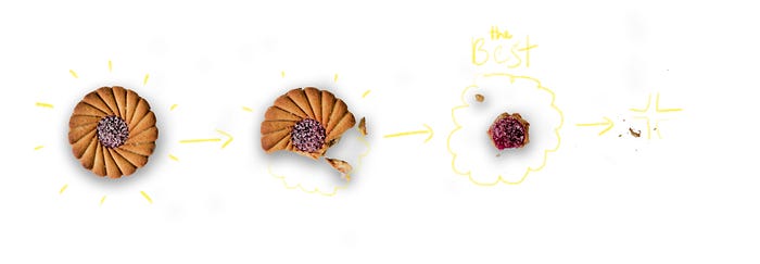
- The way we eat our bread is a classic example of the anchoring effect. While eating bread with the sides uncut, by experience we know the sides are the worst part and the core being the best part. We purposefully start and continue with the sides and gradually proceed to leave the core for the end, thus setting the anchor with the worst experience and enhancing the best part even more. And we happily extend this method to a number of foods, think! No, eating your bread will never be the same again!
- Another understandable example is — Beat drops in music. The contrasting property of beat drops is a huge reason why they are so popular, similar is the case with Beat Switches. The build-up before the beat drops sets the anchor which breaks after the drop. Interestingly enough, beat drops do not work as well when you skip straight to the drop as it provides no opportunity to set an anchor!
- Salesmen often employ anchoring (works best for unfamiliar products). Customers are generally first introduced to the best model or the costliest version of a product (as opposed to our intuition that says to start with a basic product) thereby setting the highest possible anchor, making cheap products seem cheaper. This greatly increases the favorability of lower products in contrast with the anchor in terms of price. Hence,…
Anchoring helps us manage expectations to some extent.
Thus, anchoring is a specific cognitive bias that affects the way we asses likelihood and probability. The concept of anchor was first introduced in and is borrowed from the book Thinking Fast and Slow by Daniel Kahneman.
“Plans are best-case scenarios. Let’s avoid anchoring on plans when we forecast actual outcomes. Thinking about ways the plan could go wrong is one way to do it.” — from Thinking Fast and Slow
Applications in design
Clever use of contrast in designs is the key to create interest, depth, focus and hierarchy which are some vital characters of a good visual design. As it is said — the best way to learn and practice good design is to master the fundamentals.
1. Negative space or white space
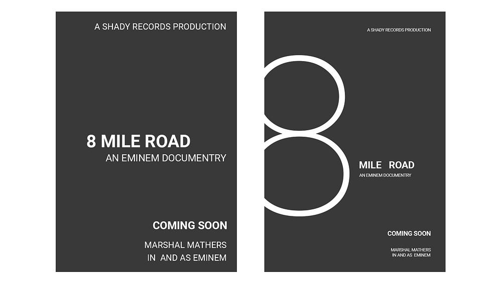
Negative Space is the space or emptiness in a design other than the primary design elements — the blank areas. For eg. the trap space in the letters ‘A’, ‘D’, ‘B’ etc. It is the harmonious relationship of contrast between the negative space and positive space (primary design elements) that makes a successful design.

In case of Graphic design, the aim of design is to communicate information visually, which means the design elements are the information to be communicated. Negative space, when used effectively to create rhythms and patterns, provides the eye to rest between these information and room to breath which is very important to balance cognitive load. 🥵 Let’s look at examples to understand.

Negative Space also finds its application in UI Design. For instance, it is important for a good UI to not overwhelm the user with a ton of information and thus Information Architecture is extremely important. Now we know that it is not just the tune or beat in a song that is great but the harmony between the silences in between and the musical nodes is what makes a great track!
2. Typography
Simple formatting features like size, weight, opacity and even case sensitivity can be used to create hierarchy in text bodies or even sense of depth in type designed posters or artwork. A handy rule or mantra for designing with contrast is
Go all the way. Intended contrast should be apparent.
That is looking at the contrasting elements, the viewer should be able to differentiate them in a split second. As Chris Do from The Futur says, ‘You don’t want to be in the no man’s land. Go extreme.’ A few instances of this would be:
- Skip a weight: Use a combination of Bold and Regular (skip Medium)
- Double your size: For a pair of Heading/Body text, use 16pt/32pt or 14pt/28pt etc.
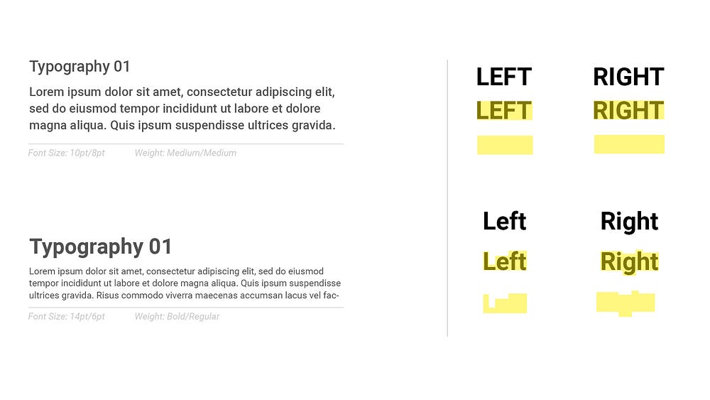
It is also advisable not to use ALL CAPS frequently. While all caps may seem neat and uniform, it’s uniformity is the very reason to avoid using it frequently. Our brain recognizes the form of text and letters before we identify actual words/letters. A combination of contrasting forms of lowercase letters make it easier to distinguish different letters and decipher the words faster, before actually recognizing individual letters. It is therefore recommended to use Title Case lettering in all emergency signs. ALL CAPS increases the cognitive load on our brain causing fatigue.
3. Form compositions
Form Composition of a good design, be it visual graphics, music or even experience design, has to be dynamic in nature. Being dynamic means it should not be monotonous, should not fall flat and have a depth — in respective context. Quickly going through a general practice for visual designs like photography, graphic design etc.
The rule of thirds:
A direct application of contrast and one of the most widely used rule. The subject or element of interest is placed on 1/3rd of a 3x3 grid of the frame. Heavily used by photographers and visual artists. The reason why this works is because it creates a more dynamic negative space around the subject, different from a center-framed composition.
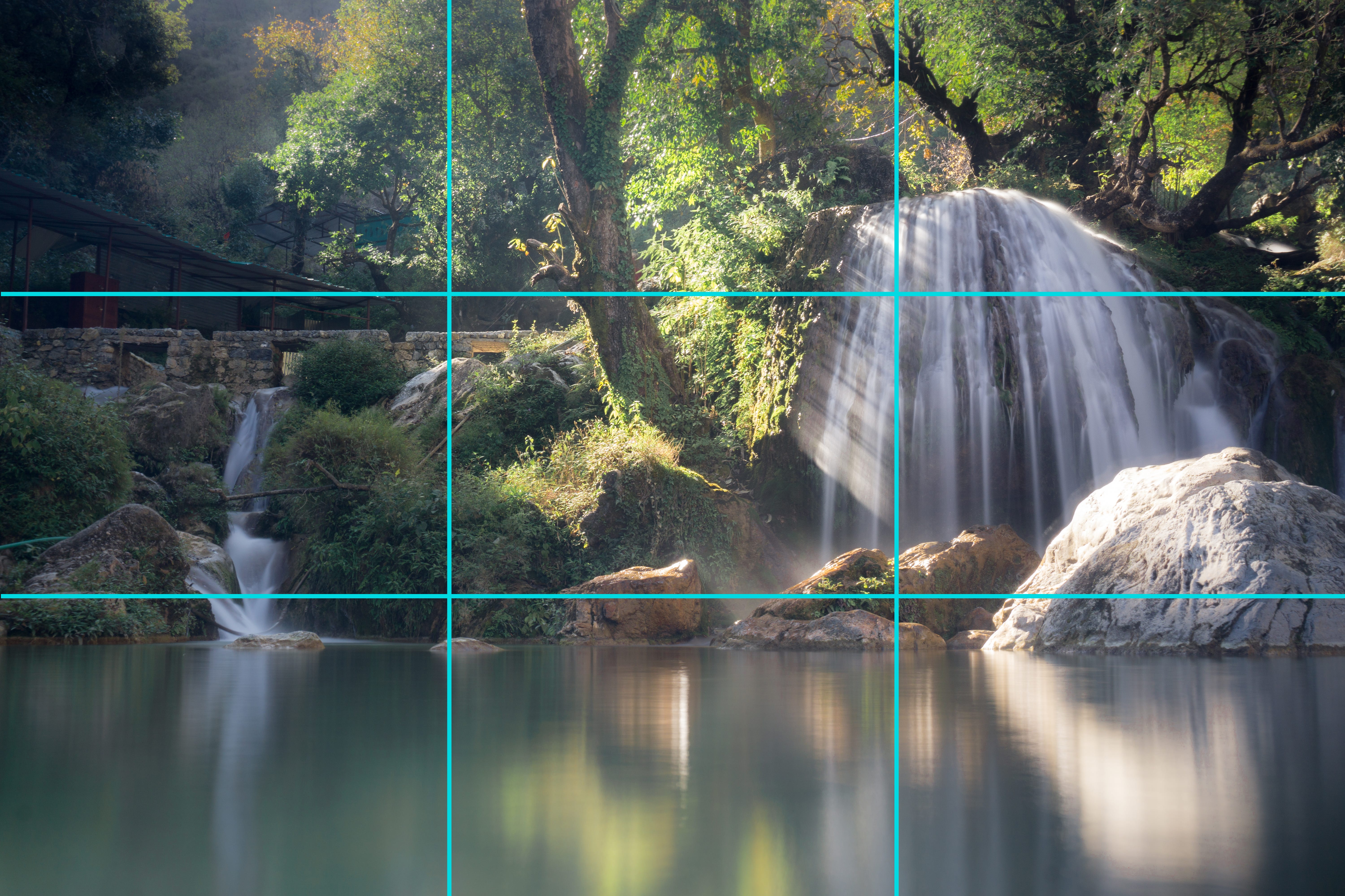
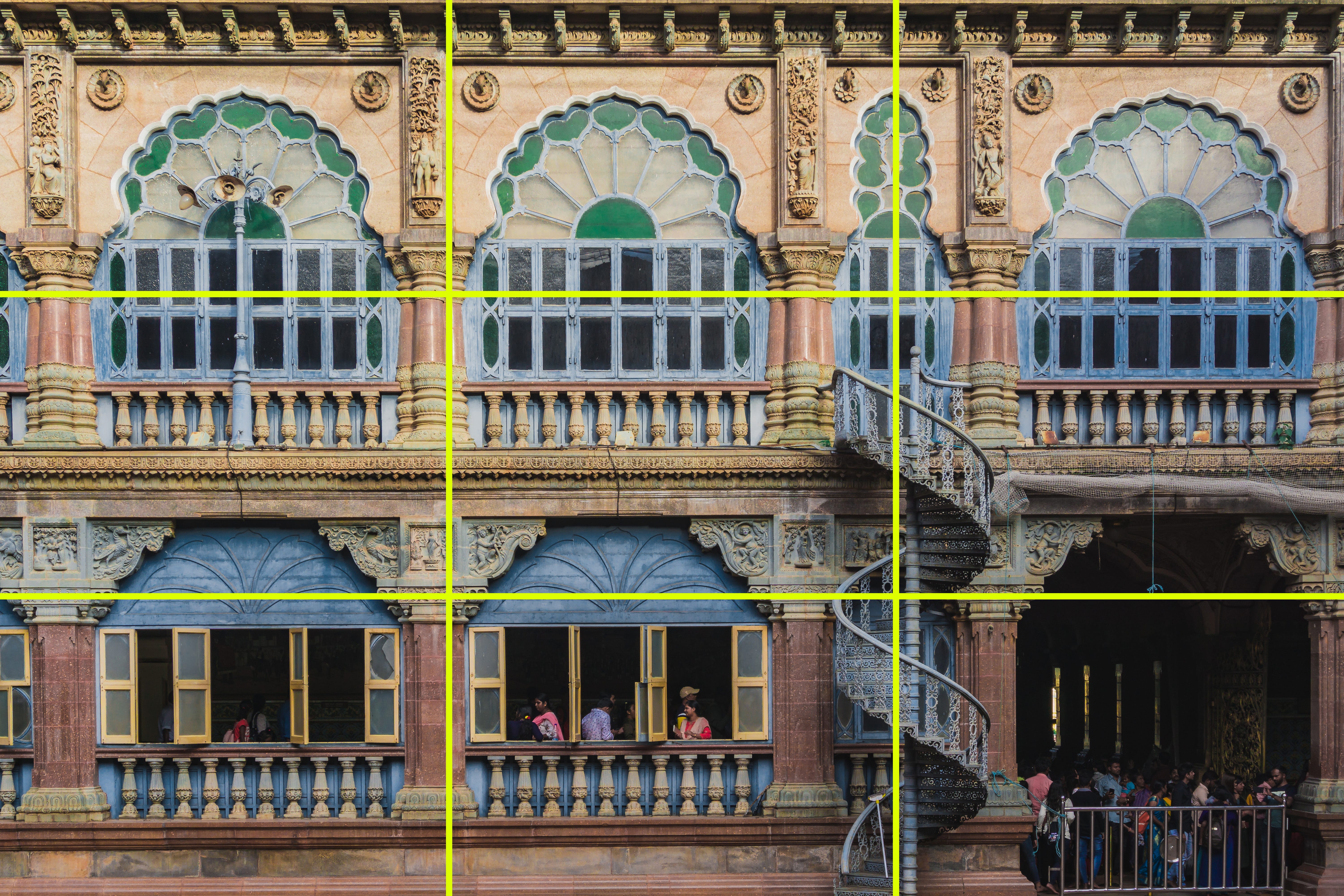
Of course there are many different grid placements like the Golden ratio but the primary goal is to make the composition dynamic. While there are also designs with center-framing and symmetrical form that works just great!
Some amazing examples to look at, study and learn compositions are Editorial Magazine layouts. Harmoniously implementing order and chaos and yet having a pretty defined hierarchy, magazine layouts offer much to learn in terms of form dynamics. There is only so much to learn about dynamic compositions in itself that we can save it for another article.

Do look at more designs and find out the numerous examples that enhance the experience using contrast. Appreciate good design. Hope you find and notice contrast in more than just a pair of clothes. What are some other applications of contrast that you recalled?

Thank you so much for reading. Feel free to hit me for any discussion, I’d absolutely love to make friends over Design or Psychology xD. Connect with me on LinkedIn and others.
Here are some leads to my inspiration behind this article. Check these out to know further :)
- Thinking Fast and Slow by Daniel Kahnemani: An undeniable classic in the domain of Psychology. A lifetime of wisdom and learnings to come back to.
- Influence: The Psychology of Persuasion by Robert B. Cialdini: An interesting guide for psychology concepts especially focused on marketing domain.
- Predictably Irrational by Dan Ariely: As catchy as the title is.
- Typography Critique by The Futur: The ultimate YouTube channel for designers. A Gold mine of learning for any designer starting out as well as already creative professionals.

