Crafting content experiences in a mobile-first world

 When Google rolled out its “mobile-friendly algorithm update” in 2015, it became trademarked as “Mobilegeddon.” Marketers and data analysts raised their brows at what this change could mean for their websites. It was even more of a concern for those whose websites weren’t yet responsive or mobile-friendly.
Why?
Because almost everyone has a mobile device.
Most people have smartphones
According to 2019 data from the Pew Research Center, nearly 96% of Americans own a cellphone of some kind — and that trend is happening around the world, too. More than 80% of those cellphones are smartphones, used for online tasks. Globally, it’s estimated that 3.5 billion people have a smartphone — roughly 45% of the world’s population. And counting.
These stats are important to digital marketers around the globe. It’s important for designers and developers to understand how to idealize and build a website that’s built for small screens.
And that’s great! We should be talking about how websites and apps are designed on small screens. But equally important in this conversation and learning is how we design content. While content can mean “all the things” on a website, in this case, I’m speaking specifically of the words on the page.
Discover your content & website needs
Content design is answering a user need in the best possible way for the user to consume it. — Sarah Richards, founder of content design and head of Content Design London
Sarah Richards, one of the strongest voices in content design and an expert on the practice, focuses on the needs of users above all else when it comes to content design. “Content without discovery is like playing chess without the board,” she says. And she’s right.
Part of discovery understanding your audience’s:
- Roles and everyday responsibilities
- Needs, wants, obstacles, and challenges
- Online habits and approaches
- Inspirations for conversion, and how they make them
- Preferred devices for finding information
Understanding this information — before your keyboard starts clacking — helps you establish readability guidelines or the type of language and readability you want to apply to your content. It sets the stage for an inclusive experience to reach the most people possible. And it lays a foundation for content strategy and development.
Not sure where to start with user needs? Just ask. Whether an online survey, a focus group, or a quick feedback loop with your newsletter subscribers, find out what’s challenging today and what they need most.
Build a useable site architecture and journey
You’ll want to plan your site’s architecture and experience first.
Knowing what “buckets” your site entails, and how users are expected to interact with your navigation is just as important as the pages you build, and in fact, can’t exist without a structure to live under.
“Please do your Information Architecture and journey maps first. It becomes really apparent that the underlying structure wasn’t thought through when I get to a mobile experience and the ONE THING I need is buried in a submenu or tab.” — Jess Vice, UX writer and strategist

As you create your site navigation, think about how to be clear and direct with your labels. Wordy navigation not only limits your design options in some cases, but it can make your user experience more clunky for the people who need the content. And on smaller screens like mobile phones, they can be even more cumbersome.
“Word navigation labels and link labels concisely, please. I go cross-eyed when breadcrumbs are wordy and start to wrap.” — Debra Kahn, content strategy and technical writer
Creating this outline should help you (and your team, if you have one) think about the flow of content on the page and how it works with design elements. A journey map is a great way to plan for the experience of users and how they’ll engage with your content.
And, of course, test your information architecture with card sorting exercises or tree testing to confirm (or deny) that you’re on the right track.
Partner with your designer, if possible
The best content design experiences are created in tandem with design.
As a content writer, I can usually spin up words needed, but it’s much easier if I know what I’m working with in advance. That said, this isn’t to say design should dictate space for words — but rather, working together lets you decide as a team what content needs what space to be the most effective.
Designers have the eye and skill to think about the space of a page or screen and how best it should be used. Having their vision in mind as you write content also helps prevent a great deal of slicing and dicing to fit the content in later.
Perhaps your designer envisions a card-based element for presenting information on a mobile page — wouldn’t it be better to know that before you start writing? Definitely.

Craft your content
Sometimes it helps to just start writing. That said, you’ll want to make sure you’ve done your research (such as stakeholder or expert interviews, if needed) on what you’re writing about, but then think about organizing all that information in a logical way and putting it on paper (er, a screen in this case).
Not sure where to start? Think about the inverted pyramid. There’s a handy guide for the inverted pyramid from the University of Leicester.
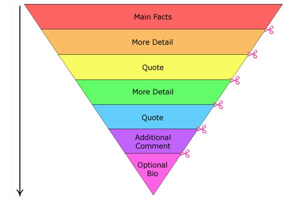
- Start with the most important information first. In journalism, this is known as the lede. Define the purpose of the page in a sentence or two before going into your supporting points.
- Use subheads to guide your points. When writing content for mobile, think about the length of subheads. Usually, 4–5 words max is what you’ll want to aim for, because once that page condenses to smaller windows — like on a smartphone — those words will quickly stack. Never use subheads as decoration — they’re meant to introduce new topics or changes in voice.
- Keep paragraphs short. Two or three sentences is a good rule of thumb, because again, once it responds to smaller screens, you’ll have larger blocks of gray text, which can kill attention spans of your readers.
- Use images. Generally, images should have some value to the experience of the content. They’re great for breaking up dense text, but they should be meaningful. This could be a chart, table, or supporting image. Remember to use alt text for accessibility.
A quick tip about images: Make sure you’re thinking about the experience of any graphic you use. Infographics and banners look beautiful on desktop, but if not designed well, can be almost unreadable on mobile devices:
“If you use infographics or just graphics with text make sure it’s readable on mobile. I see way too many graphics out there with text that can’t be read on a mobile device because it’s too small or there’s just too much text.” — Christoph Trappe, content and digital marketing expert
Test, implement, analyze, and iterate
Once your team has created the experience and page you had in mind, it’s time to perform any user testing possible, implement it, analyze the results, and iterate if needed.
Whew, that’s a lot!
We don’t always have the freedom to test content design with users before implementing it, especially depending on budgets and timelines. But monitoring the use of a page through heatmap and scroll map tracking, Google Analytics or event tracking, and conversions can give you an idea for how it’s faring.
Fortunately, there are plenty of ways to implement content testing, both before and after launch. Work with your team to choose the right option, and remember to monitor the results and make iterations on your content and design (or, content design) as needed.
The web is never done, so consider your website a work-in-process and a living, breathing, blooming part of your brand experience.


