Create better, accessible focus effects
Here’s a neat little CSS-trick for when you need an alternative to the outline property.

Most browsers has their own default, outline style for the :focus psuedo-class.

This outline style is crucial for accessibility, especially when it comes to keyboard navigation, so removing it isn’t considered a good thing.
However, it is OK to do so if you replace the styling with something else.
I’m not a huge fan of the default browser outline. Take chrome’s for example. I think the color is too light and the border too thin. Sure, you can always change the color and thickness. Like this:

This approach is fine, but a “problem” with outline property is that it doesn’t follow the rounded corners. Personally I would prefer if this wasn’t the case so I tend to go with a different solution.
Use box-shadow instead
You can achieve the same result using box-shadow. Here’s how:

This will now be applied to every element’s default focus style. Like for the inputs in this form:
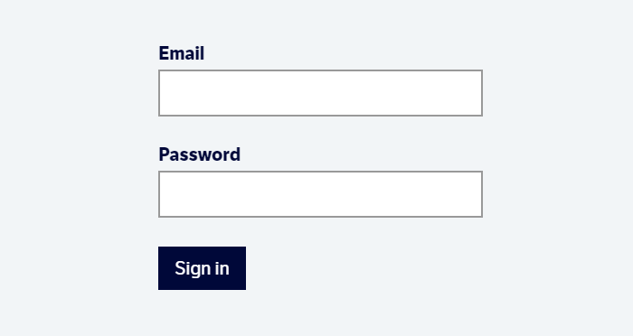
However, these inputs have a border and I don’t think it looks that good when you have both the borders and the box-shadow-effect.
You can get around that by removing the border-color upon focus:

Take aways
Box-shadow is a nice way to get around the disadvantages of the outline-property. Keep in mind that elements that have a box-shadow property on the element itself could create some “icky” results:

You’ll have to counter this by adding the focus-styled box-shadow to the element’s box-shadow upon focus.


