Creating a conceptual dating app for Ghana — a UX case study
Designing an app for dating
Just to kick this off the bat, I’m single.
Cool. Now that’s out of the way, let’s get to the main point of this article.
So I’m a Ghanaian by birth but I lived in the US for a couple of years. If I could describe Ghanaians in general, it’s that we can be a “timid” bunch. Often times, this can be a problem which results in finding it hard to date socially.
But in the world of technology, people are finding ways to connect online especially through social media.
So why aren’t there a lot of dating apps or platforms specifically for Ghana? Well, there are apps like Tinder and Bumble where anyone can sign up but it can sometimes be a ghost town and more often than not, there can be some “suspicious” characters on these apps especially in Ghana.
So I set off on a design challenge to try and design a dating app specifically for Ghana.
Please Take My Survey….
The first thing I needed was a bit of data about what dating in Ghana in 2018 was like. I designed a survey and sent it through various social media platforms including Facebook and Twitter.
From the little data I got, I could see there was an opportunity to design something that people might be interested in.
Most people in the survey said they didn’t really use dating apps. Some had dabbled in Tinder and Bumble but not many had actually found good enough matches. Most cited their mistrust of dating apps as it seems that the people on there are more into hookups, which can be a turn off for people who want more things like casual dating.
(If you’re in Ghana and are interested in taking the survey, you can click the link below:
https://jk24.typeform.com/to/oKgpvW)
Design
From the data gathering from the survey, it looked like the design of the onboarding process would be crucial.
With that in mind, I took into consideration that users would want options as who they would want to be matched up with on the app.
Below is a Lo-Fi design for the onboarding process.

I also took into consideration a “Verification” process. Most users on Tinder here tend to be “fake” so creating a realistic experience would make sense. Since this is a still a concept, I considered a Facebook verification or using an ID card verification.*

*(Why a Verification process? So most respondents in the survey stated that they had a mistrust of dating apps and so having users verify themselves could help create a more authentic experience. Bumble also has a somewhat way of “verifying” people but making them take selfies)
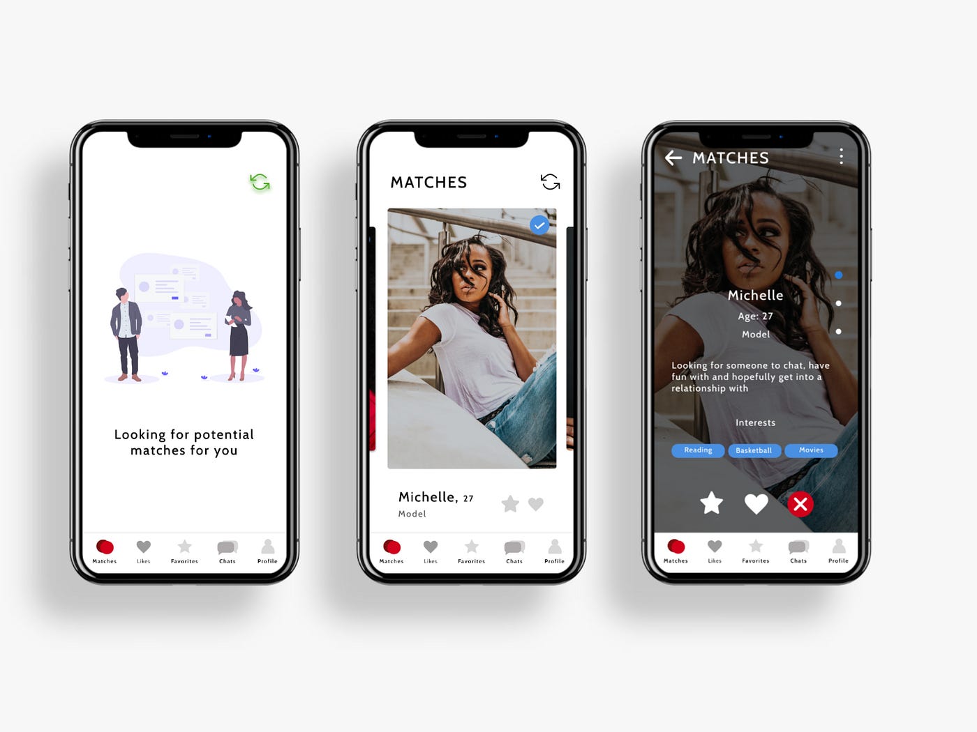
Getting Matched Up
After the onboarding experience in which users answer some basic questions and select their preferences, they’re displayed some matches.

If you notice in the top right of the profile pictures, you can see a “verified” sign meaning that the matches you see have either verified through their Facebook profiles or used a specific ID to verify themselves. Users would be able to skip this verification process but the point is to get people to verify themselves.
With this screen, we also get a look at the navigation bar.

The menu items include: Matches, Likes, Favorites, Chats, and Profiles
The Match menu item is self-explanatory. The Likes menu is where all the people you’ve liked and have also liked back appear.
With the Favorites, you can actually “favorite” a match in case you want to come back and check out their profile. (I did get feedback that a Favorites section wouldn’t make sense. Tell me what you think)

Matches appear in the Chat menu. You can only chat with someone you have liked and they’ve like you back.
In the Profile menu, you can change your profile picture and preferences to get more matches.
Match Profile Screen
This is what a Matched profile screen would look like:

Get Matched Up

Once you get matched up, you get a prompt asking you to start a chat. But you can opt to do that later. Again, your “Likes” will appear in the “Likes” menu section on the navigation bar on the bottom.
In-App Chats

This what the in-app chat screen looks like. Very clean. Simply type and send.

The more matches you get, the more chats appear in your Chats menu. You can always dismiss a chat if you’re done.
Work In Progress
This is just a concept although some people have asked if this would good from concept to reality. It really depends on if I have time and if people would be interested. The design can always change based on feedback. For now this is the concept as it stands. You can check the prototype here (Designed it in Figma):

