Creating a copy system along with your design system
For Google Pay, we needed UX copy that extended from marketing through product, and across surfaces including mobile, web, and voice. Here’s how we created a content system to scale along with the design system.
Google payments had historically been a sort of mishmash of product offerings: Android Pay (in-store payments), Google Wallet (peer-to-peer payments), and additional unbranded checkout flows for various Google entities like Google Travel, Store, and Play. A little over a year ago, we decided to unite these experiences under one brand and extend the functionality to create an amazing payments product. That meant we needed a cohesive design system—and a detailed copy system to support it.

A design system at its base is a set of fundamental principles, UI patterns, and detailed components that underlie a product offering. The purpose is to bring consistency and ease-of-use to customers regardless of the operating system, screen size, or even the interaction mode (web, mobile, TVs, watches, voice-based devices). As the head of content for Google Payments, I realized my team had a huge challenge on our hands to build a copy system to support this robust, fast-evolving design system. Here’s the short version of how my team and I brought the system to life.
Content architecture
To begin, I felt I needed a way to envision the whole enchilada, a diagram that would encompass all the conceptual elements needed in the system. I thought of it as a content architecture that would tie all the messaging together. It made sense to envision a hierarchy of content and messaging that laddered up. Here’s the sketch I came up with:

This helped to unite marketing and product messaging by establishing a hierarchical framework for all the copy. (What you see here is an example, not the verbatim text we used — that’s proprietary so I can’t share the real text.)
We then knew, along with our marketing partners, we had to create a series of supporting artifacts based on the copy system architecture. We needed:
- Brand guidance for 3rd party merchants and developers
- Messaging and value props for each feature and use case
- A detailed design spec that included color, sizing, typography, and copy for standard UI components for implementation by both internal teams and external developers
- Style and terminology guidance aligned with Google’s general writing guidance to share with Google product teams, Marketing, BizDev, Partner Relations, and Customer Support.
And of course, we had to remember all the things that can complicate a system potentially designed for billions of new and existing global users:
- Don’t alienate users of former products (in this case, Android Pay and Google Wallet)
- Don’t alienate non-English speaking users or non-US users with different money mindsets and payment methods
- Tie back to existing Google products, of which there are many (!), without creating unpleasant, mysterious, or jarring surprises
- Keep the copy fresh and fun, but also universally acceptable to everyone
All of this work is ongoing and no small undertaking. But back to the copy system since “writing for billions” is clearly its own topic…
Aligning user needs with the copy system
OK, so we had a rough concept of the content architecture in the form of a messaging hierarchy. Our next step was to assess user needs at each stage of the user journey. What copy was essential for onboarding? What did users want to know most at first use? To answer this, we developed a user needs gap analysis to ensure we had copy that answered the most critical user questions. We relied on our fantastic user researchers in usability testing, our customer support partners (always a goldmine of insights!), and we brainstormed as a team as a starting point for any not-yet-released features.
Here’s a super simplified example of the consumer version (again, not real text) of the Q&A matrix we created:
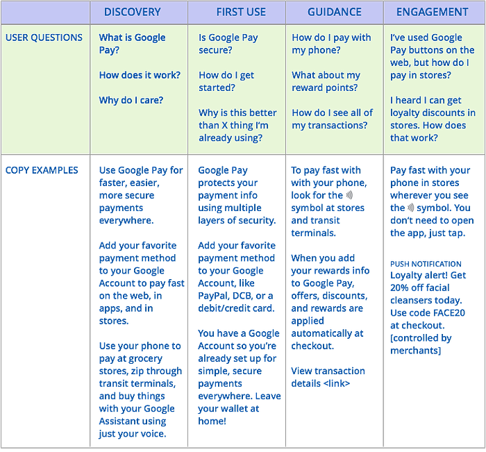
To develop a comprehensive copy system, we needed a user needs assessment for each of our audience segments, for each of our interaction modes, and for some unique global markets. The coolest outcome of this exercise? We were able to understand recurring themes and key points.
Every user needed to know what Google Pay was and the basics of how it worked, especially its benefits. This sounds obvious, but reaching consensus on a very brief description for a vast, feature-rich ecosystem of payments options is not easy! Needs assessment helped us align on a core description with minor variations.
Developing copy components
The next critical step for us as a UX writing team was to write strings that could be generalized across devices and modes. We wanted to keep the copy as consistent as possible to reinforce messaging and learning.
Some strings could be applied the same everywhere as standard copy components. Headings, dialogs, micro text like tooltips, form field labels and errors, terms of service strings, and many CTAs were standardized for re-use.
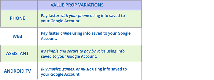
To accommodate system complexity, we created a few variations to suit specific use cases. (Fictional examples shown here, not verbatim text.)
Now imagine a very large matrix of strings for all of the “messaging moments” listed in the hierarchy diagram. For obvious reasons, I can’t share that final doc here, but I hope you get the idea. It’s pretty big.
With this approach, we were able to add real-deal copy strings to the spec for each component in the design system. No lorem ipsum text. (Keep your eyes on the Material guidelines — they might one day soon include the spec for Google Payments.)
So that’s a bit about how marketing messaging, content strategy, UX writing, and microcopy came together to form a scalable copy system. It’s far from perfect, and it will continue to evolve for years to come, but I hope this helps to explain some of the thinking that got us started. Shout out to the Payments UX Writing team, especially Kristen House, for partnering with me on this adventure.
Thanks for reading!

