Creating a design system in Figma: a practical guide
Getting started building your own system.

Do you like staring at a blank canvas every time you start a new project in Figma?
I’m guessing you’re not a big fan right?
Wouldn’t it be better if you could kick-start your design projects faster, and save yourself so much time?
Well. This is where a Design System can come to your assistance.
So, what is a Design System you may ask?
In its most basic form, I like to think of it as a Component Library and Style Guide rolled into one.
Something which enables you to have those core UI elements pre-built, ready to go, allowing you to focus on the nuances of a design project, and complete it so much faster.
So with all that said, let me show you how I put together my Design System; Cabana for Figma, and in the process help you better understand what goes into creating a versatile and powerful System for yourself.
PLEASE NOTE: This article is here to help give you valuable tips, and advice on the best way of starting your own Design System. It’s not a guide on showing you how to create one from start to finish. Who’s got time for a 10000-word article right?
OK. Let’s do this…
Oh. Before you read the rest of the article…
🏠 Growing a SaaS startup? I combine strategic design with proven founder experience to help you build products users love.
Join the Haus waitlist for early-bird perks → https://gohaus.design/
Why you should build a strong Colour palette before anything else.
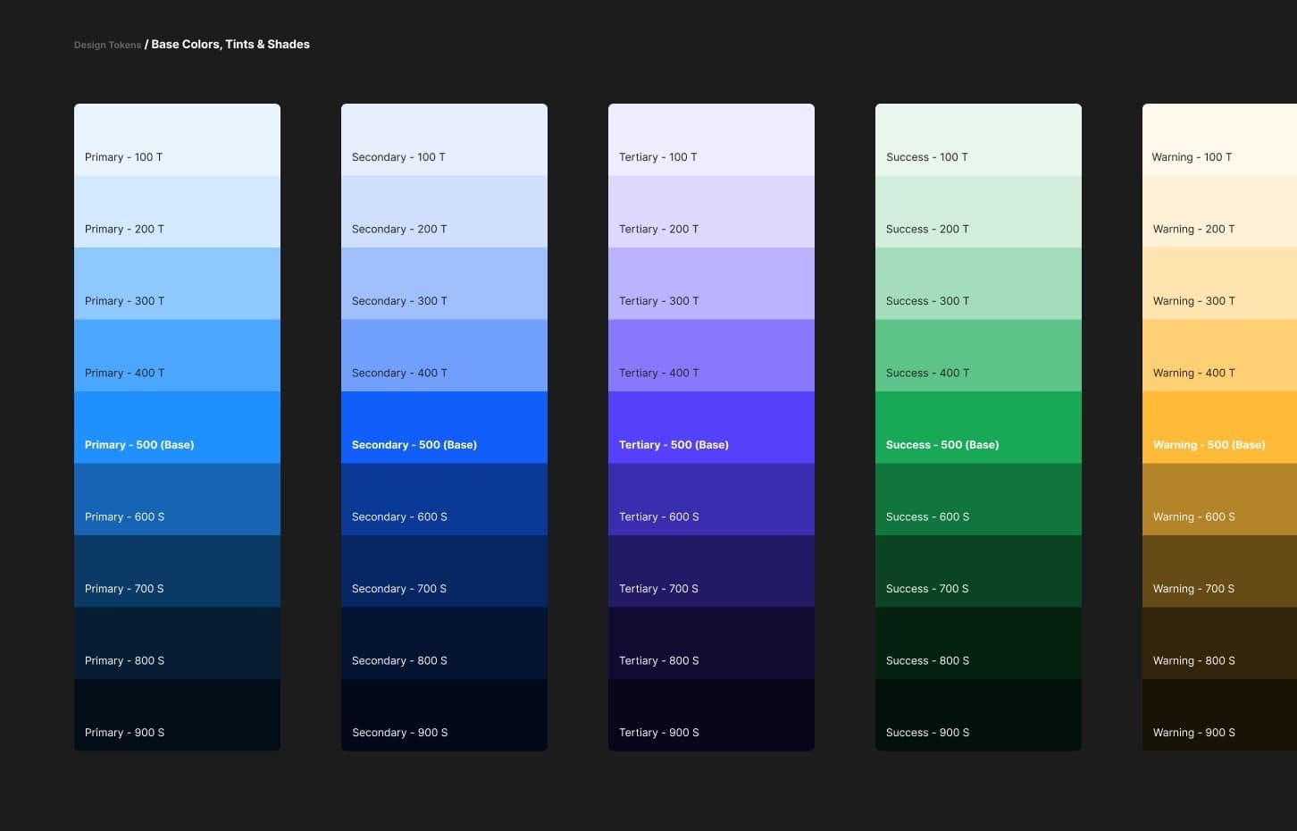
When you start creating your Design System in Figma, you want to start with your Colour Palette first, and aim to keep your Base Colours to a minimum where possible (ie; Primary, Secondary, and Tertiary).
Of course, it makes sense for the purposes of flexibility to then expand on those Base Colours by offering varying degrees of Tints (Lighter variants), and shades (Darker variants).
Now you could go ahead and create the varying Tints and Shades from your initial Base Colour by tweaking the Saturation, and Lightness values from the HSL option inside the Colour Panel in Figma, but that’s a time-consuming process.

A tool that I use to make the whole Tints & Shades creation process even quicker can be found at the following link -
https://maketintsandshades.com
Here you can quickly produce Tints & Shades by simply pasting in your Base Colour HEX value, which in turn will then produce perfectly computed Tints & Shades for you.
You then select which Tints & Shades you’d like to use inside your System, and simply copy back across your chosen HEX values, which you can then insert into the relevant Fill options.
Before we move on, let me give you a simple tip on naming conventions when it comes to your Colour Palette…
I highly recommend using something as simple as the following…
- Primary / Base
- Secondary / Base
Using forward slash (/) will categorise your Colours for you and aids in quickly finding the relevant Colour from the Inspector panel.

You’ll also need to look at implementing the standard Red (Error), Green (Success), and Yellow (Warning) Base Colours for usage within Notifications, Badges, and Input Field Borders for example.

Black and varying shades of Grey are an absolute must too.
As well as the obligatory White, I also recommend adding White with varying levels of Opacity. These variants are perfect for example, when you want to insert an Icon over the top of a Colour or Image, letting you easily allow as much, or as little of the Colour or Image to leak through.

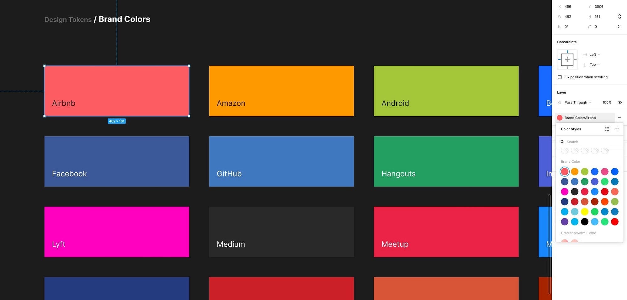
And don’t forget those Brand Colours.
You’ll find yourself calling upon these for many projects, and it pays to create them at the same time as your main Colour Palette.
And lastly, a healthy selection of Gradients always comes in handy.
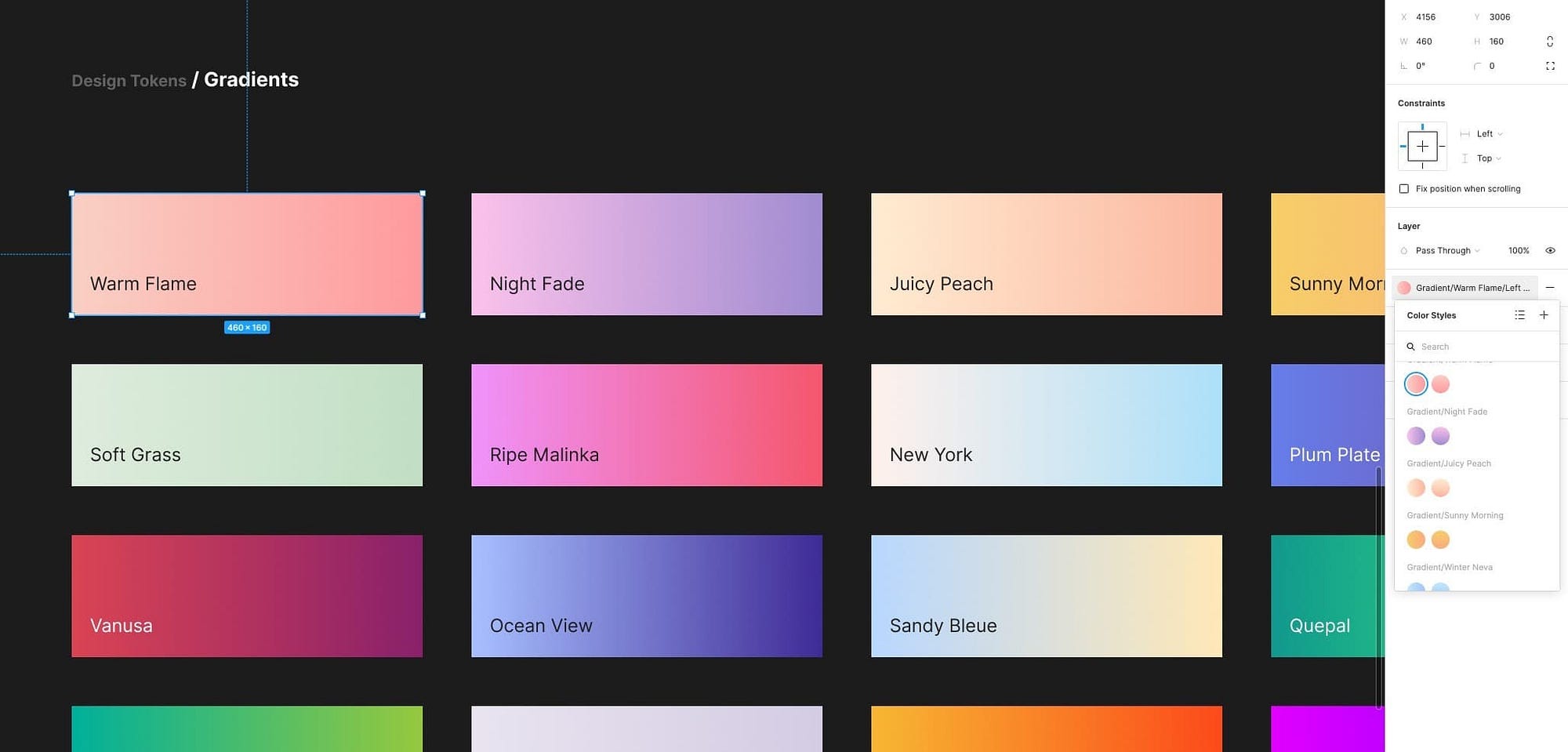
If you do decide to add Gradients in your initial build make sure you give yourself some versatility by maybe adding both a Left to Right, and Top to Bottom variant from the get-go.

Give yourself plenty of Typography options to cover both Desktop and Mobile usage.

Unlike an app like Sketch, which ties Alignment, and Colour together within the Text Style. Figma breaks these apart, allowing you to have a lot less Text Styles to manage, and makes for a much cleaner, and lighter file.

Even so, when building out your own System I recommend sticking to a 2 Font Family rule if possible.
For my own System, I chose Inter and Oxygen as the Base Font Families because they complement each other really well, and they’re not too decorative as initial Base options.
As well as creating oversized Display Styles, I also created styles for the usual suspects of H₁ to H₅ using Modular Scaling, with my Body text size set at 18pt, and using a Ratio of 1.2.
The Body I set at a healthy 18pt to improve legibility, especially when creating long-form content.
As well as the Headings, and Body styles, I created styles for Lead, Small, Caption, and X-Small, with the latter being perfect for when creating designs for mobile, and the former for when dealing with Desktop projects.
The naming convention here is entirely down to you, and what you feel most comfortable with. I know some folks like to opt for a naming structure like Heading 1 through to Heading 6, and Body, Body L, Body S etc… and a million other kinds of naming conventions. Whatever works for you?
What I do recommend though, and following a similar pattern to your Colour Palette, is to once again use those trusty forward slashes (/) to group your Text Styles and make them much easier to reference.
Something like the following works great…
- Lead 24 / Family #1 / Regular
- Lead 24 / Family #2 / Regular

With these 2 Font Families and their various styles (ie; Hero, H₁, Body etc…) I suggest creating a Regular and Bold weight variant as the bare minimum. You can, of course, add to this to suit your personal preferences at any point (ie; Light, Semi-Bold etc…)
Now. In Figma currently, when you want to change to a different Font Family you have to do things manually… each Style at a time.
Not cool!
But don’t despair, there’s an awesome plugin that I highly recommend called Batch Styler from the very talented Jan Six.
With this plugin, you can change multiple styles at once. All good!

And finally, don’t forget those Elevations and Shadows.

One last addition to the core styles of any good Design System, alongside your Colour Palette, and Typography Styles are Elevations and Shadows.
I suggest creating shadows suitable for both Light, and Dark designs, and their accompanying Elevations (20%, 40%, 60%, 80% etc…)

Icons. A good Design System needs Icons.

Every good Design System needs a great set of Icons right from the start.
The core elements of a powerful Design System are -
- Colours
- Typography
- Elevations & Shadows
- Icons
Other Core Components such as a Buttons, Inputs, Modals etc… are a close second, and I’ll be touching more on these very soon.
Find a lightweight, but varied Icon Set for your initial build.
For my own Design System; Cabana, I wanted a fairly substantial, but not oversized Base Icon Set.
I aimed for something that had a varied number of icons to choose from, was not too quirky in its style, and had both Fill and Line options available to me, and that’s why I settled on the Open-Source set; Eva.

Another Open-Source Icon Set that I highly recommend is the beautiful Feather Icon Set.

Want to organise your Icons better? Get yourself an Icon Organiser.


Back in my System, and on a Main Components page that I’d created earlier, I simply dropped in, one by one, icons from the Eva Icon Set.

The cool thing with IconJar is that it will insert your icons with a 24pt Bounding Box already applied, which aids alignment and visual consistency within your designs.

Then, it was just a case of attaching the Primary Base Colour Style that I’d created previously…

…choosing a naming convention to aid with categorisation of my Icons (similar to what I’d created previously with the Colours, and Typography)…
- Icon / Alert Circle / Fill
- Icon / Alert Circle / Line

…and then simply converting it to a Component (Alt + Cmd + K).
Wash. Rinse. Repeat.
Now, this part will seem a little time-consuming, but I’ve yet to find a Figma Plugin that can help automate this process well, so manual it is for the time being I’m afraid.
Choose your Main Components wisely.

So, what goes into a versatile, and powerful Design System?
Components. And lots of them.
It’s a big job in creating hundreds of components in the first instance but when it’s done it’s a smoother ride from there on with just smaller incremental additions as required.
It’s the part of creating a Design System that is going to take up the most of your time. Don’t expect to pump out your Main Components in one evening with a hot cup of cocoa. You’re going to have to set aside a little more time than that I’m afraid.
Always start with those smaller Components first.

What did I start with first when building out my Main Components?
Buttons.
And lots of them.
Smaller Components such as Buttons are one of the most commonly used elements of any project, so it makes sense to create those first, before you move on to creating larger Components such as Modals, Cards, Calendars etc… which will inevitably feature those smaller Components at some stage.
For my System I created Primary…
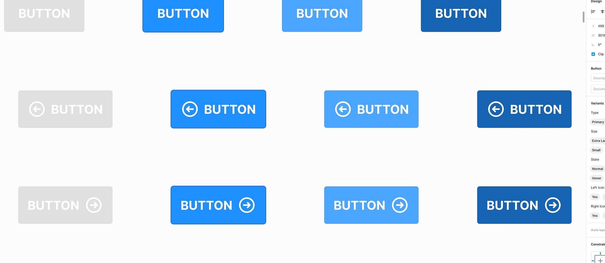
…and Secondary Buttons…

…with following variants:
- Button / Primary / Extra Large / Default
- Button / Primary / Extra Large / Left Icon
- Button / Primary / Extra Large / Right Icon
As well as the ‘Extra Large’ option I also created ‘Large’, ‘Medium’ and ‘Small’ variants to cover both Desktop and Mobile use.
Your smaller Components will become part of a much larger Component.
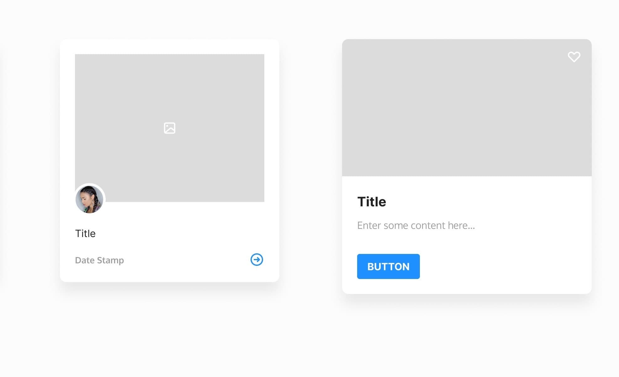
As I’d done with the Buttons Components, and knowing that they would become part of a much larger Component (ie; Card, Modal etc…), I went ahead and created other smaller Components such as Avatars…

… Dropdown Menu Items…

… Placeholders…

… and Progress Bars…

… to name but a few.
Doing it this way enabled me then to nest these smaller Components inside larger Components when it came to build those out.
Now, there are some folks that like to create the larger Component (ie; Card) first in its entirety, and then separate out all the elements that it consists of (ie; Button, Placeholder, Avatar etc…) into smaller Components.
Me personally, I like to design those smaller Components first, have them all at the ready, so I can then jump into creating a larger Component, and quickly choose from what I have available until I’m happy with the final build.
Anyway. I don’t want to take up too much of your valuable time here. So, here’s just a select few of the Components I added to my own System:
- Avatars
- Button Groups
- Calendars
- Cards
- Charts
- Comments
- Maps
- Media Controls (Video & Audio)
- Modals
- Notifications
- Pagination
- Placeholders
- Tooltips
Just remember to get the most commonly used UI elements into place to cover enough use cases, and you’ll be good to go with your initial build.
Like I mentioned before. Building your own System does take time (it took me 3 months to build my own, give-or-take), but the satisfaction once you’ve built it is immeasurable.
To never have the worry about starting a design project staring at a blank canvas ever again, is an awesome feeling once you have your own System in place.
Oh. Before you go…
🏠 Growing a SaaS startup? I combine strategic design with proven founder experience to help you build products users love.
Join the Haus waitlist for early-bird perks → https://gohaus.design/

