Creating a handwritten font for Culture Amp
How to prototype, test and build a typeface that embraces uncertainty and human expression.
Even before we started work on Culture Amp’s custom typeface, I was nervous about making a handwritten font. Disastrous images of a marginally improved Comic Sans or Chalkboard circled ominously. The graveyard of student projects that is DaFont haunted my dreams.
The custom-type projects I’ve worked on in the past have all largely been display or text typefaces. Handwriting falls into a unique category of its own. When done well it adds personality and humanness to a project. Done badly it can quickly make a piece of work feel amateur, rushed or unresolved. We knew this needed to be both refined and imperfect, and finding that balance was probably one of the hardest details to get right.
For me, a lot of our process in making this typeface was more about leaning into what felt uncomfortable. As designers, we’re often taught to rely on our gut, and use this tacit knowledge to find the edges of what feels ‘right’ to us and our audience. In this instance though, I want to make a case for embracing the squirmy feeling of navigating something hard and unknown. Sometimes you just have to dive in.
Defining the role of your typeface
Concept and Prototype
In an identity, every component has a part to play. There needs to be a specific reason for being that’s not just ‘aesthetic purposes.’ The role for this typeface was important as we started to establish the brand, and understand this it might be worth a slight digression into who Culture Amp is.
In a nutshell, Culture Amp is a global tech company with a powerful employee and experience platform. They have a unique ability to combine data and psychology, analytics and human experience, and insights and behaviour to help people have better experiences at work. For companies to really put their culture first.
This blend of humanity and science is what makes Culture Amp distinct, and became a central theme in the development of their identity. Our handwritten typeface was our distinctly ‘human’ element, representing the emotion and imperfection of human nature. After all, you can tell a lot about a person from their handwriting right? (For the record you can’t — Graphology is now widely regarded as a pseudoscience for all of you out there trying to to find future serial killers with handwriting samples)
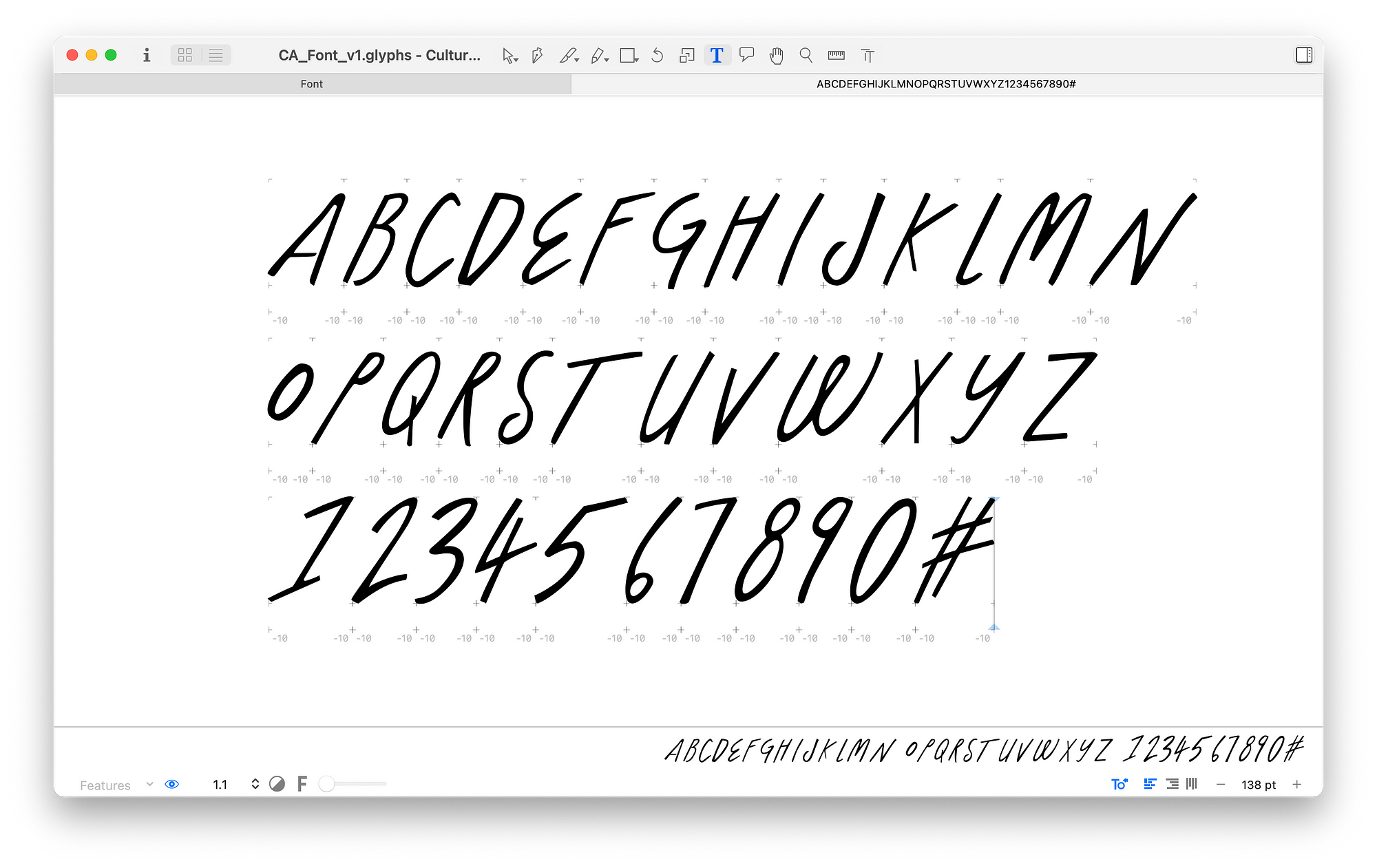
As per my previously noted dread around getting a handwritten typeface right, we decided to de-risk this gamble with a prototype. We gathered references for specific handwriting with the tone and personality we were after, and used this to draw out an alphabet that emulated some of these styles. I scanned this, live-traced in Illustrator (sorry) and then imported into Glyphs. While deeply typographically flawed, this gave us a workable typeface to use in our concept presentation and ultimately sell the dream to the Culture Amp team.
Down the rabbit hole
Exploration and iteration
As with many of our typefaces at For The People, we turned to Mathieu Réguer to bring this to life. Mathieu has an incredible ability to work with our concepts and make them better than we could have dreamed. In briefing him on this project, we looked to answer some important questions:
- What type of pen or pencil would be best for this?
- What angle should the text be at? Are all letters at the same angle or different?
- What weight do we want?
- How much texture do we want and how do we achieve this digitally?
- What’s our letter height and spacing?
- All caps or lowercase or both?
- How do we make sure this is accessible?
- What writing scale should we use as a base?
- How do we make this feel natural?
Many of these questions would already be answered in a typical typeface, but in handwriting these are all variables determined by the holder of the pen. So that’s where we started — with many pens on paper.


Starting analogue on this project was crucial to really achieve an authentic expression of handwriting. Mathieu roped in letterer and studio-mate Julien Priez and between them hundreds of samples were made. Importantly, this allowed us to identify two key factors in the typeface that we would keep returning to until we got things just right: rhythm and energy.
This may sound like the directions from an earnest Dance Mom, but if you consider the pace at which you write and the intention (angry scrawl, happy message in a card) it can dramatically impact how letters are formed. We realised that quicker, more energetic marks looked too sharp and urgent, whereas slower more rounded forms were friendlier. This helped direct many of our iterations until we had 3 prototypes to work with.


Working with these live prototypes was perfect to understand the feel of each in situ. But at this point my worst fears were being realised. We had made typeface that at a distance, looked like any other handwriting available on Creative Market.
Making it distinct & natural
Refinement and finishing touches
If you think about your own handwriting, there are always letters that you customise and (whether consciously or subconsciously) have become distinctly yours. I remember that era in school where many of my friends customised their handwriting with little love heart or open circle dots on their i’s ….ah simpler times. But I’m not talking about that. I’m talking about little quirks that come from the way you hold your pen badly (as I am notorious for) or because you the way you learnt to construct a letter was backwards. Those are what moves handwriting from feeling like anybody’s to yours.
That’s what this typeface needed. We didn’t go so far as constructing a persona for this typeface, but we did realise that it needed to feel like it belonged to someone. And actually it did — that’s what creating an identity is all about.
We took a step back and looked at original samples of handwriting from many different people, and started to identify key glyphs that we could make particularly unique. Mathieu took this and ran with it. And the new version he came back with was better than we imagined and became the basis for our final font.

With this core personality established, we looked at some extra touches that would really make the typeface feel more naturally hand drawn. One of these early details was to apply to the typeface what Mathieu called a ‘dancing baseline/stable midline’ — a way to dynamically align and balance the characters while avoiding a rigid baseline.
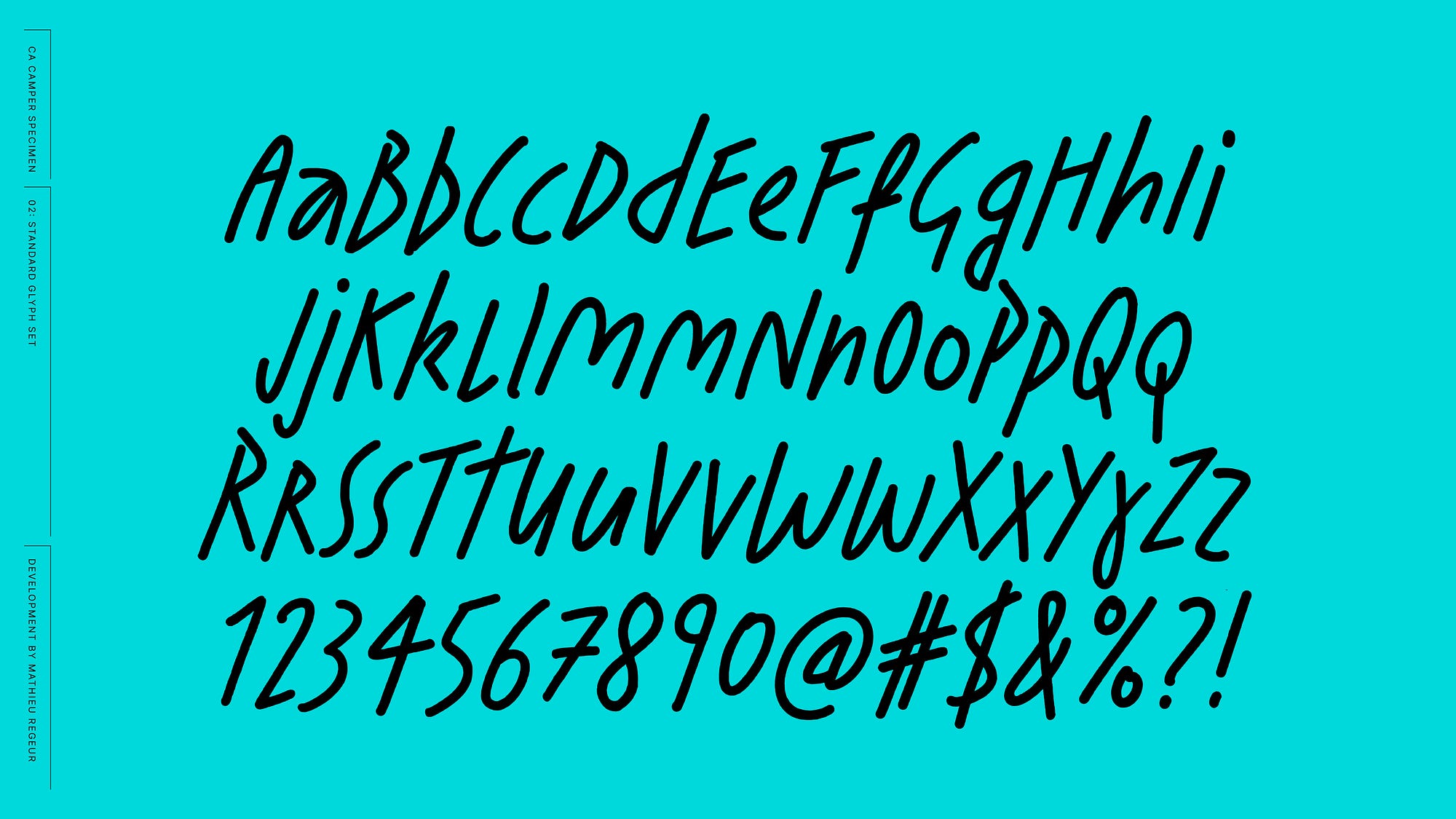
We also went a bit wild with alternates. Each character had at least 1–3 alternates to add natural variation, and were able to contextually change depending on the preceding characters. We recognised that some of these characters might also be inaccessible in some situations, so glyphs like the double storey a and g, y and r had specifically drawn alternates that were more open and readable.


A slight texture was added to all letters — a sometimes imperceptible detail at small sizes but important for larger print uses of the typeface. Lastly, Mathieu incorporated my favourite feature — a custom underline that matched the typeface and would automatically be applied to the preceding letters by typing underscores at the end of the word.


And with that, Camper (named after Culture Amp’s term for their people) came to life:
While much of this article is indulgently focused on the details of type design, I wanted to highlight a bigger theme that I took away from this project; Designing with trust and uncertainty. Being someone who likes to know how everything is going to turn out, it was refreshing to feel uncomfortable during this process.
As for the typeface, it’s now widely used across Culture Amp’s brand and I’m excited to see how it evolves in the years to come.
Camper credits
Type Design: Mathieu Réguer
Art Direction: Olivia King and Mel Baillache (For The People), Nicole Dominic and Lauren Mahoney (Culture Amp)
Camper in use


