Creating a small design system for my blog using Figma — a UX case study
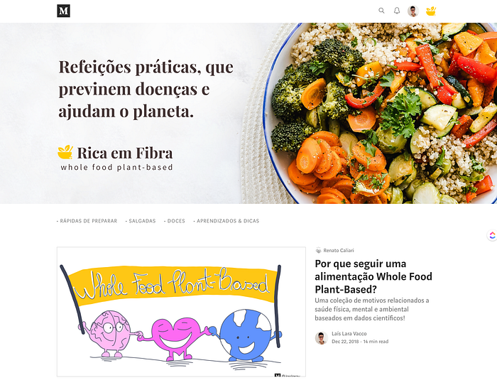
My blog is here on Medium and I share recipes and articles about Whole Food Plant-Based Diet (WFPB).
I created this blog before I started studying UX/UI design (a year ago). In this ongoing process, I thought I could practice design while improving things on the blog. That’s when I decided to create a small design system.
I mean small because the pattern library and the style guide are only parts of the design system, as I realized later.
"A style guide is an artifact of design process. A design system is a living, funded product with a roadmap & backlog, serving an ecosystem." Nathan Curtis [1]
🎯 My goals
- Learn to create components using Figma
- Learn about the design system
- Organize and create patterns for my blog
👣 My process
- Free course on Design System in Figma
- Reading about the design system
- Understanding the current state of my blog
- Establishing design principles
- Building the color palette, typography, icons, and UI Elements
Understand the current state of my design
I took a screenshot of the current page of my blog on Medium.
The things I was trying to understand were the colors, text styles and patterns on the covers of each post.

Establishing Design Principles
I thought it could be important to define design principles to guide my design choices (this would be part of a style guide in a Design System).
Simple
Awareness about what is necessary. Provide just enough information to make things understandable.
Meaningful
Thoughtful consideration to people, animal, and the environment when creating content. Purpose and utility are more important than trends.
Flexible
Openness to learning different ways to do things and evolve over time.
Building the color palette and UI Elements
I checked the current state of the colors on the design, and it showed 20 colors variables.

Besides the extense variety of colors, the previous primary colors didn’t provide enough contrast, failing to pass either the AA or AAA Web Content Accessibility Guidelines (WCAG) recommendation.

As a WFPB diet is mainly natural foods and whole grains I started searching for new colors that would match this idea. I decided to go with a warm yellow and a brown tone, which reminds me of this natural context of the diet.
This combination has also sufficient contrast as regulated by the WCGA.
Naming convention
I found that there are different approaches to naming colors in a design system (e.g. abstract name, actual names, numbers). I choose the semantic approach (described by the meaning). It thought it could be easy to remember and if I need to change at some point, I'll keep its meaning.
I set the colors as main colors, accent colors, a scale of neutral colors and feedback colors [3].
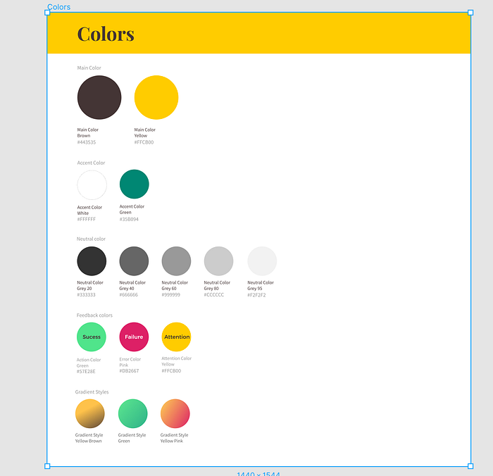
To find them easily on Figma I organized into groups by name then slash and the naming convention.


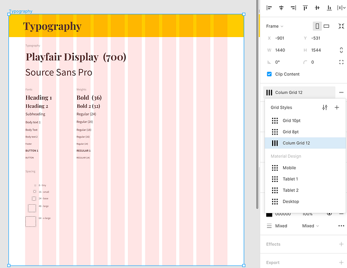
Typography
There were 3 types of fonts around the blog, plus the font of Medium.
I decided to search for new fonts considering:
• Brand adjectives
• Readability
• Flexibility (different weights)
• Latin characters
• Free for commercial use
The brand adjectives I came with:
• Stylized
• Functional
• Natural
• Sustainable
• Impactful
• Earthy
• Eccentric
For the headings and the brand, I choose Playfair.
For body text and subheadings I wanted a sans serif to pair with Playfair, so I choose Source Sans Pro. Different from the Playfair, this font is a highly-readable body text.
I choose a 4-based scale for sizing the fonts and defined spacing sizes.

I created and saved each grid and column as styles.
I grouped a column for Mobile, Tablets, and Desktop following the Material Design, thinking I could use it in upcoming projects.
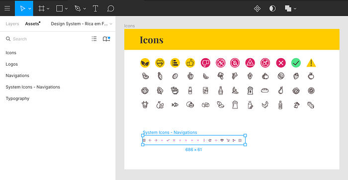
Icons
All the icons I've used across the blog I collected and redefined their size frames. Then I made each icon a component.
I organized by "text icon" useful for content and "navigation icons" that I can use in a platform.
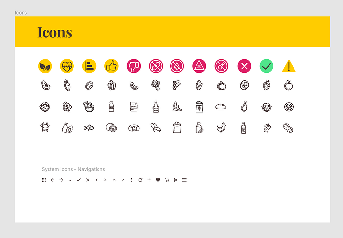
The "system icons" are a frame inside the frame called “Icons”, this way they are separate lists in the Assets panel.
Navigation
As my blog was on Medium I didn't have navigation elements to add. But during this process, I decided to design a landing page to import its elements into this small design system.
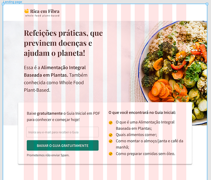
For now, I have buttons and the top navigation bar in this section.
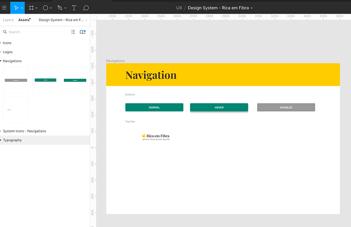
The buttons have the text as nesting components which means if I make a change to the main text it will be applied to these buttons as well.
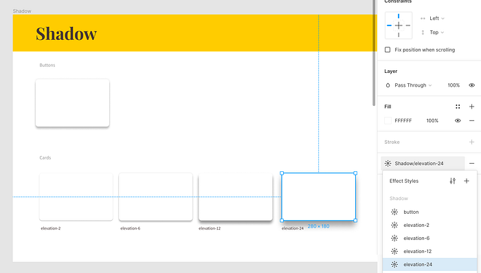
Shadow
There's one type of shadow for the button and four different shadows for the cards. I saved them as styles so I can reuse it on other objects.
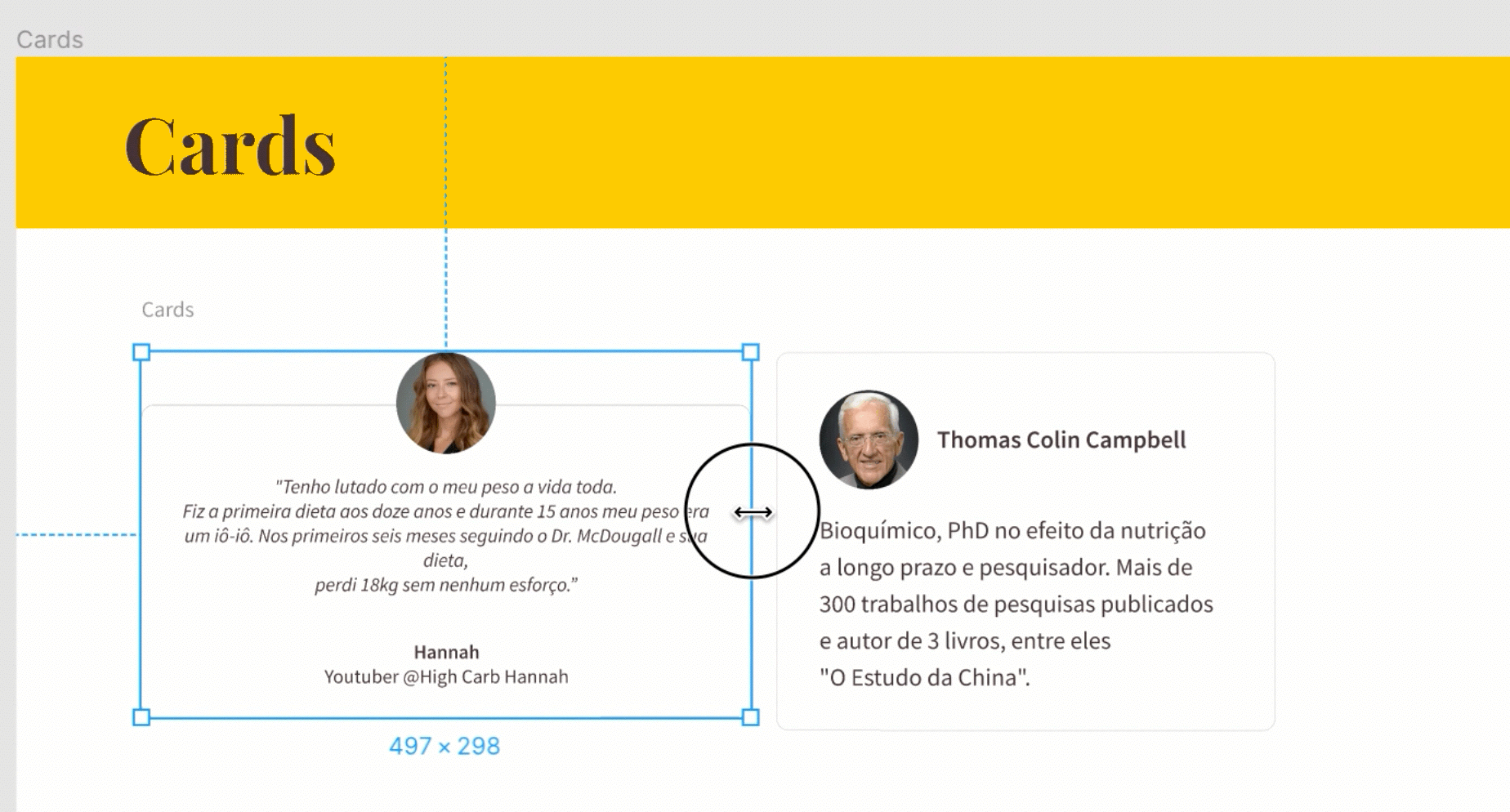
Cards
The cards and buttons are elements grouped together and saved as components. To make them useful in different sizes I applied the constraints.
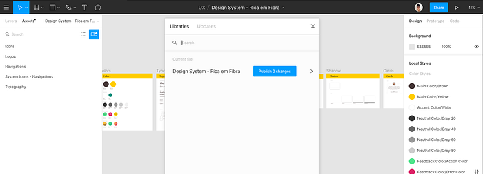
Publishing the library
In this free tier of Figma, I can publish the styles (color, typography, effects) and use in other files. But components (icons, buttons, cards, etc.) can only be shared in a paid plan.
To be able to use all these components in the landing page I created pages inside this Figma file.
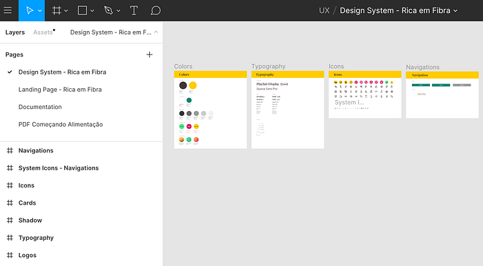
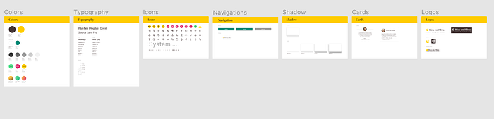
Here is the final look of this small design system.
I updated the cover of the blog and the next steps would be to redesign all covers as well.
Take away
By doing this project, I set some constraints and principles that can help me to save time and increase the consistency of the blog in upcoming projects.
I could learn a bit more about components, nest components using Figma, and about design system while improving my blog.
It was challenging when I saw the vast array of options that involve a project like a design system. There are many tiny decisions to make and I focused on what was good for this moment and I'll improve it over time.
Thanks for reading! 👏

