Creating contrast-based themes with Leonardo
A feature enhancement to Leonardo, Adobe’s open-source tool for creating beautiful, accessible, and adaptive color systems using contrast-ratio based generated colors.

Recently we launched Adobe’s open-source tool Leonardo with the goal of empowering designers and engineers to create accessible-first color palettes. Since then, we’ve been continuing to evolve Leonardo — the engine that drives the adaptive color theme for Adobe’s design system, Spectrum.
This latest update is for authoring adaptive themes in both the npm module and the web tool. This means building out multiple contrast-based color palettes at once, and each output color being based on its contrast with a shared background.
Creating an adaptive theme
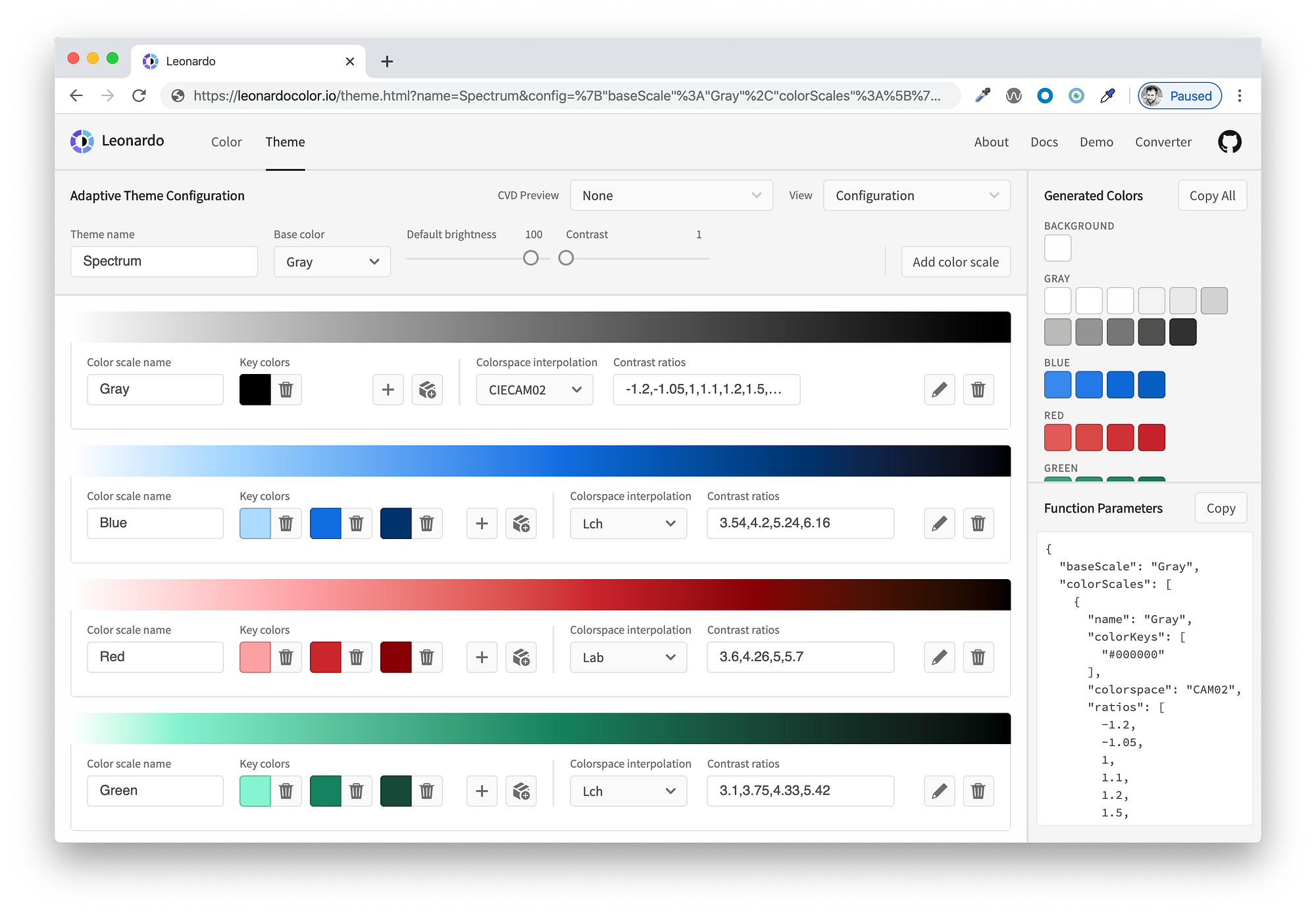
Start by visiting Leonardocolor.io/theme.html. You can give your theme a name, then add a color scale to your theme. By default, the first color that is added is named “Gray”, and is automatically selected for the base color (used for generating the background color).

Each color scale that you add will populate the screen with a card for configuring your color. Each of these configurations are the same as what you find in the “Color” tab of Leonardo. The configurations of key colors, colorspace interpolation, contrast ratios, and the bulk import feature are already documented here if you are unfamiliar with how those work. It is worth noting that the contrast ratios in this view are a list of ratios in a single input, rather than multiple inputs per ratio.
If you’re looking for a jumping-off point without building a theme from scratch, here are a few adaptive themes based on existing UI libraries:
- Bootstrapper (based on Bootstrap )
- Semantically (based on Semantic UI)
Some modifications have been made such as including accessible contrast ratio swatches for colors that did not already meet WCAG AA requirements. None of these adaptive themes are official or endorsed by the libraries they are based upon.
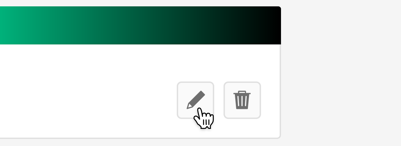
Helpful tip: It’s recommended to use the “Color” tab for creating each of your color scales, since this view provides a more detail for a single color scale, including charts and 3d model for interpolation evaluation as well as both text and UI examples of the color for contextual preview of your generated colors. Click the edit button to open your color scale in a new tab.
Brightness and contrast
A few important additions to this UI are the configuration sliders for default brightness and contrast. There are a few different ways that these sliders can be used:
- Setting brightness values for specific themes:
eg. “Light” theme with brightness of 100, “Dark” theme with brightness of 20. - Setting contrast values for specific themes:
eg. “High contrast” theme with contrast value of 3. - Using brightness and contrast for defaults only and allowing users to edit these values within your product:
eg. Leaving brightness and contrast undefined will return your theme as a function such asmyTheme(brightness, contrast);
The beauty of using Leonardo in your web product is the ability to enable your end users to control the brightness and contrast of their experience. It’s important to note that impairments to vision are complex, and some of which are either purely environmental, or are exacerbated by environmental factors, leaving users with a need for personalization.
In fact, the working update to WCAG’s contrast standards (Project Silver) mention personalization many times. At this point, the brightness and contrast sliders in Leonardo are a way to preview and audit your adaptive color system, as well as act as a tool to help you to define maximum contrast value and appropriate value ranges for your light and dark themes.
How to do this:
Let your engineers know your intent here, because this is an implementation-dependent topic. For engineers, you will define the theme as a variable without any brightness or contrast value passed through the configurations. This will return your theme as a function, which can be integrated with controls for your end users to regenerate the colors in real-time.
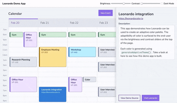
Helpful tip: Take a look at Leonardo’s demo app to see an adaptive color theme in action. In order to see how this is accomplished, you can take a look at the source code as well.
Theme outputs
For each color scale in your theme, the right panel will display your generated colors. You can copy individual colors by clicking the swatch, or you can copy all of the colors’ hex codes as a list by clicking the “Copy all” button.
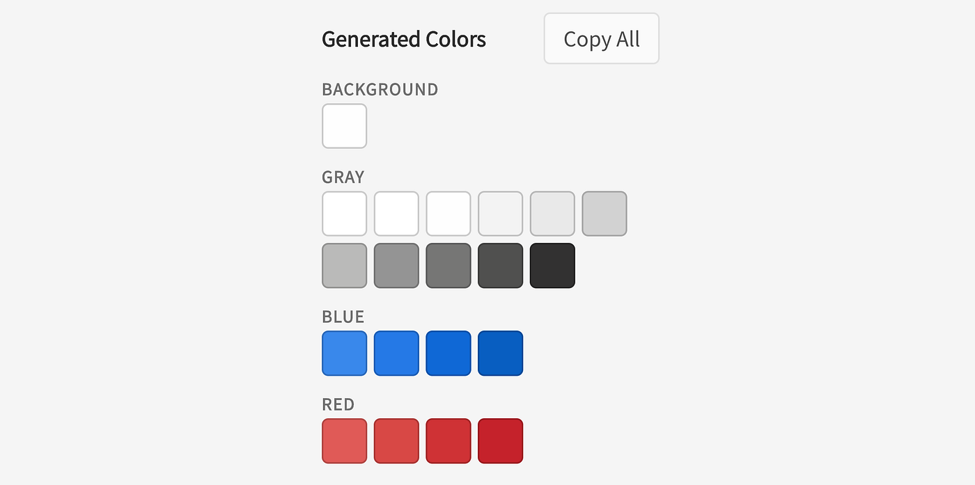
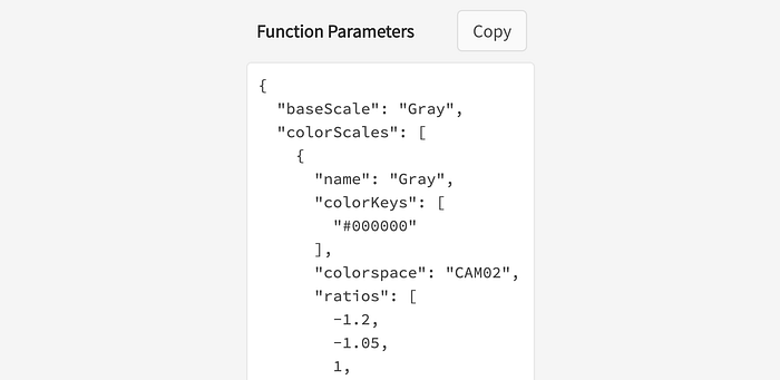
The right panel also outputs all of the unique configurations that you’ve created as parameters to pass through the Leonardo npm module. Each of these parameters are documented in Leonardo’s contrast-colors package readme. Engineers can click to copy these parameters and pass them directly through the generateAdaptiveTheme function to output the same colors seen in the web tool.
Just as with the previous version of the web tool, the URL is updated with the parameters of your theme configuration so that you can share your theme with your team members. This is helpful for both collaboration and for easier sharing of javascript parameters with your engineers.
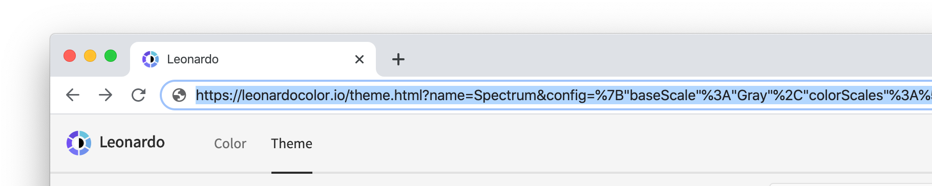
Don’t worry, though; URLs that you’re sharing for the previous version of Leonardo’s web app will continue to work as expected.
Additional helpful features
We’ve included a few extra features to help with the creation and auditing of an entire adaptive color palette in Leonardo.
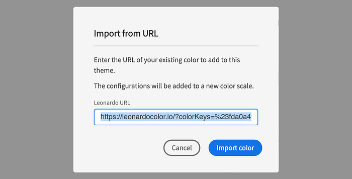
Import from URL
If you’ve already begun using Leonardo for the creation of your adaptive color palettes, this feature is a short-cut for keeping your existing work.
Views
The default view for theme authoring is the configuration view. This displays the gradient of your color scale and all inputs for configuring each color scale. This is great for inputting values, but not so great for comparing color scales.
The color scales view hides your configurations and allows you to see each color scale gradient side-by-side. This is helpful in evaluating your color scales overall, such as seeing when one color may becomes more saturated than others as it gets lighter or darker.

The swatches view provides a larger view of your generated colors and places them on top of the background color for additional context. This view is particularly helpful with the next feature, color-vision-deficiency (CVD) previews.
CVD Previews
If you’re unfamiliar with this term, CVD stands for “color-vision-deficiency” — this is the appropriate and more accurate term for “color blindness”.
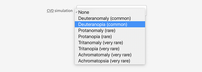
This set of options allows you to simulate what your theme looks like in a variety of color vision deficiencies. These include both types of red/green (protan & deutan), yellow/blue (tritan), and full color vision deficiencies (achromatic). I have a brief introduction to these in the article Colorimetry and the Cartography of Color, however for a deeper dive, see Color-Blindness.com.
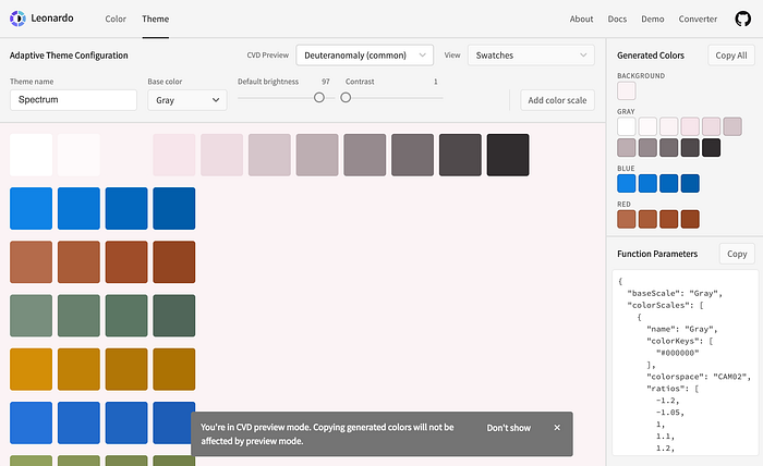
CVD simulations will not affect the color values when you copy output colors. This is to help ensure you don’t accidentally copy a simulated color value rather than the actual color output. These simulations are helpful in qualitatively evaluating the identifiability of each individual color of your theme for a wide range of color vision deficiencies.
This update helps you author and implement an adaptive color theme for your product, making personalization of color a reality for your end users.
We would love any feedback, and contributions to Leonardo to help us improve the tool for everyone. Pull requests are welcome!
To log any issues, bugs, improvement requests, and PRs, please visit the repository at: https://github.com/adobe/leonardo
Thank you 🎉


