Fixing a baby store’s unfriendly online experience — a UX case study

With four locations in Metro Vancouver, Canada, Crocodile Baby is a store specialized in healthy, organic and long-lasting baby products such as strollers, cat seats, furniture, essentials and more.
A baby store with an unfriendly online experience.
Crocodile Baby’s website needed an overhaul to better assist all types of visitors. It looked uninteresting, outdated, hard to use and it didn’t accurately reflect the voice of the company. On top of that, the staff always had a hard time updating the content, products and product variations.

The Challenge
Save staff’s time by improving the website structure and syncing it with the POS system. Improve the brand connection with the audience by simplifying and redesigning the website.
Currently, the store was using Magento CMS that didn’t fit their necessities. The staff was tired of it and wanted a new CMS. Hence, after some discussion, we set up to provide a better solution for their needs by switching the system to WooCommerce and syncing it with a new POS system.
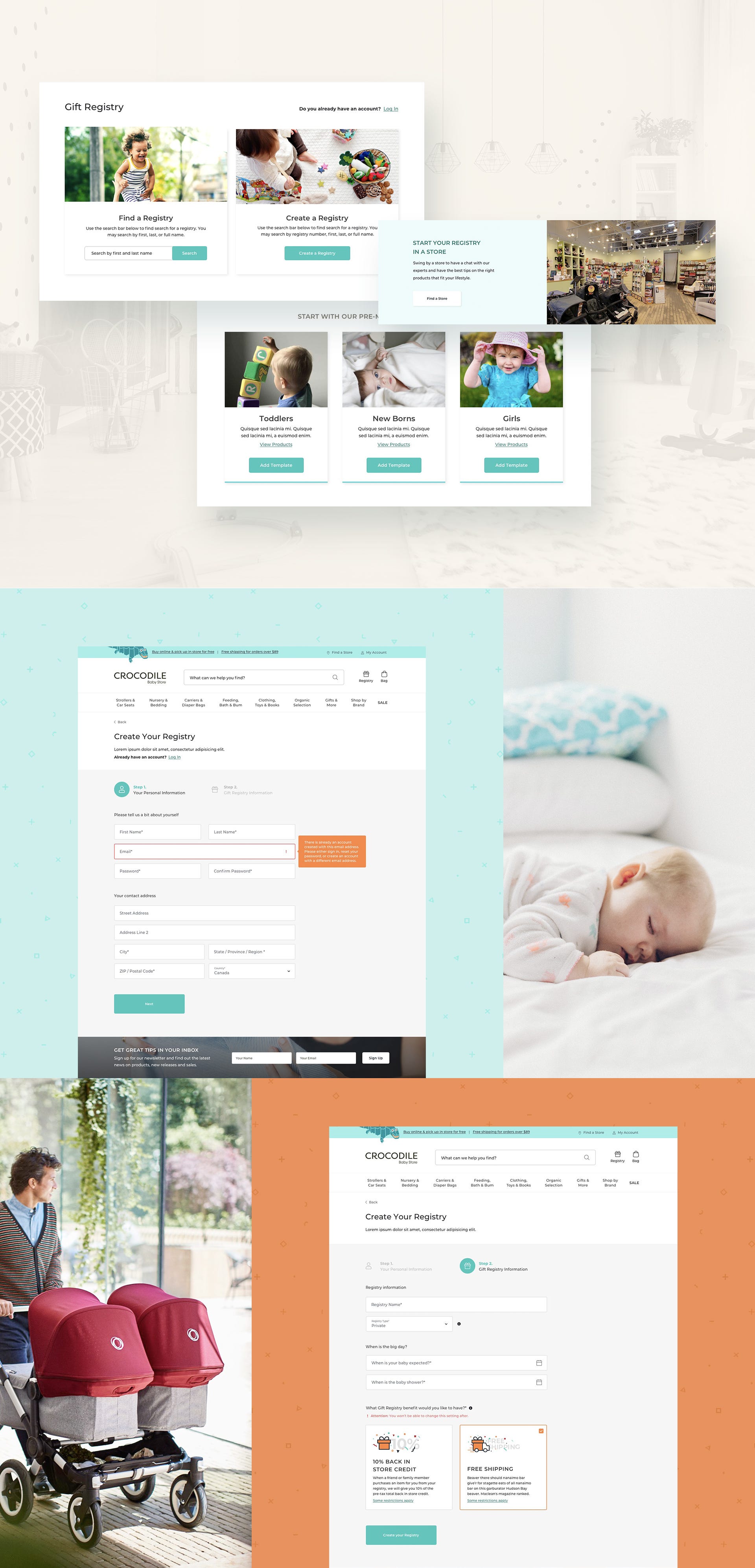
For end-users, the website had poor usability and some of its pages weren’t working as expected. The checkout process was overwhelming. Return and Exchange information wasn’t easily accessible, bringing the store’s rate down. The Gift Registry was also quite difficult to use.

My Role.
I was the sole UX/UI designer on this project. This included research, information architecture, communication, presentations, iterations, visual design, content suggestions, writing and more.
I’ve collaborated amongst a team composed of two more people: a Project Manager and a Programmer.
UX Goals
We needed a frictionless way to upload, view and buy products online.
At the outset of the project, we had the basic goals to revamp the design, switch CMS and integrate it with a new POS system. As we dug deeper into research, we realized that we also needed to improve the usability of various areas such as checkout, product pages, gift registry and the menu navigation.

Discovery
More than half of the users would leave the check out page without placing an order.
The checkout page was one long form that lacked the proper hierarchy. Google Analytics revealed that the number of people leaving the page without finishing the order was astonishing. That was even worse on mobile devices, which accounted for 58% of the website’s visits.

We had an idea about why this was happening and we also used Hotjar to record users to see from their perspective. The recordings were useful to convince the client that the checkout had several design issues.
People were confused by the return and exchange policy.
Crocodile Baby had various rules about specific products that we couldn’t change (e.g. unreturnable products and specific rules for some products’ shipping). We had to find a way to let the audience know when a specific rule applied to a product.
This lack of information led to friction and mistrust among consumers.

The Definition
Assist two types of users.
Novice parents need to think of Crocodile Baby as trustworthy support. They usually are overwhelmed by the amount of knowledge and support they will quickly need as first-time parents. Tools like product lists based on style or necessities, educative blog, good product filtering, and personal in-store assistance are important to make them feel cared for.
Experienced parents just want to quickly find what they are looking for. They know the products and are more interested in the search, filtering and how easy it is to purchase.
Unfortunately, the client wasn’t comfortable with user interviews, so we relied on web reviews, stakeholder interviews and social media to dive deeper into some users’ thoughts and desires.


The search was a must and the navigation needed a lift.
Perhaps the best feature of the past website was the search. It was advanced enough to suggest products while you were typing and it would search by brand, type, name and SKU, which was essential for the staff.
However, the navigation wasn’t so smooth. Apart from having unforgiving three-level dropdown menus, some products weren’t organized as expected.

Wireframes.
Wireframes enabled us to have enlightening conversations with Crocodile’s digital team. How elements such as banners, content and product data would work with their staff were discussed in our wireframe meetings. It took three rounds of iterations with minor tweaks to reach a common ground.

The Visual Design
We defined most of our visual references at the kickoff meeting.
Crocodile Baby had a clear idea of what they should look like and we all agreed on the main references from the get-go. Our task now was to decide how to adapt visual concepts such as simple, bright, calm, minimalistic and caring into the final designs.

Does it ship for free? Can I return it? Know before you buy.
A major flaw in the past design was that it didn’t make the product rules clear. Since Crocodile treated different products with different shipping and return rules, we had to let the audience know the restrictions before and during the purchase, so there are no surprises at the end.
Check out process required a lot of cognitive load. Not anymore.
The checkout page was a single page with two-column forms. It demanded a lot of thinking and figuring it out for the users, especially the ones accessing with a small monitor. The client wanted to keep it that way, as they liked to see all the forms in one page but, after our research, they changed their mind and agreed on a multi-step flow.


The Product Data
We were supposed to integrate the website with a POS system. This changed mid-project causing some issues.
At the start, Crocodile was going to set up a new POS and we would then sync it with the new system, and everything would be OK. However, they changed their mind mid-project. So we had to adapt.
Product data wasn’t correct in Magento, so we couldn’t do an automated import to WooCommerce, therefore products would have to be input by hand. This was the biggest catalyst for the project delay.
What We Have Learnt
1. Be ready for change and don’t be precious about an idea.
Due to several unforeseen issues, including the POS and product data switch, the project had to be delayed for 2 months. We couldn’t launch the finished website in the end, because Crocodile was sold to another baby store.
2. Prioritize experience over features.
Project restraints made us focus only on improving usability and flows to make the website easier to use.
We debated amongst ourselves for the best ideas. We had a lot of recommendations for new features based on end-user requirements that we couldn’t do it in order to focus on the basics.
3. Have a basic content strategy and tools to help the content creators.
We needed to be ready for non-optimal content entry. We relied too much on the client to provide copy and, in the end, it didn’t match the new navigation. That’s why apps such as Gather Content are popular — it gives a clear structure for content creators to follow.
Gift registries could have been better if we had a dedicated content expert in the client’s team. Even though we had a content strategy in place, it was up to the client to adhere to it or not.
4. Collaboration is key.
The product data had to be fixed by ourselves, which caused strain in the team as we haven’t planned for this. In the end, after some collaborative effort, all was ready to go and working as intended.
5. Visual design is just the tip of the iceberg.
I’ve designed e-commerces before, but this was the first time I was deeply involved within the development team and was aware of most technical problems. I wore many hats, as I created UX copy, was part of technical decisions and input and reviewed batches of new products attending to our new structure. I confirmed the substantial importance the proper definition of User Flows have in e-commerce — there are so many variables! — and what looks simple on the surface (e.g. a login page or shopping cart) can be hard to get it right if you don’t plan beforehand.
Even though the website wasn’t launched. It was a truly collaborative effort to get all ready and we learned a lot about how to navigate e-commerce systems.
UX/UI Design: Marcos Duda.
Web Development: Alonso Ysa.
Project Management: Rory Mullin.Developed at CodeHammerhead.


