Crossy Road’s effective engagement methods — a UX analysis

Crossy Road has been downloaded by more than 200 million people, so let’s take a look at how they create a compelling experience that keeps their users pleased and playing.
This article should be used for learning, not as an attack on the designers.

How they get you engaged
Often the first 30 seconds of a user’s interaction with your product is the most important. Players use the first impression to creates a mental model of how they think the rest of the experience will be. With games and most other products, this is the window that you lose most users. Here are a few of the ways Crossy Road combats this.
They get you playing instantly. There’s no menu to navigate through and no settings to configure; you simply open the game and start playing. This is a win-win, the user finds out very quickly if the game is for them, and the app company has a better chance of hooking more users.
Crossy Road’s designers did an exceptional job of creating a frictionless tutorial. It’s simple, there is no text to read through, you learn by doing. An animated hand shows you a few simple controls and then you’re off. It doesn’t feel like a tutorial, and that’s what makes it so great.

Crossy Road understands that you generally trust your friend’s opinions over an ad or other forms of marketing. That’s why they make it easy and fun to share your experience. You usually die in a funny way, and they capitalize on this by letting you share a polaroid of your death. In a GDC talk, the developers described how this small feature drastically increased the sharability of the game. I would highly recommend watching the full talk, but skip to 30:31 for the discussion on the polaroid idea.
Another feature done well by Crossy Road that should become a standard in mobile games is the smooth transition of gameplay from portrait to landscape mode. This not only allows the user to decide which method is most comfortable for them to play in, but also provides a better marketing experience by fitting the game to whichever platform it’s being promoted on. Landscape fits YouTube best, while portrait is suited for Snapchat and Instagram.


How they keep you engaged
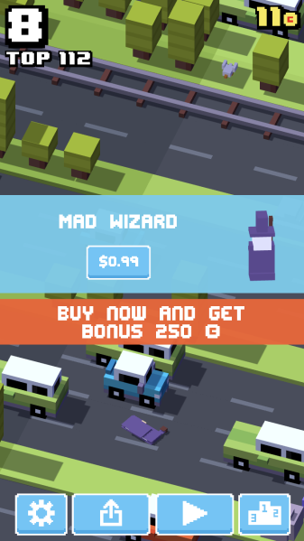
They created a smart method for driving engagement with their users through an always changing alert/messaging system. After each game you’re presented with alerts based on what is beneficial for both the company and the user, for example:
- Show a rate button after unlocking a new character
- Option to buy a new character only if you have enough money
- Watch an ad for coins if you’re close to having enough at the vending machine
One of the key reasons this system works so well is because users pay attention to things that change, that’s why animation is a useful tool if you want to draw a user’s attention towards a certain element. If you constantly show the messages and buttons in the same place, users start to tune them out.
There’s a reason return policies help drive purchases, people want to try a product risk-free before coughing up the cash. Crossy Road does just that by randomly providing users the option to try a new character for a round, and then allowing them to easily make the purchase afterward. To help increase conversion rates they throw in bonus coins if you make the purchase instantly which is a very effective FOMO, or Fear of Missing Out tactic.
The same technique is used after showing an advertisement. You are given the option to remove ads for a few dollars, but they also throw in a perk for doing the deal right then and there. Chris Goward describes in his article The LIFT Model how urgency helps drive sales and is one of many methods Crossy Road uses to subtly increase profits.

Crossy Road also uses techniques to get users to play more. There is no option to end a game via the pause button, you have to finish the game you started first. For me, this rides the line of ethical UX. There is no consequence for dying, so getting to the menu is fairly easy if you want to, but the developers know that most people will just end up playing the game through like normal. And the more you play the higher the chance of you getting hooked. This system may work for this game, but not for others where starting over holds more weight. They could make a few improvements to the pause system by simply providing a couple of standard options like toggling off music or haptics. The same restrictions can be found when you first open the app. The only way to access the settings and other options is by playing a game and dying first.
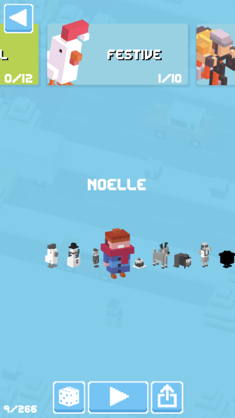
One area I feel is lacking in the experience is their character selection menu. This is a tough problem to solve, having so many options and trying to keeping the design open to scalability for future additions. A good way to start is by mapping out the different reasons a user would come to the menu. Here are a few examples:
- Try out a new character they just unlocked
- Browse through the different characters
- Switch back to their favorite character.
Once you understand the user, you can then create the menu around their needs. In Crossy Road’s case, I think they lack an important use case, there is no easy way to see all the characters you have unlocked. This may be intentional, to get you to browse through all the characters and hope that you stumble across one you’ll buy, but I’m hoping it was just a design oversight on their part.
Takeaways
- Think about ways to enhance your onboarding experience. A good strategy is mixing different teaching styles like visual, audio, and text. A simple approach to showing that you care for your customers is helping them customize their experience even before they start using your product. Asking them questions like if they’re color blind or what language they prefer is an easy way to making your users feel important.
- Break up the mundane. Users block out information that is always presented in the same fashion. Change text colors, animations, the timing of information, but just make sure you don’t change the method of obtaining that information. You don’t want to accidentally frustrate the user by putting options in different menus.
- It’s ok to use strategies for gaining new users or generating more revenue, but make sure you’re doing it ethically. Don’t trick users into watching an ad or making a purchase, but instead create enticing reasons for why they should choose those options.
Hope you enjoyed the read. Let me know if you agree with the points I’ve made, or more importantly if you disagree. Recommend any games or sites you’d like me to do a design analysis of in the comments!