Curating digital collections
Evaluating usability and overall user experience in online digital collections.
This post is part of an assignment in the UX Design curriculum of Lambda School. Examining the use of visual hierarchy in the landing pages of three different websites, I evaluate their usability, visual impact, and overall effect.
In the last few decades, advancements in digitization processes have enabled global access to thousands of items of historical, cultural, and intrinsic value that are held in archives, libraries, and museums across the world. Most of these institutions are engaged in ongoing efforts to share these digital collections as widely as possible, creating online exhibitions and archives that allow users from all over the world to explore, study, and admire these previously inaccessible items.
Like digital museums, these institutions face a difficult task: to provide a digital space that is inviting, simple to navigate, and gives an adequate indication of the breadth of items available. Of primary concern to these institutions is the landing page for their collections. How well do they succeed at the given task? Are the landing pages intended to be an online surrogate for the museum or library experience? Are they geared toward interested but casual users, or are they designed specifically for the serious researcher?
In this post, I examine the landing-pages for three institutions. Each has a long and venerable history as a respected archive and repository of priceless, one-of-a-kind items: the Bibliothèque Nationale Francais, the Uppsala University Library, and the Beinecke Library of Rare Books and Manuscripts. An evaluation of the use of visual hierarchy, layout, and other design considerations will be addressed.
Gallica
digital collections of the Bibliothèque Nationale Francais
Gallica houses the digital collection for the French National Library. As the repository for thousands of items of historical importance, the site is tasked with presenting an interface that communicates the immensity of the collection and highlights its variety.
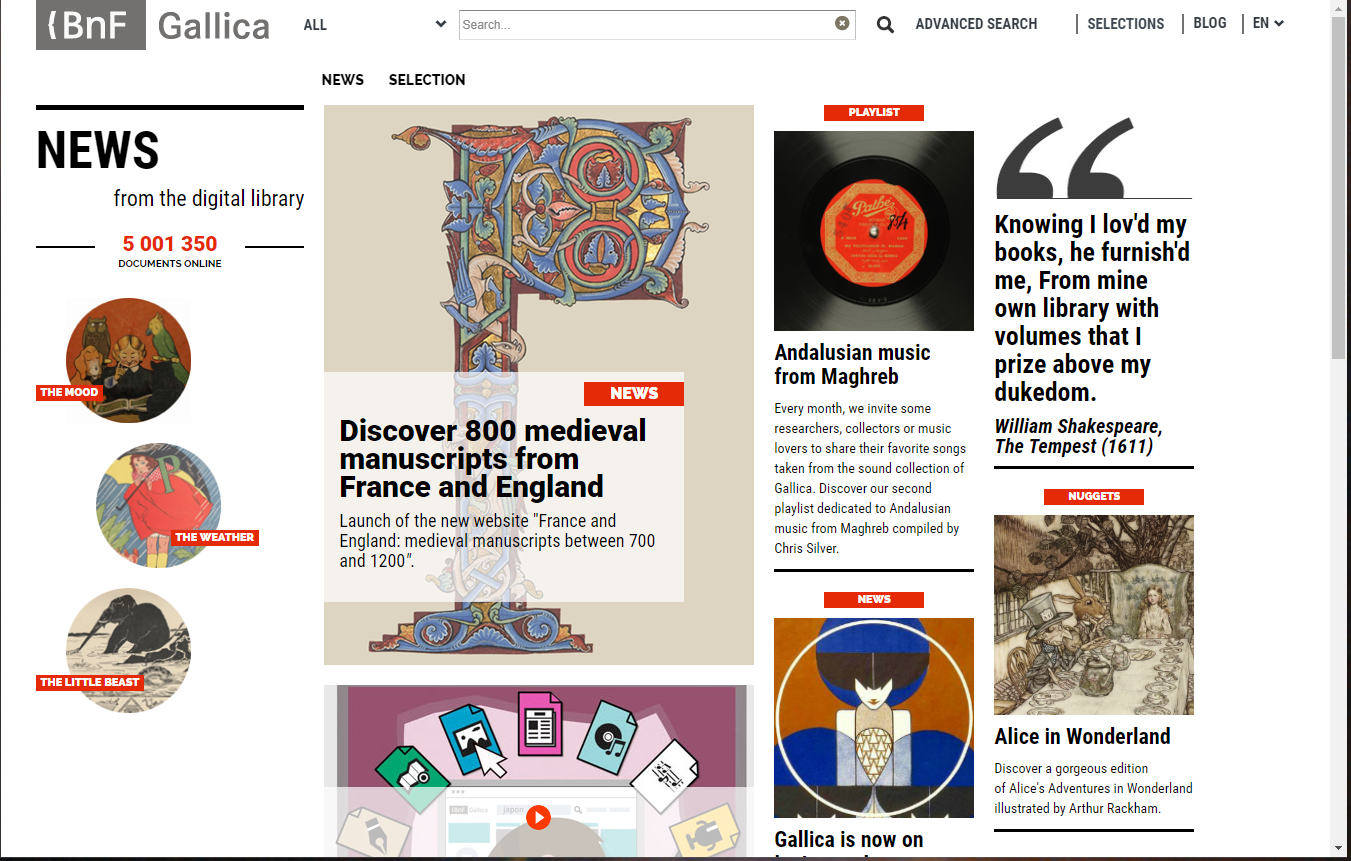
The site’s nav-bar follows convention, spreading across the top of the site. Diminutive and simple, the nav-bar is easy to navigate through links and a centrally-placed search bar. Its classic placement makes the navigation easy to find and use, but it fades into the background compared with the eye-catching collage.
On the right side of the page, a news section is distinguished through the use of white space, circular images of equal size, and high-contrast text with clearly defined links.
The central focus of the page is a collage, highlighting certain digital collections with eye-catching images across the right two-thirds of the screen. The terraced, off-kilter layout utilizes implied movement, leading the eye up to the largest central image, the illuminated letter.
The site is extremely busy, perhaps overwhelming, but the eye is drawn according to some basic principles. Across the top and left sides of the page, navigation is made simple through clear, well-organized links and images, while the busy, colorful collage fills the rest of the page. Each item’s borders are defined through the close proximity of a link, image, title, and text confined within plainly delineated sections made even clearer through the use of dividing lines.
Some attention is made to the area hidden below the screen, known as “below-the-fold”, but the execution is not entirely satisfactory. There, a new section is introduced, but it is simply another collage of curated collections without additional clarification.
At the bottom of the page is an extensive navigation section that is fairly clear and easy to use, but some items in that section might have been better used as features, rather than afterthoughts. For instance, one of the navigation items in the footer is a link to “Front page from one hundred years ago”. This item could have been better utilized as an eye-catching banner image above the confusing collage as a space to rest the eye before diving into the content. While the site is attractive and relatively easy to navigate, the collage is overwhelming to the eye and potentially confusing.
Uppsala
University of Uppsala Library digital collections landing page
Uppsala University Library’s digital collection handles the same task as Gallica in a simple but very effective way. The nav-bar is large and well-spaced with clearly defined links, ample white-space, and a search bar in the upper-right corner.

Like Gallica, this site also places a menu down the left side of the page. This menu uses more text, but the additional text offers semantic clarity while the generous white-space between each menu item makes a text-heavy list easy to use and restful to the eye.

A single banner image dominates the right two-thirds of the page, with a brief description of that single item in the upper left and a very clear UVP section in the lower right. The UVP is clarified through the use of contrast: a black text-box stands out against the light image, with the ‘Digital Collections’ title in large, high-contrast white.
This site also handles the fold beautifully. In contrast with Gallica, Uppsala uses a single simple banner image but expands to reveal a huge range of options below the fold. In both of these sites, one of the primary challenges is to illustrate the breadth of a huge collection, making that material inviting to the user and easy to navigate. Uppsala University’s digital collections accomplish that task with elegance and clarity. Below the fold, a large number of special collections are highlighted with attractive images and clear links. Additionally, similar collections are grouped together through the use of proximity and dividing lines.
Beinecke
Yale University Beinecke Rare Book and Manuscript Library

Yale University’s Beinecke library’s interface is the simplest of those discussed here and its purpose is clearly defined by the layout, the lack of eye-catching images, and multiple search-bars. This is a site for researchers and has not been designed with the casual public in mind.
If we must believe the visual cues, the nav-bar would be the most important element on the page. Its location is similar (across the top of the site) but appears much larger by comparison with the rest of the information on the page and is the only element on the page to employ decorative treatment in the distinctive angular shape and dropped shadow of the tabs. Beinecke’s page lacks a banner image and any central distinguishing element. A red title, some brief explanatory copy, and a search-bar constitute the body of the site. On this page, no attention is paid to the fold. A list of selected items from the collection follows below the search-bar, continuing beneath the fold down to the end of the page.
Conclusions…
Gallica, Uppsala, and Beineke each face a similar task: present the landing page to their digital collections in a site that is attractive and easy to navigate. Ideally, the landing page would allow users to either browse curated collections in a digital space (similar to the way people might enjoy a museum in the physical world) or allow researchers to search for and study a particular collection item through robust search capabilities.
Gallica’s site employs a modern, funky aesthetic to create an attractive and exciting landing page. It contains perhaps more information than is comfortable for the eye, but its purpose is clear: to entice visitors to explore a wide variety of collections through carefully curated content. Beinecke, on the other hand, is clearly designed with the academic researcher in mind. Little care is paid to the aesthetic presentation of the collection, but the landing page has no less than three search-bars, an obvious sign that they expect users to come to the site in order to examine a particular item. Uppsala presents a nice blend of the two. The search capability is readily apparent, but the casual visitor will also find a large number of curated collections to explore in a site that is inviting, navigable, and enticing.