Custom colour themes for your product
Things to note before providing multiple colour themes for your product’s UI

If you’re a designer coming up with a product from scratch you would’ve definitely come across at least one of these,
- Let’s go with white colour. It will look Clean, modern and give more white space(?!). 🙄
- I’m definitely going to do a dark theme for this! 🌚
- Umm. Both the white and blue looks good. Let the users decide! 🤕
- Night mode or dark theme? 😶
- and much more…
Providing custom colour themes or coming up with a single good looking colour theme for your product is not an easy task for a designer. There are numerous important things to consider before you decide to give those three to four extra colour themes for your product. This article gives an idea about some of those stuffs you need to keep in mind when coming up with multiple colour theme for your next app.
Brand Identity
Your product should define your brand. You cannot choose a theme that is completely contrary to what your brand feels and convey. Facebook is one best example where they stick to their brand value across all platforms. The solid blue, when you think about facebook forms the brand identity because all the 2.5billion users see the same colour all over the world.

(Scalability is another factor — which is discussed below). Imagine if users are allowed to choose their favourite colour for facebook (like how Orkut used to be). 😱❌
B2B and B2C
The next important thing is to know the nature of your product. If your product is B2B ( Business to Business), the end user is going to see what the other business you offer the product to wants the users to see. i.e the business who is going to use your product for their users, will be needing to customise the UI according to their brand identity. In such cases, providing options to customise the user interface becomes an added advantage. One good example of B2B is Intercom, (which let’s you use your website’s colour theme for their product💚).
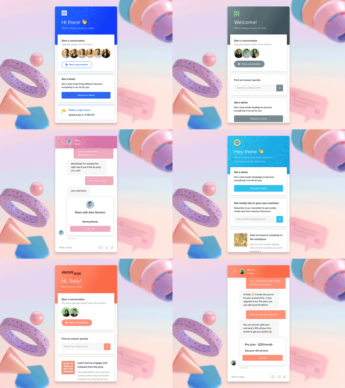
B2C (Business to Consumer) is where you get to decide what the end users want to see. Slack handles theming for users very well. It has a few prebuilt themes which looks pretty neat and also let’s the user to build a custom theme from it. So both people who use for business can build a custom theme that adheres to their branding and the individuals can build whatever they like.

The interesting concept in slack is, you can share the theme you built with the channel and others can apply it on a single click 😍.

One more great example of B2B and B2C is Twitter (see the dark mode section to know more!)
Understanding Your User Group
Understanding the core user group of your product is very important since that helps in crafting the experience for the end user. Majority of the messaging and chat apps which target teenagers give some funky colour themes to attract user groups 🌈. Some examples are hike and telegram, where they give much varied multiple colour themes to choose from. If the user group is elderly people or your product is more business oriented, you must reconsider giving out funky or playful themes for your app.🧐

Scalability
Scaling your product for a large user base is going to be a necessity, with which comes the difficulty in providing multiple themes for such a varied user group😰. Facebook for example has over two billion users using the app and they cannot check multiple colour themes and fonts for such a huge number of users. (different languages, devices, etc) Hence, it is a difficult thing to implement when coming to give colour themes for product that is well established and has a very large user base. Google products such as Gmail, follows the same suit where it does not allow the users to change the entire theme of their product. Instead it gives you an option where you can change the background image (and nothing else 😎) and they match the texts and contrast depending on the theme/image you use. (There are however third party extensions that you can add to your browser to change the look and feel of Gmail😉)

The Dark/Night Mode
Providing night/dark mode mainly depends on the type of product you provide. If the users are going to see a lot of content throughout the day and night, you might need to consider having a dark/night mode to improve usability and for better reading of the content at low light 👀. This has been an increasing trends with popular apps that deal with content and data giving night mode for it’s users. One such hit was twitter’s night mode 👌🏻 (who uses the normal mode now, anyway! 🤷🏻)

Interestingly twitter also allows the users to customise how other people wants to see their page 🔥. Which is a great advantage to represent their branding. You can take this as another example of how to handle both the end user and the business’s needs on providing customisation to the app UI.

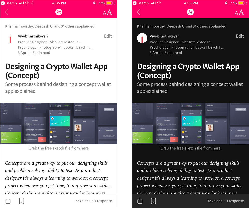
Medium, also supports a night mode 😉
The Conclusion & The Complexities
There are definitely much more things to note before deciding on providing themes for your app. More than that, as a designer there are definitely many pain points one must go through when coming up with such themes.
- Never design for multiple themes at the same time. Coming up with a MVP should be the goal, not coming up with something that has an option to change colours. ⭐️
- Never give too much to the users. Have control over the design.💪🏻
- Give the option to customise only when it is absolutely necessary, do not give themes for the sake of giving it.
- Keep studying on how users use your product and tweak the themes accordingly. If the users are not using a particular colour theme, go ahead and remove it or modify it.
- There is always going to be new features which will be added to your product at a later stage. Have that in mind when designing multiple themes, so that it can fit in in the future as well.
- Users are lazy. Unless you give them something to change, they won’t change it. (There are a very few exceptions though, who ask for it. )
- 10 colours, 5 fonts gives you 10x5=50 combinations 🤯. The higher the customisation, higher your design workload will be. Less is simple 😉
- Designing multiple themes always is a headache but it’s definitely better to have a very good interface with one theme than a modest one with plenty of themes. After all, if code is clear, it is most probably easier to implement any feature, especially theming, whenever you want.
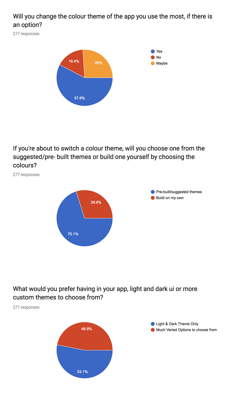
Here’s a small survey I carried out to find what the users want in their apps.
