Member-only story
Dark Mode UI Design: A Complete Guide
How to choose Dark Mode colors for your UI project in 2022
Published in
4 min readJan 7, 2020
Dark Mode isn’t a gimmick. It is quite functional.
Mainly, due to the following 2 reasons:
- Helps reduce battery drain significantly (mostly on OLED phones… “why so?” discussed below)
- Is relaxing (and hence more appealing) to the eye, especially when most of us have our eyes glued to the monitor 8 hours a day and no longer want to bear the white strain at night.
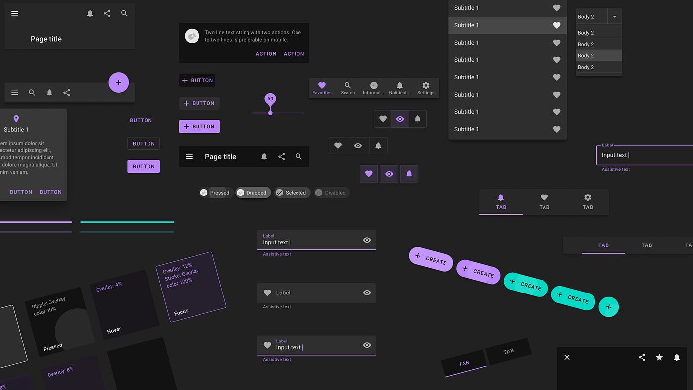
Choosing the right colors can convey information intuitively and invoke desired emotions. For referential purposes, we would be applying our colors to some base components from the Material Design component gallery.
Neutrals / Greys (Sets the mood and tone of the app)
Neutrals are the colors you will use the most and will make up the majority of your UI. Use them for most of your text, backgrounds, and borders, as well as for things like secondary buttons and links.
In practice, you want 8–10 shades to choose from. Not so many that you waste time deciding between shade #45 and shade #46, but enough to make sure you don’t have to compromise too much.

