Dark or Light UI? The UX Influence.

“Let’s go for a dark theme, our app will look cool and trendy” — I have come across that statement quite a few times. When I get asked for that requirement, my response contains even more questions. My curiosity rises as I try to figure out what’s the thinking behind it.
More often than not, it is revealed that the answer for that decision is based on personal preferences and assumptions rather than solid data. In my eyes, that does not have a valid standing to proceed with, unless some sort of research and statistics are revealed to back it up.
We should let data drive decision-making, not assumptions or personal preferences.
As a result, it triggered me to explore how do various companies in the digital industry treat this subject. In the process, I have discovered the following, which could be used for guidance when discussions about dark and light themes come up.
Readability
The sun, our planet, and other bodies emit electromagnetic energy that differs in wavelengths. A portion of that electromagnetic spectrum is the light visible to the human eye. Depending on the wavelength, the colour of that visible light can vary too — for example, a clear sky is blue because clean air scatters blue light wavelengths more than red ones.
According to Harvard Medical School publications, although blue wavelengths can boost our levels of attention, mood and reaction time during the day, it’s a different story at night. Devices, such as e-readers and phones, are rich in blue light emission which suppress the secretion of melatonin, the natural sleep-aid hormone. Long-term it could cause even more health issues. (source) (source)
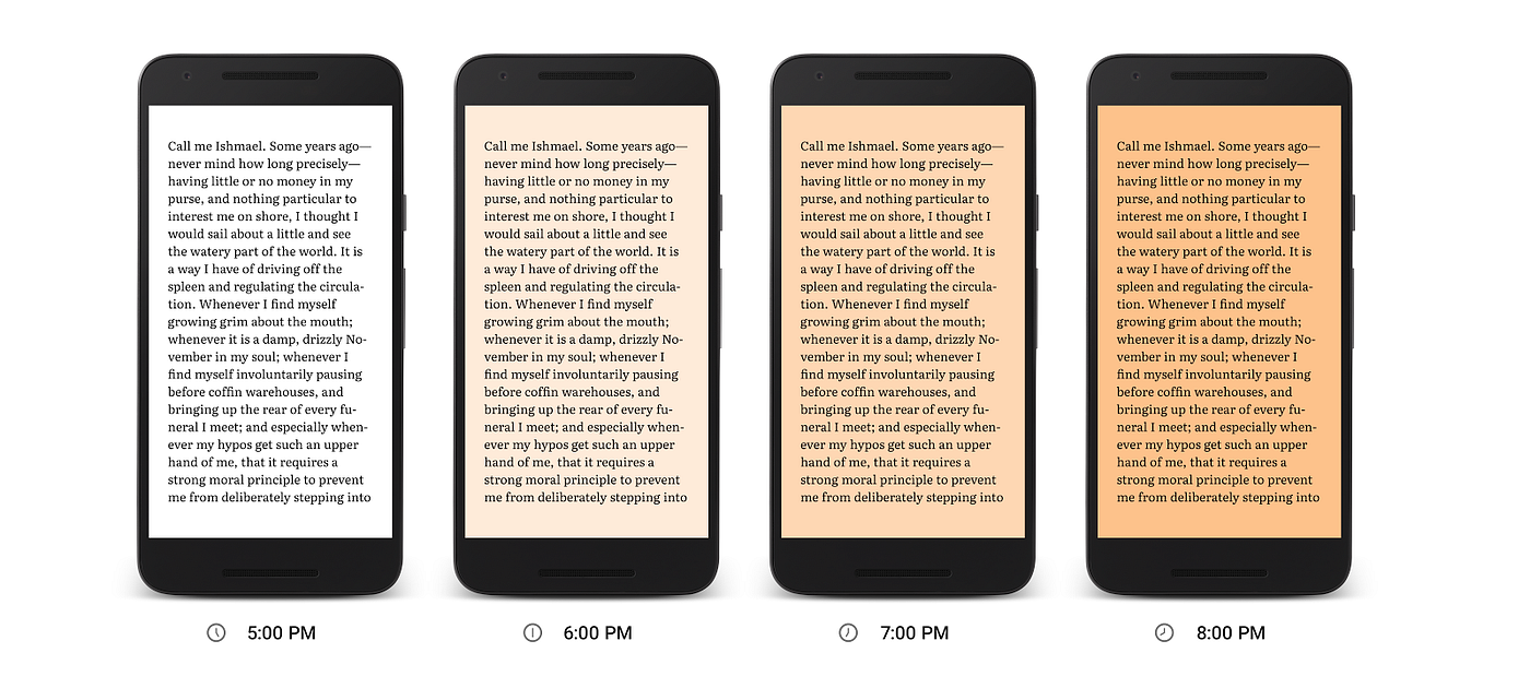
Based on those facts, it makes more sense why e-book services, such as Google Play Books, introduce features such as Night Light for reading. Based on the time of day and region, Night light gradually substitutes blue light with a warm amber to make night reading more comfortable on our eyes.
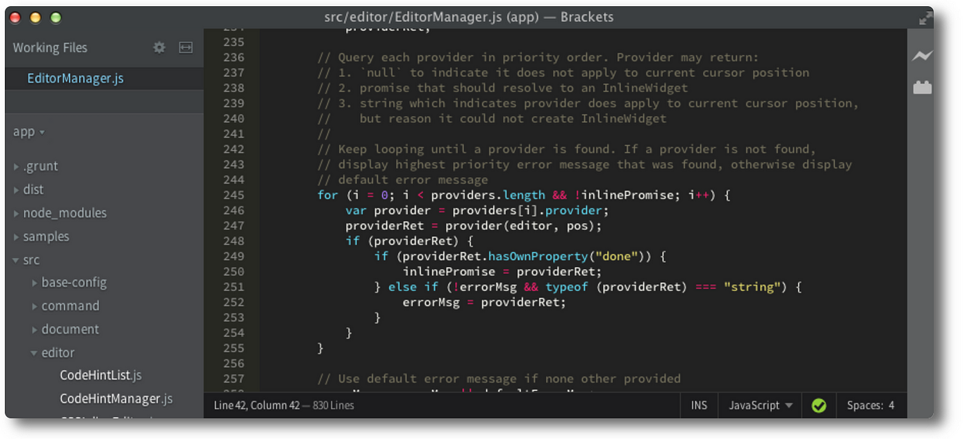
Another example that helps with readability and it’s gentler to the eyes are code editors. Dark text on light background is more widely used for better readability and focus during the day. However, the more time we spend concentrating on reading or writing in front of a screen, the more straining it becomes for our eyes. That’s why lots of programmers switch to light text on a dark background.
Contrast
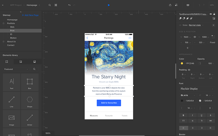
Most 3D computer graphics software such as Blender and product design and prototyping tools such as UXPin, come with a dark theme option. That’s not a thoughtless decision of design. Such tools can be quite complex and intimidating with the amount of functionality options available to the user.

The dark theme can let all of those options sit in the background and not appear as intimidating, while shifting the focus to the main content area — the mesh of a 3D object or the elements of a mobile app design. Be careful though, the theme chosen should not make it more difficult for users to find and use important features and functionality.
Contrast is another consideration when it comes to colour theme decision-making. For example, if a UI design comes in dark colour tones, the background could do with a lighter theme to avoid low-contrast issues and vice versa.
Match the user’s environment
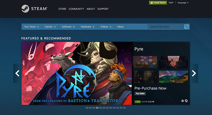
As we’ve already learnt, bright light at night or in a dark environment is not the best option for our eyes. Hence we have to take into consideration, the user’s environment when an app is used. The reason behind the dark theme on entertainment platforms, such as Steam, Spotify, YouTube and Netflix, is that users tend to engage in such activities later in the day, after work or in a room with dimmed lights.
The emphasis is shifted to the main content, in this case a game or a movie, and the background offers less distractions. Users can immerse themselves into the activity and enjoy vivid colours on a whole new level. It helps users avoid having to adjust their vision between a bright screen and a darker environment, leading to strained eyes. The latter, also applies to the “night mode” feature on Google maps; the app adjusts its glaring white display to a darker one. (source) (source)
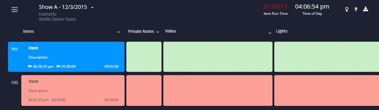
Dark and light themes are also used for the Shoflo team’s event production software. They backed their decision based on the user’s environment too. A light theme can be used during meetings in the office or other bright environments and a dark theme during a show with limited lighting.
Michelle Kadir, when she was a director of product development at Spotify, she compared the dark theme redesign of Spotify to a movie theatre experience, saying “When the lights dim, the movie, not the theater, becomes the experience. Spotify believes listeners should feel like that when they listen to the service’s music”. (source)
Watch the brilliant Rochelle King, VP of Product Design & Insights, explaining the redesign process of Spotify and the importance of data-driven decisions.
Accessibility and the age factor
We should keep in mind the contrast between the background and text colours, as well as font size and other accessibility factors, when considering a theme. They should at least comply with W3C’s AA-level standards.
We should remember that we are not only designing for people similar to us but for a broad range of users. What works for one user, might not work for another, a younger audience has different needs and preferences than an older audience. Hence the importance of making sure we know who’s our audience and what are their needs. (source)
And now, last but not least…
Black screens are energy-efficient. Myth?
As stated by the Scientific American “Black isn’t the new green”. (source) Also, according to Quinton O'Reilly “LCD displays are backlit meaning everything on screen is lit up regardless of colour. AMOLED and OLED displays don’t have a back light. Instead, each pixel lights up individually so when a pixel is black, it doesn’t need to produce any light”. (source)
Note from the author…
If you found this article useful or interesting, please recommend and share to help others find it.
Follow me and my Medium publication ‘A Cup of Psyence’ for more articles.
‘A Cup of Psyence’ is a collection of essays on human psychology, science, user experience (UX), technology, and general wellbeing — curated by C. Maltezou-Papastylianou, with the occasional invited article by other experts.
Thanks for reading!


