Dark UIs: the dos and don’ts.

Creating the look and feel of a product is one of a designer’s primary responsibilities — the initial design decision must be appropriate to the product’s purpose, the particular situation, and its audience. The color scheme will have a long-lasting impact and must be carefully chosen — and it all starts with the selection of a background on which the design elements will be placed — the “canvas.” The usual choice, almost by default, is a white background.
There are good reasons for choosing a bright background. Contrast, text, readability, and the ability to work with a wide range of subtle colors are some of them. According to many scientific studies, optimal legibility requires black text on a white background. Branding may also influence the decision because company logos and colors will not work with a dark color palette.
Most studies have shown that dark text on a light background is superior to light text on a dark background, i.e., it’s easier to read. In one famous study, “visual fatigue” was significantly greater when subjects read light characters on a dark background vs. dark characters on a light background (Bauer, D., Bonacker, M., and Cavonius, C. R. 1983).
There is also an expectation: people are used to seeing a variety of content rendered with dark ink on a white background presented along with images. Think newspapers and magazines — which have been around for over 350 years. Going back even further — thirty-five thousand years to the Paleolithic era (the caveman days), we find cave drawings of lions and mammoths generally placed on a light background with charcoal or burnt bones used to draw the depictions.

Nevertheless, when a project warrants it, today’s digital product designers may choose to work with a dark color scheme for a variety of reasons. As suggested above, it’s often an aesthetic choice meant to convey drama and elicit an emotion — something unexpected — or perhaps a designer wants to fuse the design with branding or make certain that visual content stands out.

However, if a designer chooses to cross over to the “dark side,” they will be faced with a number of challenges. All kinds of usability issues come into play — mostly related to scannability, readability, and contrast. The main aspect to consider is sufficient contrast between text and background. The context (use case) and the environment must also be considered and the device on which the UI is likely to be viewed.

Some dark UIs are designed to minimize “digital eye strain.” With an increase in digital technology, we stare at screens for most of the day. Digital eye strain is a common condition that affects millions of people on a daily basis. Caused by everything from excessive computer use to regular exposure to bright light, it can cause headaches, neck pain, blurred vision, and burning/stinging eyes.
There are even such things as Computer Vision Syndrome (CVS) and “ocular discomfort.” According to a study, over 83 percent of Americans use digital devices for more than two hours per day, with 60.5 percent reporting that they experience symptoms of digital eye strain. (Eyes Overexposed: Digital Device Dilemma.)
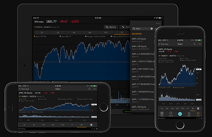
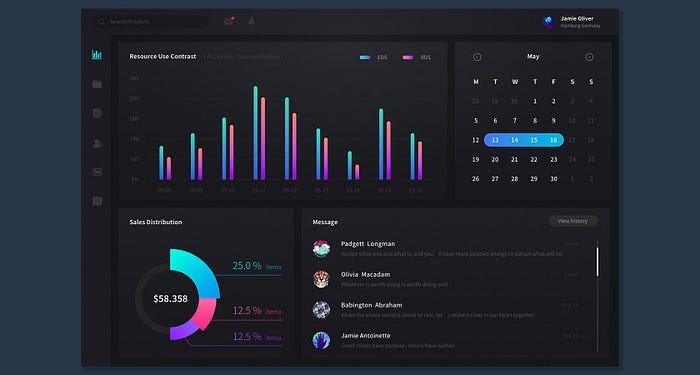
Business-to-business SaaS products and multimedia editing applications are used for many hours straight. Many have been designed in a dark-themed UI to reduce eye strain yet support visual clarity. However, such an approach requires a careful, up-front evaluation of design direction.
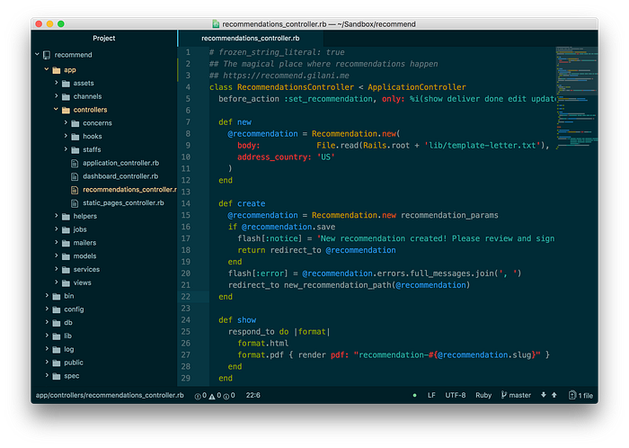
Most developers use a black screen with color-coded syntax to reduce eye strain. As Toptal developer Kevin Bloch puts it: “A black background reduces eye strain and makes automatic color coding easier to read, which makes code much faster to understand at a glance.”
Toptal Developer Amin Shah Gilani adds: “I personally use the solarized dark theme for my code editor. I prefer a dark theme because a darker background feels easier on the eyes, especially since I either like to keep the lights dim or work at night.”
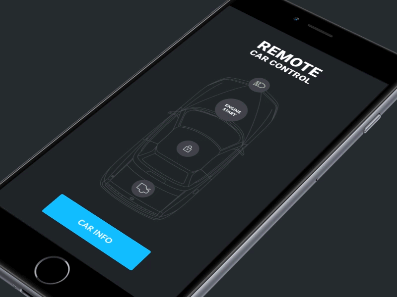
Gaming App UIs also tend toward darker themes. The gaming context and the environment where players are gaming fit better with a black color palette. A black background design reinforces striking visuals, introduces a sense of mystery, has better contrast, and supports visual hierarchy.

When Dark UIs Work Well
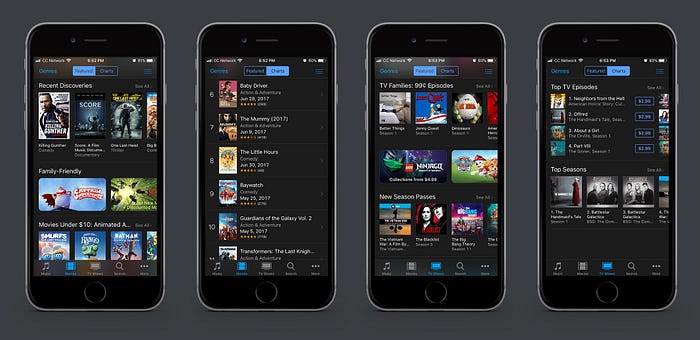
The majority of entertainment-related UIs (Smart TVs, Game Consoles, and TV and Movie Apps) tend to have dark-themed UI designs — for good reason. Most entertainment-related activities occur in the evening, are viewed from a distance of 6–10 feet, and are watched in dimly lit rooms — in other words, the screen matches the environment. Additionally, colorful content (e.g., cover art and promos), stands out dramatically on dark-themed UIs.
The aim is to match the context of the activity: “It’s getting dark, I’m relaxing, and I want to watch some TV.” Similar to thousands of tiny light bulbs, digital screens put out light wherever a bright pixel is present; hence, a bright UI would light up the room — an undesirable effect considering the activity. In this scenario, the UI design is trying to match the context: the device, content, activity, and environment.


In the right context, environment, application, and use, black-background UIs make sense. Always consider the context that the interface is likely to be used in. But it goes further than that — the choice to go with it should depend on content and context: what, when, where, and on what device.
- To achieve a strong, dramatic look for striking visuals
- To project a feeling of style and elegance, luxury, and prestige
- To create a sense of intrigue and mystery
- To help focus and guide the user’s attention with minimal distractions
- To support visual hierarchy and information architecture
Dark UIs should only be used with sparse, minimal text, and “chunked” information with a strong emphasis on visuals — light on text. If text is used, it should be in high contrast to the dark background — preferably pure white or another strong color (not dark grey) on a black background.
When Dark UIs Don’t Work Well
As indicated earlier in the article, dark-themed UIs are a bad choice for text-heavy and data-heavy content, or when using a variety of content types (text, images, video, data tables, dropdowns, fields, etc.). The general consensus in the design community is that dark UIs are a huge challenge to design for unless you are dealing with simple content and just a sprinkling of text here and there.
The challenge is trying to maintain sufficient contrast, which impacts the overarching challenge: readability, which is connected to usability, which impacts UX. Generally, all colors work on a white background, whereas on a dark background the useful range of colors is dramatically reduced.
Here is a real-world example of when not to use a dark-themed UI: I was involved with a B2B SaaS project where the CEO was adamant that, in order “to be different,” he wanted to go with a dark-themed UI — which matched the company’s branding… for the entire platform. For everything. After several meetings, and by rallying the design team and product managers behind the cause, we were able to talk him down from such a potentially disastrous decision.
The platform used a standard set of SaaS application UI components and consequently was full of forms, widgets, dropdowns, pictograms, and icons along with text and numerical data in tables. Navigation, layout, and functionality would have become incredibly difficult to manage while achieving sufficient contrast and a consistent color scheme. In summary, it would have been nearly impossible to make it all work with a dark-themed UI.
Depending on the appropriateness of the application, perhaps the right choice would have been to suggest a mix of light and dark UIs. For example, settings pages with widgets and forms and data tables could have been designed on a light background, and analytics pages with charts could have been designed with a darker color scheme.

The Dos and Don’ts of Using Dark UIs
In closing, the decision to go with a dark UI needs to be approached with care. Designers shouldn’t do it for the wrong reasons — to be hip, different, or copy someone else’s design. It’s crucial a designer consider context, content (contrast and readability), the device, and use case, and have a good reason for their choice. It’s a delicate balancing act as there are potentially many benefits but also many pitfalls.
When it’s OK to use dark UIs:
- When a branding color scheme warrants it
- When the design is sparse and minimalist with only a few content types
- When it is appropriate for the context and use, such as nighttime entertainment apps
- To reduce eye strain, such as analytics pages that are used for long periods of time
- To elicit an emotion — for example, a feeling of intrigue and mystery
- To create a striking, dramatic look
- To create a sense of luxury and prestige
- To support visual hierarchy
When it’s best to stay away from dark UIs:
- When there is a lot of text (reading on a dark background is difficult)
- When there is a lot of mixed content on the screen
- In the case of B2B applications with lots of forms, components, and widgets
- When the design calls for a wide range of colors

Crossing over to the “dark side” should be approached with care. Deeper, more thorough research and analysis are recommended before making such a potentially precarious decision that is fraught with pitfalls. Once a designer goes down that path, it’s very difficult to turn back. Designers would be well-advised to consider all aspects — the good and the bad, the dos and don’ts, before jumping in with both feet.

👋🏻 Hello! Thanks for reading and getting to the end of the article. 🙂
I’m now available for starting people on their UX designer careers through my UX Course or for ongoing mentorship on MentorCruise.
Learn UX with me at half the cost of crappy bootcamps. Get certified & build a portfolio for a high-paying job. 7-day free trial http://uxwithmiklos.com
You can also follow me on Twitter. ➣