Data-driven UX with Google Analytics
We’ve all heard that “data is gold”, and this is no different when it comes to user experience design.
The potential to use Google Analytics as a UX tool is easily overlooked. It’s relatively easy to understand, data rich and other than set up does not often require intervention from developers.
Google Analytics has several features that are relevant to the work we do as UX designers or researchers, and this article will unpack some of the use cases.
Disclaimers: None of the technical aspects of implementation are covered, but I have included some useful links at the end of this article. I will also occasionally refer to Google Analytics as GA for ease of reading.
Getting started
Google Analytics standard is available for free and can be used on any web-based or native app.
To get started, register a free account on Google Analytics here, and follow the prompts. Once installed, open your website or app and head to the “Real time” section of Google Analytics. You should now see your activity being reported on.
Useful metrics, dimensions and filters
Metrics and dimensions are the various data points within Analytics and are measured for all users. Dimensions can be explained as an attribute associated with a visitor (for example, their age) and a metric is what is used to measure these attributes (such as the amount of times they viewed a page).
Metrics and dimensions provide you not only with numbers, but they can also be compared over time periods or pulled into custom reports which make them very useful to UX designers for research and A/B testing.

The display of metrics and dimensions can also be modified in addition to comparing them. Some examples include changing the time frame (i.e. hourly, daily, weekly or monthly), sorting by metric or displaying the tables as graphs.
Not all of the out of the box data points are necessarily useful to a UX designer, but there are some key ones that can be indicative of user behavior:
- Demographics (Audience): Google Analytics gives you access to several demographic data points like age, gender, location, language and interests which are very useful when trying to understand who your users are. These demographics are based on the data collected from users while logged into their Google account which means that it’s not necessarily a full view, so use this information qualitatively.
- Browser, Operating System and Devices (Audience): Useful for determining cross-browser compatibility of your product, as well as studying behavior on different device types (like desktop versus mobile).
- Time on page/screen: Indicator for whether users are engaging with a single page or screen in your product. Can also be useful for measuring whether or not your layout is too long (i.e. has an early drop-off) or too short (users don’t spend a lot of time on the page).
- Session duration — The amount of time a user spent on your entire app or website in a single sitting. This is really useful for measuring the effectiveness of your user journeys. It can also be used in conjunction with bounce rate, exit rate and pages per session.
- Landing page, Page depth, Next page path(s): Also useful for measuring user journeys; these dimensions provide a sense of where a user came from and where they are going.
Site Speed
It’s well known that the speed of an application is instrumental to a good user experience, and Google takes this seriously:
The “Speed Update,” as we’re calling it, will only affect pages that deliver the slowest experience to users and will only affect a small percentage of queries. It applies the same standard to all pages, regardless of the technology used to build the page.
Google’s Site Speed feature is useful for analyzing high level performance**. It is paired with browser type by default, but can also be broken down to metrics like page views or bounce rate. The speed metric is based on a sampled average of your website which makes it useful for measuring individual pages.

** Word of warning: Google Analytics will only track page speed after the page loads, which means that it might not necessarily give you the full picture. The data is also sampled, meaning that one bad load can potentially shift the average dramatically. I would therefore recommend using this data qualitatively to test some very high-level objectives as the data might not be completely accurate.
Intent analysis using Google Ads, Search Console and Site Search
Marketing and UX teams often work in isolation without recognizing that there is a clear symbiosis. UX efforts can greatly inform marketing teams when it comes to marketing funnels for example, and digital marketing can be a great tool for user research and discovery.
Both Google Ads and SEO are very intent driven marketing mediums, which makes them good candidates for understanding your users. Both Google Ads and Google Search Console (Google’s SEO tool) can be connected directly to Google Analytics and gives you access to some new data points.
Search query for example is the query or sentence a user typed into Google to find your ad or website. It’s available for both Google Ads and Search Console (new sections you’ll find under Acquisition) and is perfect for researching user needs or intent. Other sections that might be useful is Display targeting which outlines how your advertisers are targeting users and can be useful for user research.

The real power of connecting these data sources however, is using them in combination with other data points. Using search query in conjunction with session duration, bounce rate and page depth for example; will give you a clear indication of whether or not you addressed the user’s initial need or intent.
Events
Events is likely one of the most underrated features in Google Analytics. An event, simply put, is any unique tracked action a user takes within your application or website.
Events consist of three dimensions: A category, a label and an action. Categories are useful for grouping events into themes or types and labels can be used to describe something about the event. Lastly, the action can describe the action a user takes. These three dimensions can be combined in several ways to provide detail on how your users interact with your product.

As mentioned, events can consist of any interaction, but these are some examples that are especially useful to a UX practitioner:
- Scroll depth: Measure how far a user scrolled down a page or screen; useful for gauging whether or not your pages are too long.
- Interactions: Track whether users are clicking or tapping on certain elements like banners, buttons, menus etc. This could be used to test the effectiveness of UI components, or their placement.
- Dynamic loading: Events could be useful when components or content in your application is loaded dynamically — for example a “Load More” button.
- Form engagement: Form interactions can be tracked on multiple levels: Validation, completions and submissions
- Content engagement: It is also possible to measure how users engage with your content by combining some metrics such as time on page and scroll depth
- File downloads
- Video plays
- Third party: Events could also be used to track events on third party applications, such as Internet enabled IoT devices or point of sales systems.
Events are not set up by default and will require some up-front work. They can be implemented in a few ways but using Google Tag Manager will make your events more scale-able. It is also for this reason that events should be based on objectives.
User Flows
Google Analytics has three tools for analyzing user flow and behavior: Navigation summary, Behavior Flow and User Explorer.
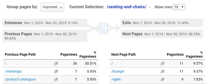
Navigation summary is a straight-forward view — it provides an overview of the page users came from and the page they are going to in relation to a specific page. It also demonstrates how many users viewed this page first, and how many exited from here. Navigation summary can be found under the Behavior section of GA when analyzing individual pages.
Behavior Flow is an excellent feature and provides a lot of in depth detail of how users move through your application or website. This flow can be viewed based on a couple of dimensions (even events) and can be drilled into on multiple levels. The only draw back of this tool is how it groups pages, as it won’t necessary show you a flow chart of every single page on your website. That said though, you can get to this view by adding filters.

The Behavior Flow tool is very useful for getting a broad sense of how users move through your website or app, but User Explorer offers a much more granular view.
User Explorer provides an overview of a single anonymous user’s interactions based on their cookie ID.
There is a substantial amount of information available such as session duration, the amount of sessions and how the user found your product. From a UX perspective though, the most valuable data would be the ability to see the detail on each of the user’s interactions — and this includes all the events they triggered. It is also possible to export this data to JSON which can be consumed by third-party applications for visualization.
Cookies do have a few drawbacks: They are device dependent which means you can track the same user cross-device, and they can also be deleted by the user. There are some ways around these scenarios without impacting a user’s privacy but this implementation can be technical.

Custom Dimensions
Sometimes you might want to report on data that is not available in GA by default, which is why it is also possible to create custom dimensions. Custom dimensions can be any data point and can come from any interaction. You might want to report on, as an example, how many of your users are married versus single.
In this example you could set up an event on a form that tracks every time a user selects their marital status. This event would then send this data to Google Analytics as a custom dimension, which would then become available for comparison with other metrics.

Testing a UX hypothesis with Google Optimize
User testing often requires prototyping and focus groups; and finding people can also be difficult or costly. Google solves for this through their free product called Optimize — a tool used for personalization and A/B testing with a direct integration into Google Analytics.
Optimize has what are called Experiences, and there are four types: A/B test, Multivariate test, Redirect test and Personalization.
A/B test is exactly what it sounds like; test two variants of almost anything in your application, whether it’s a button or a content section. A/B tests can have multiple variants and you can decide to what percentage this traffic should be split. Multivariate allows you to test two sections against one another, redirect tests redirects a set amount of traffic to a different page and personalization personalizes a users experience based on parameters.
What makes Optimize incredibly powerful is the ability to create these tests without making any changes to your application code. Optimize uses a visual editor that allows you to edit content, components and styles as if you were making changes to a live website. These changes are then only applied when the conditions are met.
There is also a paid for version of Optimize available (called Optimize 360) that would allow you to connect Google Analytics Audiences to an experiment for more precise targeting.
Wrapping up
The last port of call is to present your data and findings and there are some options to automate this process. Google Analytics have built in reports that can be customized to show and compare data over time. An alternative option is Data Studio, a free data visualization product from Google. Connecting Google Analytics to Data Studio is relatively easy and allows you to visualize any metric or dimension in a variety of graphs and tables.
Google Analytics offers a tangible way to measure UX initiatives and can be a very useful tool in a UX designer’s arsenal. Remember though, that it only provides us with the data and that it is ultimately up to us to find the insights.
Follow me: Medium / Dev.to / LinkedIn / Twitter
Useful resources
- Setting up Google Analytics with Tag Manager
- Metrics versus Dimensions in Google Analytics
- Connect Google Ads to Google Analytics
- Connect Google Search Console to Google Analytics
- Enable website search in Google Analytics
- Creating a custom report in Google Analytics
- Creating custom dimensions with Google Analytics and Tag Manager
- Setting up a Google Optimize experiment
- Getting started with Google Data Studio