Member-only story
Designing better data tables for enterprise UX

If you have worked on enterprise products, you must have noticed the use of lots of data tables. Therefore, I am writing this article to collect the most common use cases and discuss how elegantly we can handle them.
Let’s start with the most simple data table with basic functionalities such as showing data in a grid, with a way to expand the rows to see more details.
In the design, you will notice that I have intentionally removed showing numbers for pagination. When you show pages users won’t have any clue what is inside those pages, so it does not make any sense for the user to go to a specific page. But, it is essential to show the data set count as well as the ability to go to the next or previous page. You will find this pattern even in Gmail.
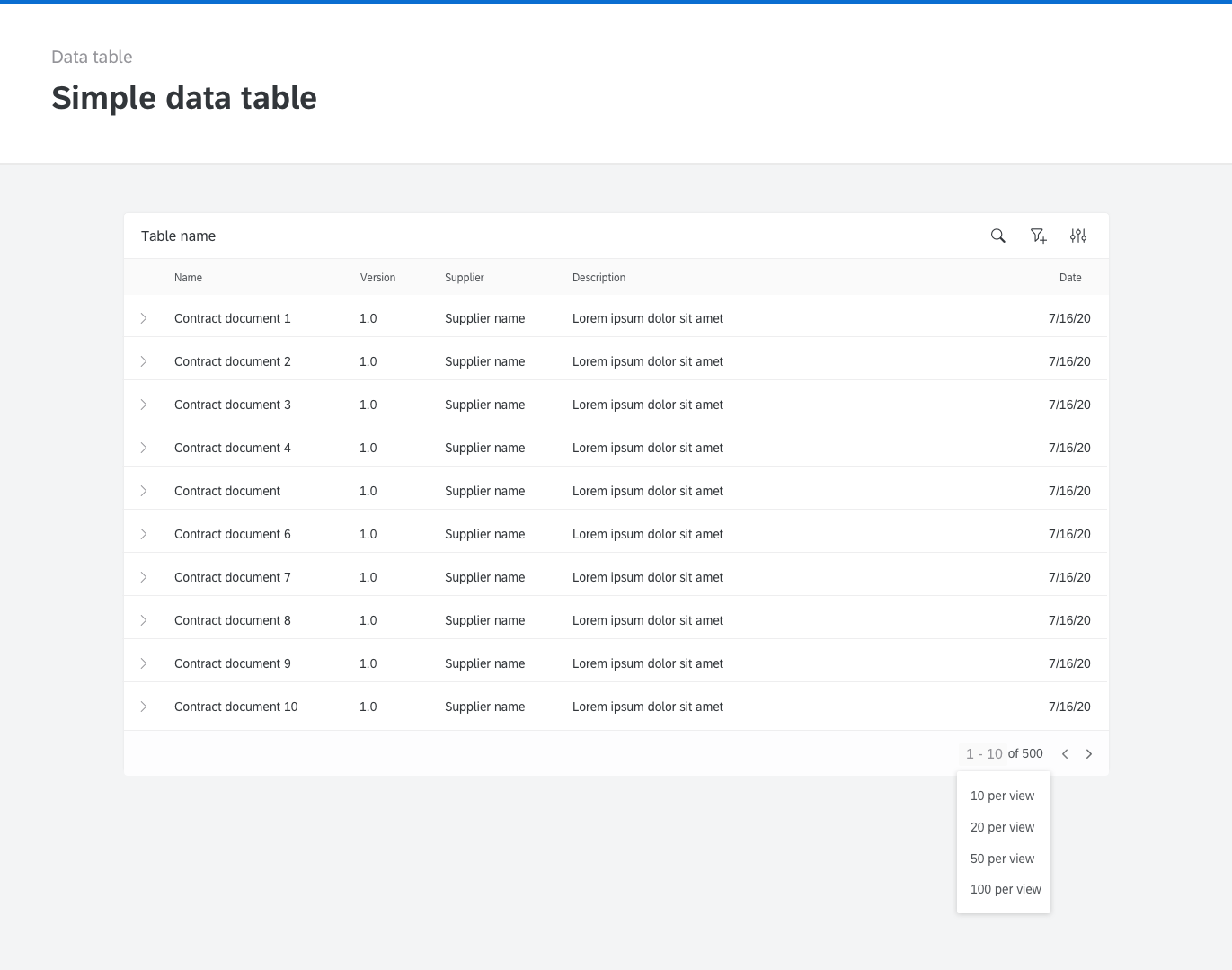

When showing images show them in a round mask. There are lots of articles written on why the round shape is better than a square one when showing someone's photo.