Data Visualization Design & front-end Resources
Design and front-end resources for chart dashboard
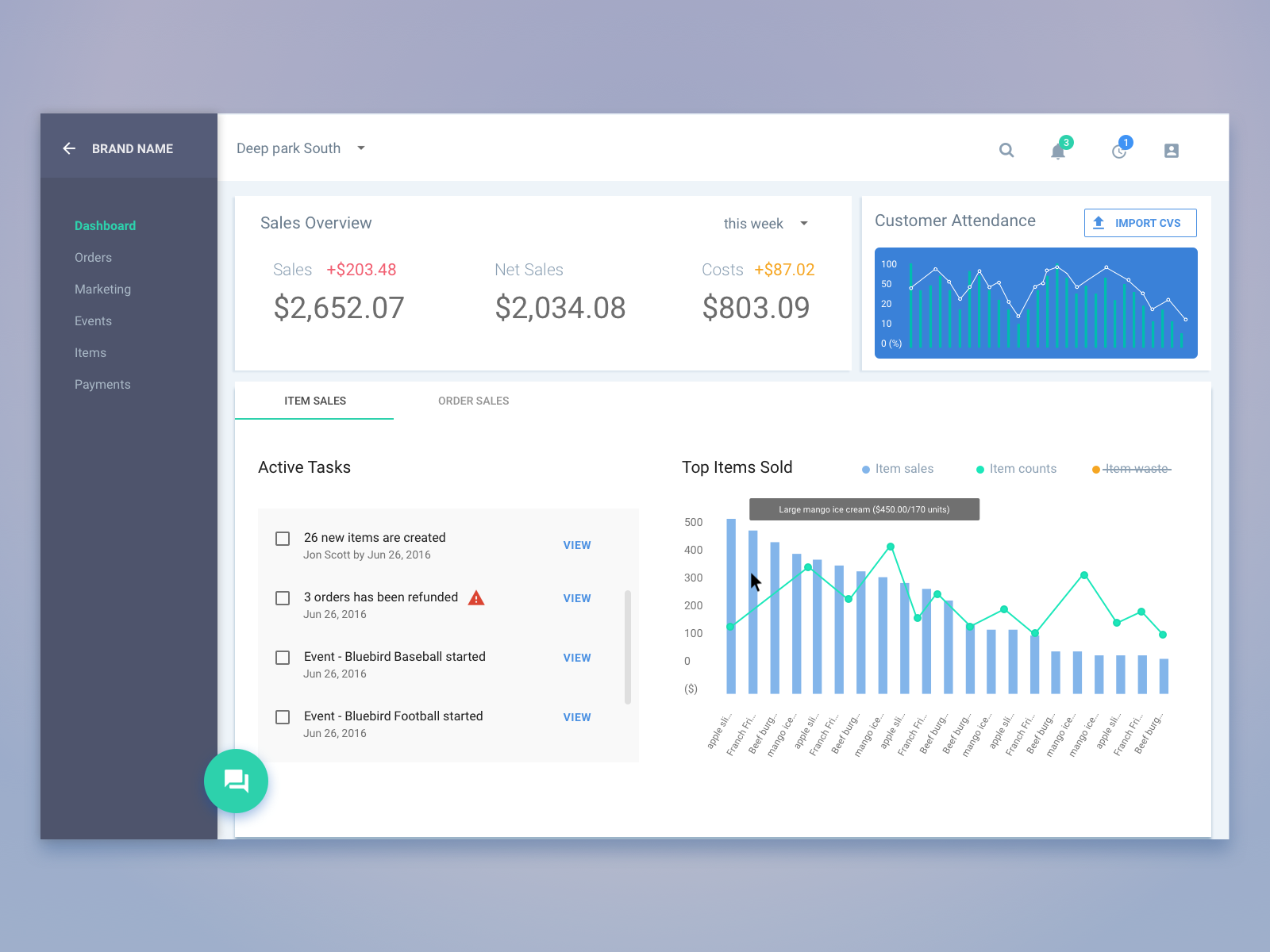
Data driven interface and chart dashboard, are similar things that can allow folks to understand numbers easily and quickly. They are powerful tools for building complex data visualization interfaces, especially dashboards where users can get an overview of all the numbers they care about.
The following are examples of web applications that can help users get straightforward understanding about different types of numbers.
Squareup

Wealthfront

Basic chart types and use cases
Line chart
A Line chart displays data as a series of points connected by lines. It’s a good way to show trend of data such as revenues, stock volatility, target numbers for road map and etc.

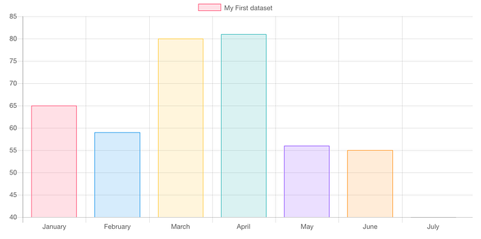
Bar chart
A bar chart could be used to show trend data, or comparison between different value across time or different categories.
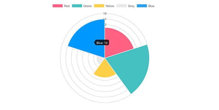
Pie chart
Pie charts are usually used to show relational proportions between data and use arc length to present the percentage of total.
Doughnut charts are basically the same, but with a white space in the middle that could be used to show important numbers.
Polar chart is similar to pie charts but with an extra dimension of range for each category.
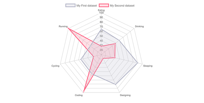
Radar chart
A radar chart is used to analyze and compare different variables such as strength, intelligence, endurance and etc. You can often find in game design to show different parameters of a character.
Front-end resources
For the difference and comparison about following JavaScript charting frameworks, here’s a contingency table that contains all the details.
Each of them could be customized for specific scenarios. Some of them are highly polished with beautiful UI and smooth animation. And each of them is well documented in a way that is easily understand and implemented.
The following 4 libraries are beginner friendly, well designed, and suitable for web applications.
Highcharts
Highcharts is written by pure JavaScript which supports multiple chart types. It’s rendered in SVG and VML, using JSON as data input format and supports 3D charts.
“Highcharts needs only two JavaScript files to run: 1) the highcharts.js core and 2) either the jQuery, MooTools, or Prototype framework. One of these frameworks is most likely already in use in your web page.” from stackoverflow
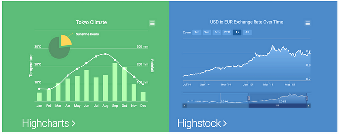
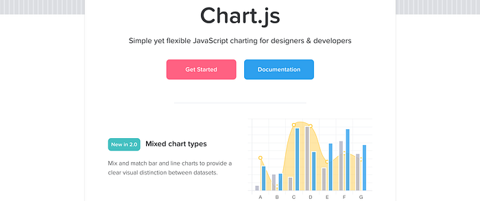
Chart.js
Chartjs is a great chart framework for Angular based websites. It’s a responsive, well designed and reactive library. It supports 8 different chart types and it’s a free, open-source framework.
If you are using Angular material or other angular frameworks for your website, and want to build simple yet beautiful charts for dashboard. I think it’s a good choice.
amCharts
AmCharts has a live editor that allows users to customize charts online and download code to local. It can support complex charts such as stock charts, and it also supports multiple interactions.
It can help users build a pixel-perfect interactive map as well. If you have needs for super complex or large data charts, amCharts is a good choice.
It’s not a free framework, you can purchase different license from $140 to $4,590.
Others
Vega
I’ve never used vega before, so I found an article about Vega and D3 for people who are interested.
D3.js
D3 is a highly customizable JS library, and it allows great control in visual. It’s easy to learn and supports SVG. If you want to build special customized charts and have a great visual designer work with you, d3 is a good choice.
Processing.js
Compared with d3, processing has some limitations in customization but it’s easy to use and very stable.
openGL
OpenGL is a large library that can be used across multiple platforms and API. It supports 2D and 3D graphics and can make awesome animation. It’s good for animation or game development, but a little “too fancy” for website applications. And it’s not easy for beginners.
AnyChart
Anychart supports a variety of chart types, including 40 different types of charts, complex stock charts, maps, gantt charts and graphicsJS (graphic JS is a JavaScript library that supports SVG/VML and allows users to draw graphs with simple JS). It costs from $79 to $2,999.
plot.ly
Not like other JS frameworks, plot.ly is an online data visualization tool that allows users to do real time editing. Users can have immediate visual feedbacks for the data they enter in. It’s very friendly for beginners to build charts, but if you want a highly customizable chart, it’s not the best choice.
ggplot
ggplot can generate simple charts in plain and unpretentious graphs, users can keep their data in Data Frames and import to ggplot and generate 2D charts.
Design resources
For data dashboard:
Real-time dashboards considered harmful by Noah Lorang
Designing a Sexy Dashboard by Oleksii Drozdenko
For charts:
10 Sketch Tips for Beautiful & Maintainable Charts by Jon Moore
Designing Data-Driven Interfaces by Erik K
sketchresources for chart search results at sketchappsources

