Database & stakeholder display of design research results
ResearchOps is both having a way to easily to store and refer back to research, and to display research to stakeholders in a compelling way
ResearchOps is all the rage in the UX Research/Design community, and part of ResearchOps is both having a way to easily to store and refer back to research, and to display research to stakeholders in a compelling way — An alternative to Power Point plus some sort of database functionality. Since last year’s Design Ops Summit, and Tomer Sharon’s idea of research nuggets and using Airtable, I have sought a way to accomplish this.
In addition to (1) a searchable database for findings and recommendation from user testing sessions, and (2) a way of presenting the information to stakeholders in easy-to-consume, very visual, and a story-telling format, I have the following 5 additional needs:
- Be open source/no cost and not require any software development or visual skills to implement. (Hey, we can’t all be unicorns…🦄)
- Be accessible to stakeholders via something they already access — nobody wants to log into yet another site/system.
- Be able to display large images without users having to click on thumbnails to get to them.
- Be able to display quantitative information nicely/visually (e.g., rating scale results).
- Be able to easily store and display collateral material such as interview guides, recruitment surveys/text, and full length video recordings of interview sessions, in a visually pleasing way.
To this end, what I’ve thought of so far is embedding Airtable in a website, which you can see here: http://miriamdonath.com/?page_id=242. This accomplishes the following:
- Being present on a site that stakeholders already access regularly
- Having a free option with no software development or visual design skills needed.
- Being able to see every finding and recommendation from every project in one database.
- Being able to display key sections that I would typically include in a single project report.
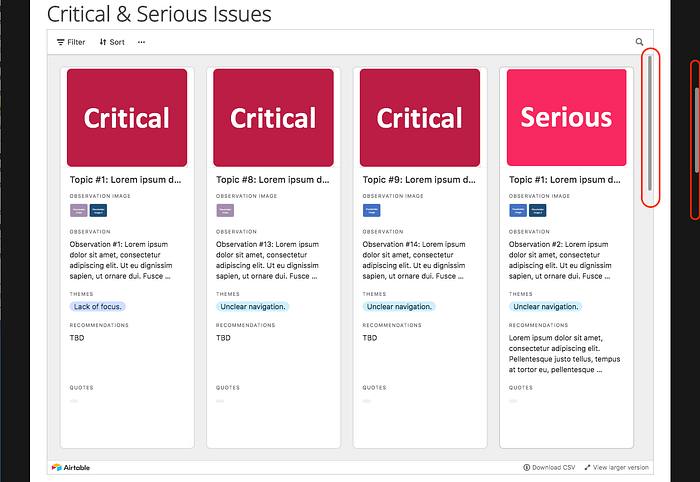
Single Project Power Point report sections reimagined using Airtable
These are examples of sections that I typically include in PowerPoint reports, which I’ve tried to reproduce in a meaningful way using Airtable.
All Projects Database
This is a good way for people to see a comprehensive list of all findings and recommendations from all projects in one spot. And it’s easy enough to focus on one project at a time from here too.
Collateral Material
If there was a single place to store and display all research results, I’d want to be able to include all associated project documentation, such as interview guides and recruitment emails, timelines, and full interview recordings.
Areas for Improvement
At this point, unfortunately, Airtable embedded into website does not meet my needs of:
- Being able to display large images — While Airtable does have a way to show large images, it requires too much drilling down from a user perspective. I need to be able to show what the design issues are visually up front, as well as design recommendations, where applicable. I cannot rely on stakeholders to drill down to get to these critical images.
- Being able to store and display collateral material — While Airtable can store PDFs, it cannot store recordings, and more importantly, like the display of images, it requires drilling down to actually access the material.
- Being able to display quantitative information with compelling graphics — I also need to be able to display quantitative information in graphs that are at least as good as what’s available in Power Point; and they need to be able to be displayed in a large format without starting from a thumbnail size. Airtable does have a “blocks” feature where graphs are available in the pro/paid version, but they are too rudimentary and, more importantly, it is not possible to embed them in an iframe, so they cannot be embedded easily on another site.
- Being good at telling a story as what I can put together in Power Point — This one is harder to describe but somehow Power Point provides a good way to package a story in a way that Airtable does not.
In addition to these issues, because Airtable is embedded in an iframe, the additional scrolling (vertical and horizontal) makes it a bit hard to control, and therefore deteriorates the experience.


Conclusion
It seems like Airtable would do a good job at storing research across projects. And this is fantastic, because it would take away the need to rely on human memory, individual people, and digging through files! It would undoubtedly save time and energy.
On the individual project level though, where more of a visual approach is needed, Airtable does not (yet?) meet my needs. So for now, unfortunately, I’m sticking with Power Point.


