A hunt for the perfect date picker UI
Today is the date picker day! After creating so many of them for different projects, I am still on a hunt for the perfect one. Let’s try to find out what makes a date picker good or painful to use.
Date picker design only looks easy. In fact, picking the date is often a painful experience.Bad examples can be found all around the web.
I truly believe that to design a good experience, it is important not to jump into decisions from the start. Take a time to ask questions, find the answers, create user stories and explore the web.
Common date input patterns
1.Text input. The simplest way to go is to let the user type in the date. This always works if the proper validation is provided. Can be used together with the calendar date picker.

2. Dropdown to choose each value: date, month, year. Still frequently used on the web. Can become really frustrating, especially if the user needs to input time also.

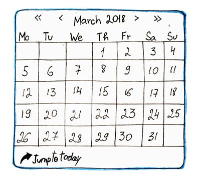
3. Calendar. The most frequently used way to choose a date range. Multiple examples can be found online. Mobile-friendly.

4. Timeline. Good for picking a date range in the limited period. Can get inaccurate for longer periods, not mobile-friendly.

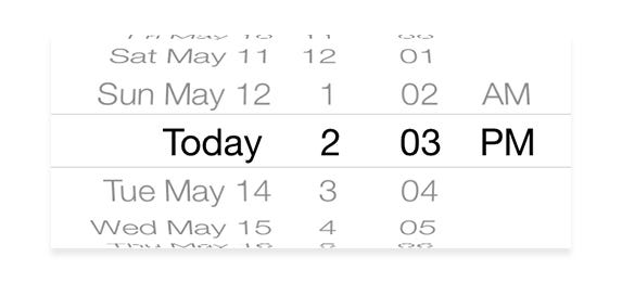
5. Scrolling date picker on mobile devices. Works nicely, when the user does not have to scroll too far into the past/future.
Using these patterns combined or alone can create a good user experience when choosing a date. How to combine them is a question for each specific project.

We will be reviewing the real use case, because context drives most design decisions (and it better be taken into account!). We’ll try to choose the best pattern for the situation.
Case: device performance analysis.
User: technical manager.
User’s main goal: analyze device performance, detect performance degradation over time.
User Q&A
So we already know our user and his goals. The date picker is one of the tools to reach this goal. But there are still questions to be answered before we grab that sharpie.
- What should a date picker be used for?
“Drilling down to the older performance data. I want to easily see reports from the certain period.”
2. Do you need to pick one date or a range?
“A range. Something like a 6-hour range, or a week.”
3. For the range picker, are there any frequently used ranges?
“Well… I often need 6 hours. A month would be good also.”
4. Is it the date picker only, or picking the time should also be available?
“We could start from the date. But how do I chose the last 6 hours.”
5. Will the date picker be mostly used on web or mobile
“We are concentrating on the web, maybe the tablet. But my management wants to have the mobile version sometime in future. I don’t think it will work, though.”
6. Do you need to choose dates, that go far back in time?
“I need to see the data from last year sometimes, to see the performance changes over time.”
7. What is bad about your current experience in this part of the product?
“I have to click through the pages in the data table to see reports from the past. It’s a bit frustrating, but I’m used to it.”
Sketch it
The information we now have allows to define the necessary building blocks of the experience.
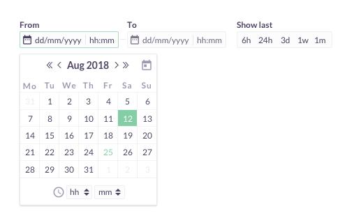
1.Calendar. This is arguably the most common pattern for choosing the date range, that is mobile-friendly.
The specifics of the calendar should cover the needs of the users in the certain area of the world. In our case it’s Monday-Sunday week representation. The month is spelled for better understanding.
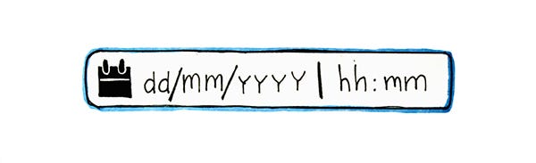
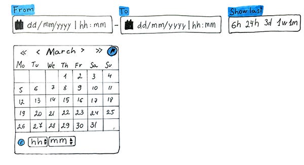
2. Text input field. This element will simplify going far back in time to choose the range, as user will have the alternative way of inputing data — typing it in. So we need the “From” — “To” fields, as well as the field for the time. They will allow the user to see the picked range and to type in the date if needed. One thing to keep in mind is that different countries are used to different data representation. In our case, dd/mm/yyyy is the most familiar date format for the user.
3. Time Picker. This can be the whole different post, but for the 1st iteration we’ll use the text input with arrows to click through hours and minutes.

4. Presets. For frequently used ranges, “show last” links will be provided. Presets themselves should be carefully chosen and tested, in order to provide the best experience.

The next step is to combine these building blocks. Some things needed to be changed while iterating. This ended up looking like this in the early stage:
Design it
After we have organized the building blocks, we can finally move to our favorite tools. I created a quick iteration, so we can see how it would look.
This is the first digital version of the design. I am sure it will undergo some more iterations and testing, until I will be sure that it works for the user.
Resources
Explore my other posts
Liked the read? Leave some ‘claps’ below so it will be visible the other members of the community 🙂
I will be excited to read your feedback and get this design to the new level!


