Dear Amazon: love your service, hate your homepage
I have been a faithful Amazon prime member for four years. I sing their praises to anyone and everyone. They saved me hundreds on textbooks, tech, and my most random essentials. I have resided at six different addresses during college and everything has arrived at the right place at the right time (not accounting for user error 😬).
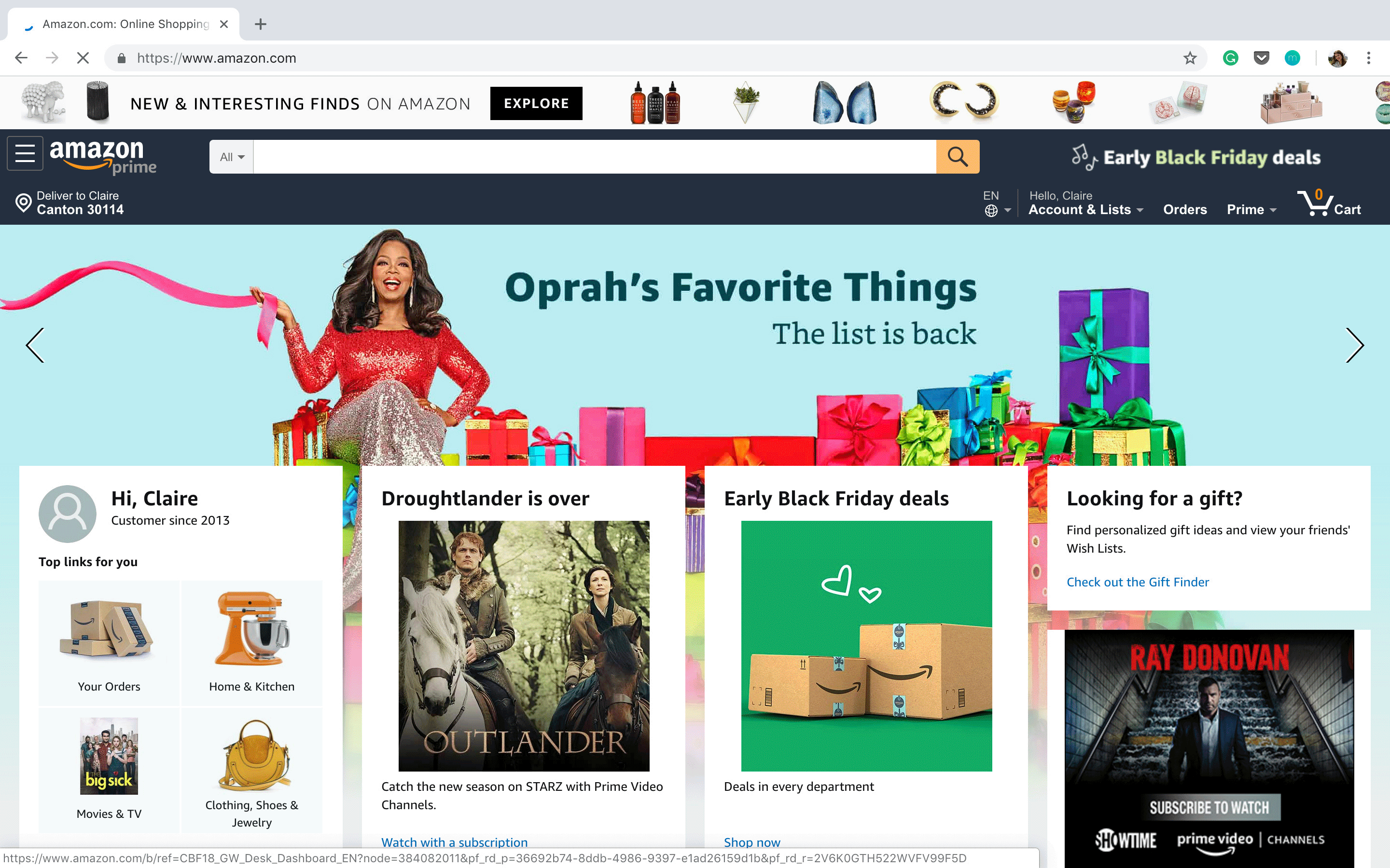
However, Amazon has a glaring fatal flaw. Go to amazon.com and take a quick scroll. Come on back and check in — did your stress levels spike? Can you recall five items/services advertised to you? Three? The amazon.com homepage puts up a messy front for a company that boasts more than 100,000,000 loyal prime users.
Amazon has been an e-commerce powerhouse for 24 years. Back when they were still disrupting the bookstore market in 2001, Nielson Norman Group reported that Amazon performed 65% better than other online shopping sites. Their atomic growth since cannot be ignored. So, with a company that seems to be doing everything right, how could their landing page look so wrong?

Theory #1: They want to be the Walmart of the internet.
In a world where everyone tries to stay relevant, Amazon needs to stay generic (to a degree). Navigating amazon.com is not unlike navigating a Walmart shopping center. It’s huge, it has products I’ve never heard of, products I’ll never need, and — most importantly — everything is remarkably cheap. Walmart is not praised for the relevance, glamour and aesthetic of their shopping experience. They are praised because they have what you need and they have it cheaper. In the same way, I turn a blind eye to the lack of hierarchy and alarming clutter on amazon.com for the real treasure — what I need at the price I want at my doorstep in two days or less.
Theory #2: They can afford it.
One of the most counterintuitive aspects of amazon.com is the relentless ad content. Not only do the ads contribute to the annoyance factor of the user experience, but they also send people away from the site. All too often I’m looking at shoes on Amazon, and I am served an ad for Zappos. Who in their right mind would make that decision? Someone who knows your end game. Amazon can afford to serve you ads for similar products because they know they have the better price. They know you will ultimately return to their store and purchase the shoes, while they also pocket the ad revenue you bolstered.
Theory #3: Different services are fighting for awareness.
Amazon truly offers countless services, especially for prime members. We know the classics like prime music, video, and 2-day shipping. But amazon.com is also home to a full plumbing service, treadmill assembly, and customizable pet profiles. Seriously: pet profiles. Even with 100 modal windows and a 10-string carousel, we don’t know the half of what Amazon has to offer. It looks like different services are fighting for the spotlight. Unfortunately, that makes me want to avoid the production altogether.

First, I wanted to break it down…
So I can build it back up…

I expanded the “top links for you” section out into the main sections and let Oprah take the spotlight. I also included ad space (keeping it realistic). However, I feel that the ad in this position behaves more like an Instagram ad. It blends in with the rest of the environment rather than another disruption. Most of the buttons I removed were redundant pointers to account benefits and settings. I replaced nearly all of the buttons in the nav bar with the simple “account” icon in the top right next to the classic cart icon.
I can see where I was last, where I go most, and most importantly — what Oprah believes I should purchase this holiday season. I’m not running from this homepage — I’m using it. Even if Amazon wanted to change the ad and banner story every day, I wouldn’t mind because I’m actually seeing them. When I am served 10 ads on a page, I won’t pay attention to any of them. When I am served 1–2 ads on a page, I am more likely to tune in.
So, Amazon, I am not asking for a design overhaul. I am asking for your form to match your function. I am asking the greatest logistics company of this century to apply your genius to the supply chain pile-up happening on your homepage.
Sincerely,
a prime prime customer


