Dear web designer, let's stop breaking the affordance of scrolling
Big picture + arrow down = lazy design
We’ve all seen it. You get on a website and there it is: a massive edge-to-edge picture, and it's beautiful… It’s a huge (pun intended) web design trend and it looks like a lot of people love it.
Ok not everybody loves it. Wait… What's that?

Why are you screaming at me, arrow down? Or should I call you "scrorrow?" Ugh… I know how to use my computer, ok? I'm a natural explorer. I've been scrolling away for years and I'm not stupid. :( Please don't tell me what to do. It's rude.
“If you have to explain it, it ain’t working” — Milton Glaser
Dear Designer
You’re breaking the user’s perception process on maybe the most basic exploratory interaction on a web page. They all know how to scroll, it's your design decision that's breaking the mental model here. Don't you see? There’s no page fold, the page is fine. This issue is an affordance problem of your design. The arrow it's not a solution, in this context it's awkward and noisy — something no designer should be delivering to their users.
Using an arrow to tell users to scroll a web page it’s like using “click here” on a button that doesn’t look like one. This is not Design. It’s not even Art, cause you’re explaining it.
That arrow has no purpose if it wasn't for the problem you created yourself. It’s a lazy and pointless design solution because it’s using force instead of communicating.
“But my clients want that fullscreen picture! OMG what should I do?”
Calm down jeez… We’re all designers here. We can fix this.
We can do better than a "Scroll arrow"
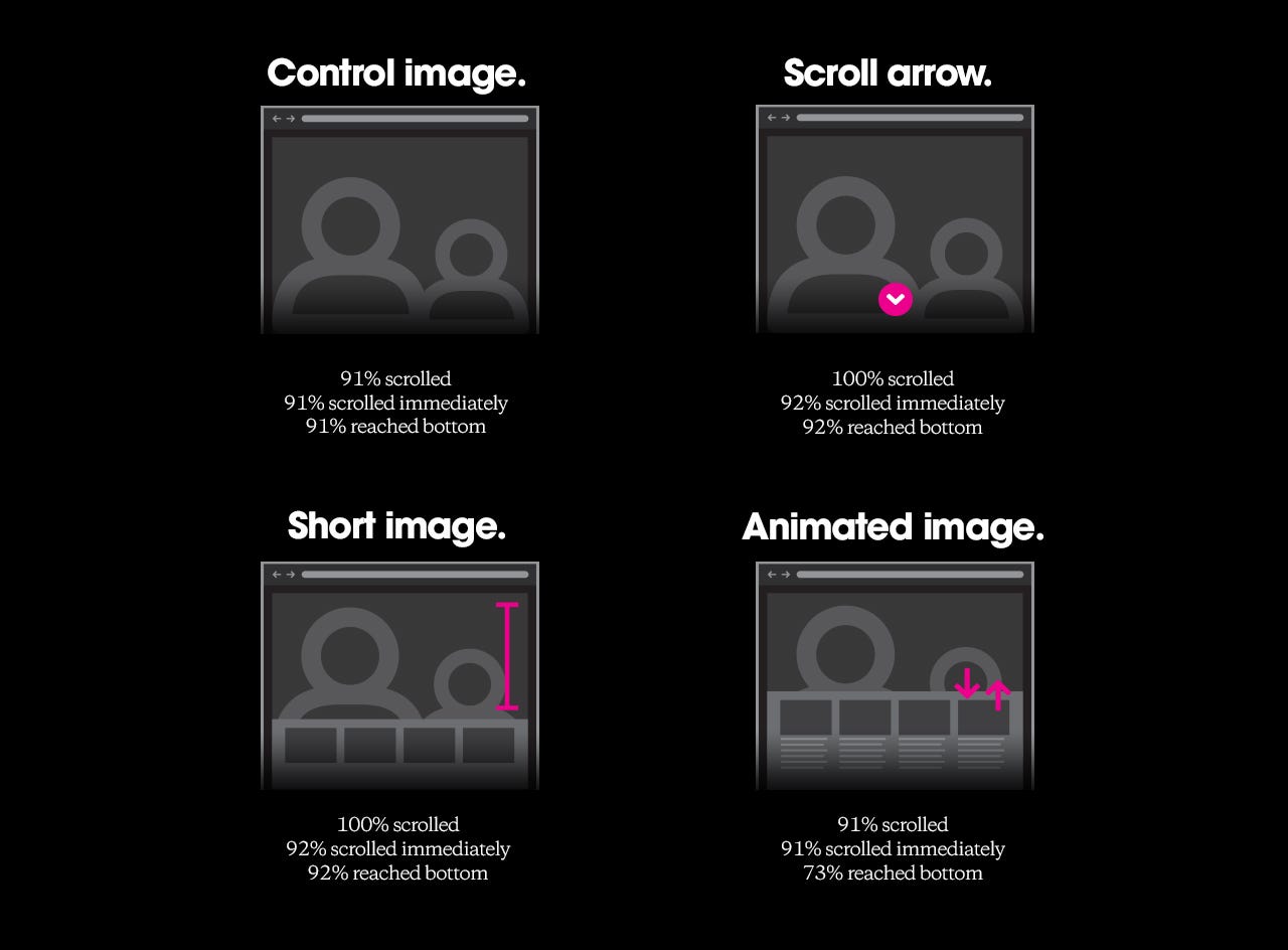
Huge's research can tell us one thing or two about how some users can skip your content once you break the affordance of scrolling and about the solutions to that problem. Even though the scrorrow had a very successful result, is it really a solution to be tested? Compare the results between "Scroll arrow" and "Short image". They're literally the same. Now compare the "Scroll arrow" with "Control image". I mean it's obvious to me that in the case of the arrow users scrolled cause the page was yelling at them. In other words, it works but it doesn't provide a good experience. If people perceive content bellow the image, they’ll naturally scroll.
Using subtle animation to communicate (not an animated arrow though)
Animating the elements of the page can give great clues about the content below that huge picture. I'm not saying I have the perfect solution for every case, but I'll use animation to brainstorm other ways to handle this.
In the first example, our content pops from the bottom and disappears right after. It's like saying "Hello, I'm here. If you need me, just do your thing:"

If you're using a parallax effect in the main picture, take advantage of it to help give that sneak peek a less subtle effect — also to be consistent with the page's behavior. After all if the picture zooms out when the user scrolls, it should do the same on that page load hint:

In case of multiple blocks, the content can be nicely choreographed:

Don't hide the content, take control of it
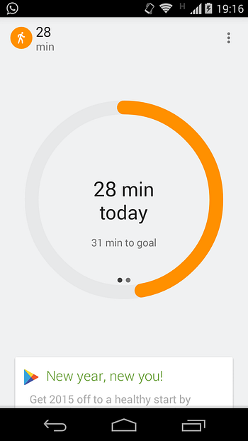
Google Fit Android app uses just part of the first card from below the big circular chart to indicate that there’s more content to see. This approach is intuitive and elegant cause it's using no additional elements to talk to the user. It’s just them hanging out on the land of good perception, while leaving a lot of room for that main circle to shine.
This isn't new. In 2006, Jared Spool was already discussing the use of the cut-off look to improve the affordance of scrolling.
On the web you can achieve something like this getting the picture section to fit around 90% of the viewport max-height, with just one line of CSS or some quick JavaScript (if you need to support old browsers).
What about combining it with an animation and setting a lower opacity for the content? That way it can't take much of the user's attention from your beloved main picture:

Let's just be careful about the level of opacity. If it's too low we're doing no good. Oh and let's not forget to set the opacity back to 100% when the user scroll the page or interact with those elements as well :-)
Simplicity is very hard, we already know that. But sometimes what it looks like a simple solution is just laziness; something that is simple to design but not necessarily simple and enjoyable to use.
Stop the noise. Promise me you'll kill that arrow, please?
BTW: We're hiring Web Product Designer in Rio.

