Member-only story
DeepSeek: when UI doesn’t matter
Localisation, prompting and a cute little whale.
A few weeks back I wrote about genAI tools — Perplexity, ChatGPT and Claude — comparing their UI, UX and time to magic moment.
I made one big error: I didn’t include the underdog.
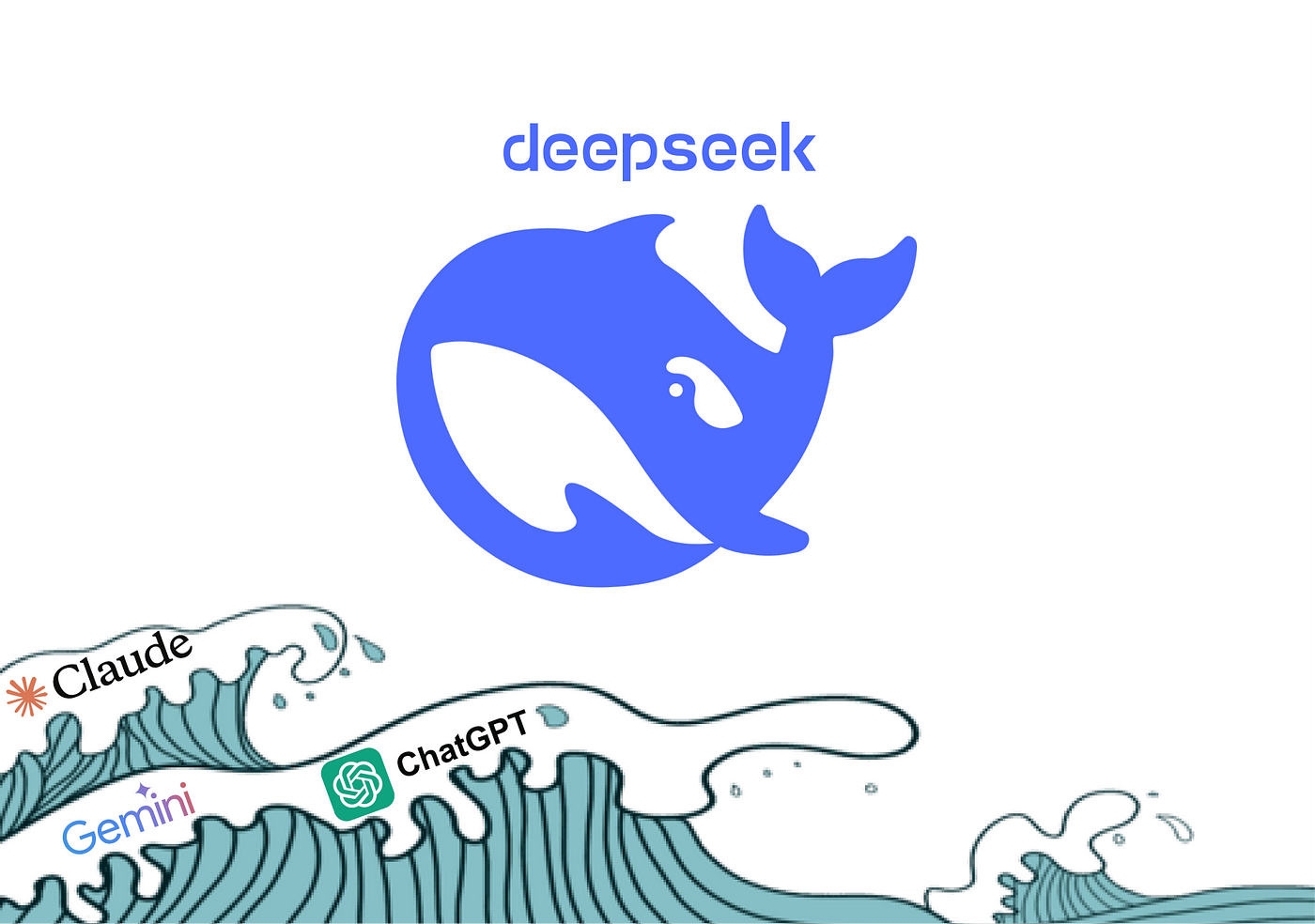
DeepSeek 🐳
It’s been in the news a lot. If you’re not up-to-date, watch this great 3-min video on YouTube which explains what went down.
In a nutshell, Chinese AI chatbot DeepSeek has shown that quality outputs don’t have to cost the earth. It was trained in around 55 days at a cost of US$6 million, which is roughly 10 times less than the others.
And, it’s free.
As a result, the US stock market has taken a hit and the AI bubble has been rattled by the question: what if we don’t need to spend so much to produce good stuff with AI?
What I’m curious about is whether this underdog can match the bigger players in terms of user experience.
It has shown that it can on quality of certain outputs and costs to develop / run, now I’m wondering:
- How does the UI compare?
- Is it as easy to use?
- Is there anything it does better / worse? Why?

