Delete models in products, because sometimes, cats walk on keyboards
When users delete something, they usually mean to do it. They actively and intentionally pressed the delete button. But Sometimes, cats walk on keyboards, and for that reason , there are several possibilities for preventing or undoing accidental deletion.

In this article I will present to you the UX models of deleting on different interfaces and products, because for various reasons (including cats), the user might delete by accident or regret it. This is where we as a UX designers enter the picture by giving the users the technical and mental support in order to save them from their errors. For dessert- inspirational ‘deleting’ collection from dribbble.
UX models for delete (Table Of Content):
1. Confirmation message
2. Temporary notification bar (Snackbar, Toast)
3. Having an “undo” button in the interface
4. Trash/Archive/ History (actions/versions)
5. Modal dialog (Confirm option)
6. ‘Unlock’ the delete button
7. Drag to trash
8. Permanently deleting
Every model has its pros and cons, some being combined and some stand alone, I’ll go through on each model:
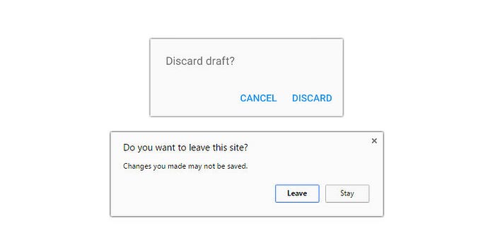
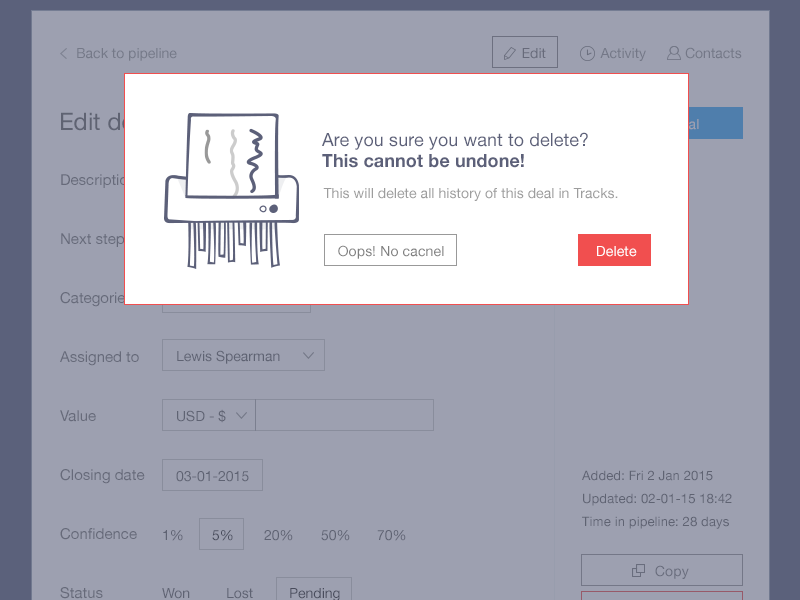
1. Confirmation message
A confirmation message is a pop-up which is an extra step that gives us, the users, a moment to consider our action. It’s a very common format consisting of a message, usually with an “Are you sure you want to delete?” dialog & OK/Cancel buttons to click on. In this case our hands have memorized close-and-click as a single continuous gesture. That’s good, because most of the time we don’t want to think about the question — we just do the right thing. It creates a habit.
Habit formation is actually a good thing: it saves us the trouble of having to think when confronted with interface banalities and it lessens the probability that our train of thought will get derailed.
Habit formation circle:
- Reminder- the trigger that initiates the behavior (user deleting)
- Routine- the behavior, the action you take (user clicks to approve the action)
- Reward- the benefit you gain from doing the behavior (mission accomplished)

Unfortunately, our habits sometimes make us do the wrong thing: we don’t even have time to realize our mistake until after we’ve made it.
So in case we hit the OK button and deleted something by force of habit, that damn instinct that executes our element and makes us pull our hair out and scream (did I take it too far?), we have a few methods that will help us support the user:
First method- Micro-copy. By replacing OK/Cancel with Discard/Keep (for example), you make the user stop and think. Clicking ‘OK’ is a reflex and you do it without pause, but when the labels on the buttons are different, you do have to make a conscious decision about which option to choose.
Second method- Stand out design. If you have variety of confirmation messages in you interface that might create the formation habit, design the deletion window differently. Put an icon in it, different colors, anything that will emphasize the importance of this specific pop-up and its implications.
Third method- After the user makes a mistake by hitting the confirmation button, the user will still have a place to turn to: Trash/Archive/ History/Revision, a place where they will find the deleted item and redeem themselves.
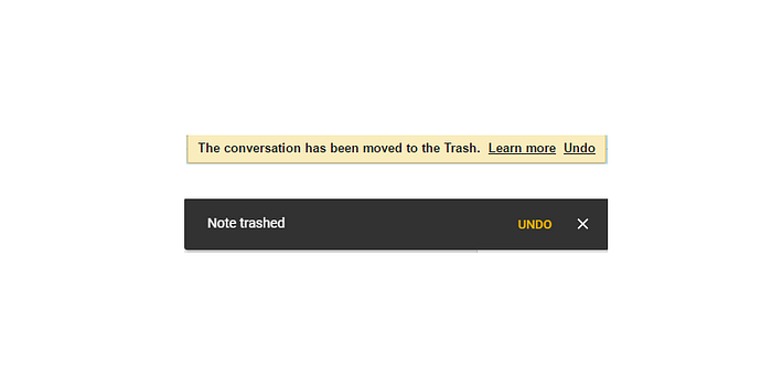
2. Temporary notification bar (Snackbar, Toast)
Snackbar or Toast is a notification bar that appears on one of the sides of the interface that contains an action button that allows the user to undo their action.
The confirmation message is an overlay pop up that disconnects the user from the interface and blocking any other action they planned on doing, the notification bar doesn’t do this. By that, the user is able to continue his train of actions without any interruptions.
The second advantage of this delete model, is the capacity to eliminate the need for a confirmation message. The vast majority of the time, the user is deleting something intentionally, so putting an extra step in with a confirmation message is usually adding work for them. Worse, they get into the habit of smacking OK quickly, which generalizes to other confirmations they had really better read.
Google uses this model in its vast array of products, for example, gmail and google notes:
Usually the notification bar is only temporary and disappears after the next user action. Therefore, this model won’t stand alone and will be backed up by a Trash/Archive/ History that exists in the product. That is because there will always be users who will regret their actions or realize their mistake even days after…
3. Having an “undo” button in the interface
A built-in button on the interface which enables the user to go back and forth through their action history.
It spares the use of a confirmation message and notification bar. This model doesn’t Have to stand alone, most of the time it’s backed up by a Trash/Archive/ History model for all those users that remember after days that they want to revive something they had deleted.

4. Trash/Archive/ History (actions/versions)
The Trash/Archive models can stand alone in an interface and give the user a place where they can turn to and bring elements they deleted back from the dead. It gives a smooth experience to the user, no interruptions like a confirmation message or notification bar, it’s there when they need it.
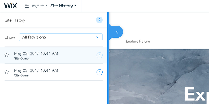
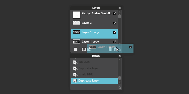
Not every product has a trash model in its interface because it depends on the essence of the product, therefore there are all the alternatives above, for example, in editors where the user can delete many elements like texts, backgrounds, photos and shapes, a trash model in the interface can be overwhelming, packed with elements where you don’t know left from right. In those cases they will typically use the History (of versions or actions) combined with an undo button.
Example of previous version history on a website builder editor:
5. Modal dialog (Confirm option)
The modal dialog is for extreme cases when the consequences of deletion are critical. A message box pops up that demands that the user types something in order to activate the confirmation button and continue. Its validates the attention of the user, and no cat will be able to pass this step ;)


6. ‘Unlock’ the delete button
Steps-Of-events-wise, this model is actually the opposite of the message confirmation model. In order to delete, the user must unlock that possibility — action->delete VS message confirmation model- delete->action.
There are a few disadvantages to this model that make it so unpopular:
- The user might not realize that there is a lock state and will get frustrated for not being able to delete.
- To complete the action the user needs to do an additional action, which is psychologically different than just approving the initial action, it is more challenging.
I came across this model on a forum as a reply from some UX designer that applied it in his product. I never came across this model so if you did, I’ll be happy if you can let me know about it in the comments. There’s an option in Mac where you can lock files or folders that are very important for you and will eliminate the possibility of unintentionally deleting them. I know some people have a hard time unlocking these folders afterwards.
7. Drag to trash
It seems a tedious method for PC, but very common for mobile platforms, and the cat certainly can’t accomplish this, the user has to be very focused to perform the action, so it is a good deleting model for preventing any unintentional deletion.
This model has to be taught to the user in advance, the trash icon needs to be close by and bold enough so that the user wouldn’t have to look for it. On mobile, after swiping to delete, you can (and possibly should) add a notification bar for ‘undoing’ the action.
By the way, all the swiping to the sides in mobile platforms in order to delete an element from a list, is an evolution of the drag to trash model. In the end of the article I give a lot it Dribbble shots of that model for inspiration.
8. Permanently deleting
You just delete, no pop up, no backup, no regrets.
I don’t recall if this exists anymore, if you do you are welcome to leave the information about it in the comments :)
Conclusion
After looking at all the options for deleting models, we know we can have the right model or combination of models for our users with minimum interruptions. From knowing about habit formation, that cats can walk on the users keyboards, to complete the deleting action as fast and as simply as can be, we can put together the best experience for our users. Good luck :)
Inspirational ‘deleting’ collection from dribbble


Originally published at www.pixelperfect.co.il on May 22, 2017.

