Member-only story
Delightful and frustrating UX in video games
Did you know that 40.75% of the world’s population is a gamer? That’s a whole lot of user experiences which need to be designed, and why gaming has become a huge industry for UX designers to work in.
While I’m not working in the gaming industry myself, I’ve spent a lot of hours enjoying a number of games in the last two years. As a UX designer, I couldn’t help but recognise common UX patterns, leading to some delightful experiences, and some frustrating ones which had an impact on the overall enjoyment of playing the game.
A lot of this article will discuss things like menu screen design, information display and HUD (the method by which information is visually relayed to the player as part of a game’s user interface. ) If you want to find out more about UX design and how it applies to gaming design, or the difference between the two, you can read about it here.
I appreciate the challenges that UX and UI designers working on these games face and I have every admiration for their work.
I should also point out, I completely missed the PS3/Xbox 360 era, and most of the PS4 era as well, so most of the games mentioned here are recent releases of the past 2 years, except for one or two older ones and remakes. I’m sure there are plenty of older games which are worth mentioning that I’ve left out here, feel free to mention them in the comments.
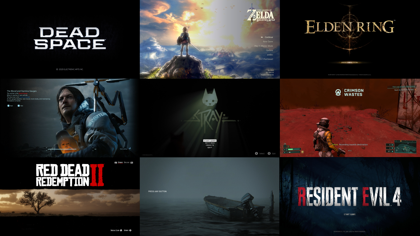
Frustrating user experience #1—Death Stranding: Overwhelming display of information

Death Stranding is a unique game and I loved playing through and experiencing this story. What sounds like an ordinary concept of “delivery man in a post apocalyptic world” is actually a fascinating story which made me keep playing until the end to find out what happens and what the twists are, of which there were plenty.
Getting started with it was hard to say the least, and it is in part because of how much information it bombards you with. The biggest challenge I found as I played through was the menu design. The screen below is an example of the menu in…