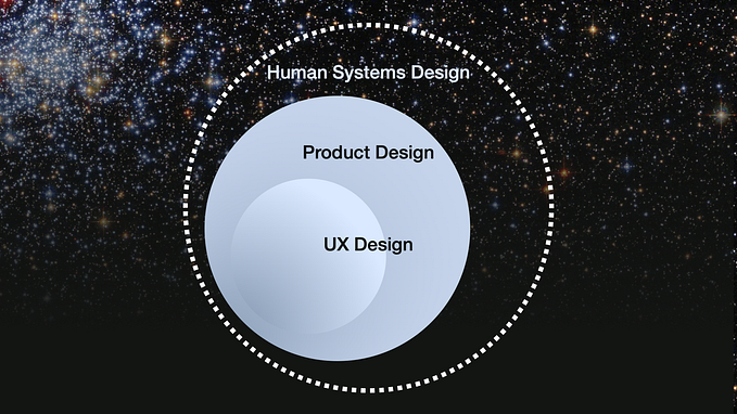
Depop Concept: Empowering the User to Define Their Own Exploration
Fashion of the users, by the users, for the users: democratizing the mobile marketplace

Thrift stores give us access to a collection of vintage items that can be found nowhere else. Here, trends from across the seasons coexist in the same space, and everything you buy is uniquely yours. Depop recognized the niche irresistibility of the thrift store resurgence, and digitized it. Founded in 2011 in Milan, Italy, the up-and-coming social shopping app brands itself as the “creative community’s mobile marketplace.” It provides users across the world a platform where they can, in Depop’s own words, “buy, sell, discover, and explore the most inspiring and unique things.”
Depop’s Explore page allows users to browse through a selection of items curated by the Depop Editorial Team. It aims to showcase the “best of the best” of user listings. Depop even boasts that items featured on Explore tend to sell 3x faster than those not featured. But users have grown frustrated by the Explore page:
1. From a buying perspective, the Explore page is too generic—it doesn’t cater to specific user interests
2. From a selling perspective, the Explore page tends to feature the same, already Depop-famous shops, neglecting smaller shops
Understanding the Problem: Why Does the Explore Page Frustrate Users?
Reading Reviews: App Store Sleuthing
When I first began this case study, I read through reviews on the App Store to learn more about what users thought of Depop. One glaring criticism caught my attention, as it surfaced over and over again, in multiple reviews. Sellers harbored a deep dislike of the Explore page:
“For the past few weeks the explore page has been the SAME, already Depop-famous people…It’s extremely hard for smaller accounts to grow and sell now that Depop doesn’t feature a variety of people.”
I hypothesized that: “If Depop gave more exposure to different, less prominent sellers on the Explore page, Depop could facilitate more transactions for sellers and more discoveries for buyers.”
I decided to conduct user research to learn more about this problem, and better understand user needs surrounding the Explore page.
User Research
I came up with a list of questions to ask users:

After gathering information from 16 users, both buyers and sellers—in addition to reading through more App Store reviews—I gained five key insights:
- Users are unsure how items are selected for the Explore page.
“I’m confused by it…like is it trending stuff? Popular sellers? What’s the basis?”
2. Users aren’t interested in the content currently featured on Explore—they want to discover items based on their likes.
“It’s unfair because not everyone wants to explore what you like or think ‘looks good.’”
3. Users want to see the items liked by people they follow.
I find interesting items and sellers by looking at the items liked by the users I’m following.
4. Users want a more customized Explore page.
“I wish it would be algorithm based because trends aren’t universal and I see a lot of stuff I’m not at all interested in.”
5. Sellers on Depop with smaller followings feel left behind.
“The same…sellers (with already massive follower bases) seem to appear…more frequently on the explore page…When I started using Depop I appreciated the fact that ‘little people’ like myself seemed to have a fair chance at…gaining a following.”
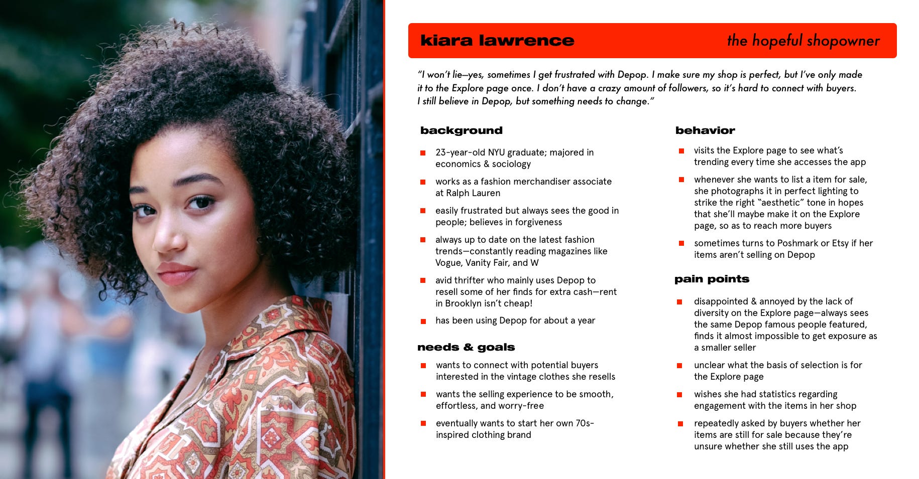
Identifying Personas
I created two personas based on the interview and survey results from my user research. These personas delineate the needs, goals, behavior, and pain points of my target audience: the experienced, everyday Depop user. Meet Kiara and Ashton:

The Explore Page Disappoints Both Sellers & Buyers
Based on my original hypothesis, I had expected only sellers to have issues with Explore—since it was difficult to get featured. But my hypothesis had only accounted for half of the problem. Now I realized that buyers, too, were displeased by Depop Explore because it was too generic. Were these two different problems, or were they, as most things are, somehow connected?
I realized these problems were two parts of the same whole. Both buyers and sellers, in their own way, craved variety. Sellers want a more diverse variety of items to make it to the Explore page, in the hopes that some of their items are among the lucky chosen ones. And buyers wanted a more diverse variety of items they’re interested in to feature on the Explore page.
Thus, taking into account user needs, my core goal in this Explore page redesign became:
Design a way that 1.) allows different users to discover items they are actually interested in on Explore and 2.) allows a variety sellers to make it to the Explore page.
Market Research: How Other Apps Execute Exploring
How do Depop’s competitors in the social shopping sphere help users discover items they care about?

No other social shopping app besides Depop has an Explore page. However, almost all of them help users discover content they care about, in their own way. I was inspired:
- Clear divisions between topics presented to the user to explore (Mercari)
- Can follow clothing brands (Poshmark), categories, and sizes (Vinted) to build your newsfeed, guaranteeing user’s feed is comprised of items they’re likely to be interested in
- Provides similar recommendations based on user’s past search and shopping trends (Etsy)
How do content-driven applications outside the social shopping sphere help users discover content they care about?
I decided it could be helpful to research how other apps allowed users to explore content.

I noticed a common trend among these apps’ Explore pages—they all take into account the user’s interests in recommending new content they might be interested in. As a result, each user’s Explore page is unique, and numerous sources of content are allowed a chance in the spotlight (read: Explore pages) of the users with an algorithmically predicted affinity for them:
- Facebook and Instagram recommendations are similar to posts the user has already liked, or those popular among the user’s network of friends
- Spotify recommendations are based on artists the user has listened to
I also noticed that Spotify clearly explains the rationale behind each of their Explore page recommendations (e.g. “Similar to Kiiara). I loved the directness implicit here—the user easily understands why they’re presented with the content, and is thus incentivized to engage with it.
These insights influenced and inspired me as I began to brainstorm solutions for Depop’s Explore page redesign.
Determining Which Feature to Bring to Depop
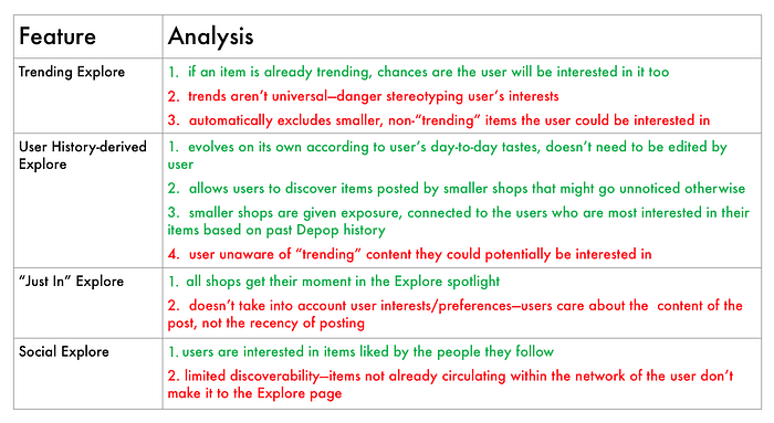
After brainstorming, I identified four solution spaces:
- Trending Explore — based on “trending” items, a.k.a. the most clicked-on items throughout the app
- User History-derived Explore—based on past searches and likes
- “Just In” Explore—newest listings featured
- Social Explore —comprised of items liked by people user follows
From here, I analyzed the strengths and weaknesses of each feature, respectively:
Enabling Users to Define Their Own Exploration
After my analysis, I decided to pursue an amalgam of both the User History-derived Explore and Social Explore solution spaces. Together, they provide a holistically customized feed for the user. An Explore page, algorithmically generated to present items similar to the user’s search history, likes, and purchases allows the user to curate their own exploration. No one wants to explore content they don’t care about—people want to explore items that align with their tastes and preferences.
But my user research showed that users are also interested in content that’s a little out of their comfort zone—they want to know what items the people they follow are liking. The Social Explore aspect fulfills this user need.
And, because each user’s feed is personalized based on their activity on the app, any seller can make it to the Explore page. Whenever a seller lists an item that matches up with a user’s interests, or happens to be liked by a person the user follows, they show up on that user’s Explore page. Thus, a greater variety of sellers are featured on Explore. I intend for this feature to respond to user needs that the Explore page be:
- Customized: suggests items according to the user’s likes and search history
- Networked: presents the likes of people the user follows
And, granted that the above two requirements are fulfilled, the Explore page will be:
3. Diverse: features a variety of sellers
How might Depop facilitate a more personalized, inclusive Explore page? This is what I set out to to explore through my redesign.
Paper Prototyping
After deciding on a solution space, I created a paper prototype to see what users thought of the direction I was going in—did my idea address their needs?
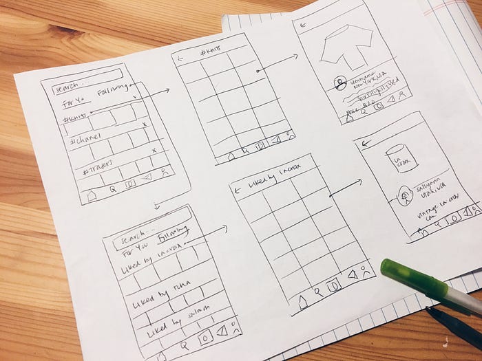
I learned that users were enthusiastic about this feature. One user told me that they’ve “been hoping that Depop would do something like this for ages,” saying they’d be a lot more likely to visit this redesigned Explore page.
Separating Recommendations and Network Activity
After receiving positive feedback from my paper prototype, I began the mid-fidelity iteration process. I started by mocking up different ways that the two content categories of the Explore page (Recommended Item Topics, & Likes by People the User is Following) could be configured.

I came up with three options, as shown above. I ran the iterations by several users to see what they felt was most intuitive. I discovered that users were confused by the lack of information provided by A—it didn’t explain what “For You” and “Following” signified, and felt they would be confused if they opened up Explore to see it arranged as such with no explanation. Users didn’t like B because they felt that seeing both categories in their entirety on the same page was overwhelming and would involve too much scrolling. I went with C because users:
- liked that that they could preview both categories on the same page
2. liked that the copy told them what to expect from Explore
3. preferred segmenting the exploration steps to seeing all content on the same page
Content Strategy & UX Writing: How can we make the user feel special?
I wanted the user to feel connected to their Explore page. After all, it was a place for them to connect with Depop content curated uniquely, just for them. The user should feel special. I decided to further invoke this mood by having the user’s name in the tagline “What do you feel like exploring?” For example, if a user’s name was, say, Ariel, the tagline would read: “What do you feel like exploring, Ariel?”
I asked users what they thought of the idea, and received positive feedback. One user said that it made him feel “at home” in the app.
Browsing Recommended Topics
After deciding on the initial Explore page configuration, I moved on to designing how users would browse through recommended topics.

When I asked users what they thought, they eliminated option B, saying that it was too “crowded” and they didn’t like that they couldn’t preview the item topic without tapping it. A was also problematic: it wasn’t clear that they could click the topic to explore it in greater depth.
I chose C because users said having the topic “in its own box” implicitly told them they could tap on it to explore that specific topic. C clearly signified to them they could take this action. It was viewed as a button rather than just a descriptor.
What Makes People Want to Engage with a Topic?
How might Depop motivate people to explore a recommended item topic? Which metric—if any—intrigues users most?
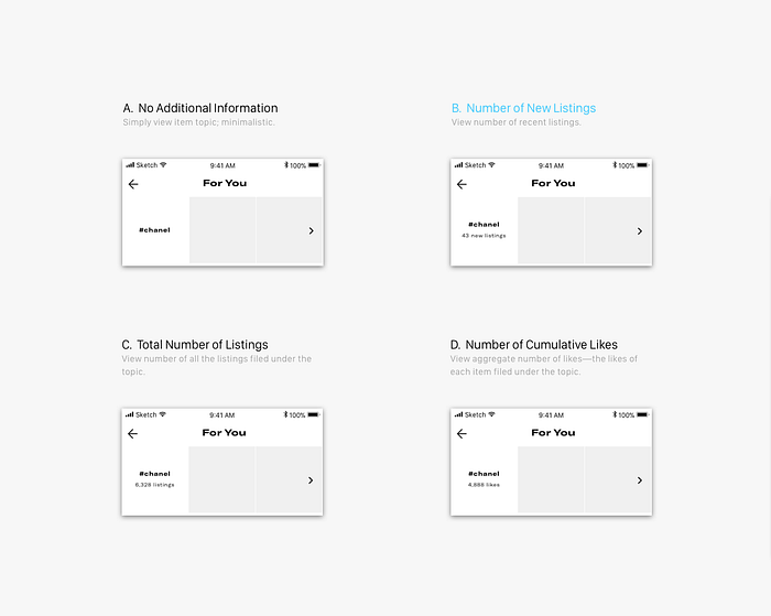
I came up with 4 iterations to answer this question. After talking to users, I eliminated options A, C, and D because:
- Users disliked the lack of a metric in A—it suggested the topic hadn’t been recently updated, which discouraged them from exploring
- Since the total number of listings in a topic is usually a large number, C overwhelms the user. The content would be redundant, as every time the user accessed the topic older content would still be displayed, duplicating the functionality of searching for the topic in the search bar
- D confused the user. The concept of likes being cumulatively amassed (by adding up the likes of each item falling under the category) clashed with user’s mental model, which attributed the notion of a like to a singular item rather than a total category of items
Users liked B because “new” implied that there were recently added items to view in the category. One question they had, though, was what did “new” mean in this respect? How would the system distinguish new content—would it be items posted that week, that day (which they preferred)? After talking more with users, I decided to add the word “today” after “new listings” to highlight the “newness” of the item listings in the category. Users loved the clarity.
Viewing a Topic: How Implicit is Too Implicit?
How can Depop signify to users that they can tap on an item topic to view it in full?
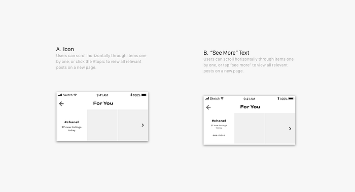
I asked users what they thought of these 2 options. They disliked B, stating that the “see more” text was redundant. The white space surrounding the topic was enough for them to understand this.
Users liked the horizontal scrolling functionality, saying that it would prove helpful while they were scrolling through the page quickly and didn’t want to go to the trouble to tap the category and go back to look at another topic. However, they disliked the > icon I placed to signify this affordance—they felt it was redundant, and interfered with the visual flow of the page. I ended up moving the second image a little to the right to signify that the row afforded horizontal scrolling. I ran it by several users and they loved its intuitive simplicity.
What happens when users are recommended topics they aren’t interested in?
How might Depop allow users to fine-tune Depop recommendations when they see a topic they don’t like on the Explore page?
I iterated several ways users could remove an item topic from their Explore feed:
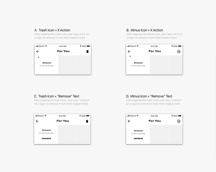
When I consulted users for their opinion, I realized something I hadn’t been expecting: they didn’t really like the two-step process to removing a topic from their feed. I realized I had neglected to consider the mental model users held regarding how they went about “training” a system to recognize their particular interests. The mental model most users held was the binary “thumbs up vs. thumbs down” approach to up-voting / down-voting suggested content. This approach is used by both the Pandora and Spotify radio features, and resonates with Depop users because it’s:
- efficient—with just one tap, the user notifies the system whether they like or dislike the presented content
- intuitive—matches up with user’s mental model
- more customizable: in addition to down-voting unwanted content, user can up-vote content they want to see more often
I came up with the following design to allow users to fine-tune recommended item topics:
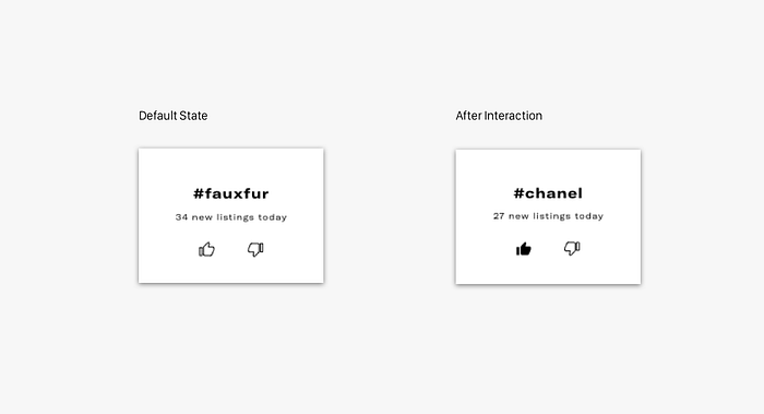
Users said it was easy to understand and “fit in with the Depop app aesthetic.”
Viewing Item Details
Do users want to stick to the current Depop Explore page interaction that exists when they tap an item, or do they want something different?
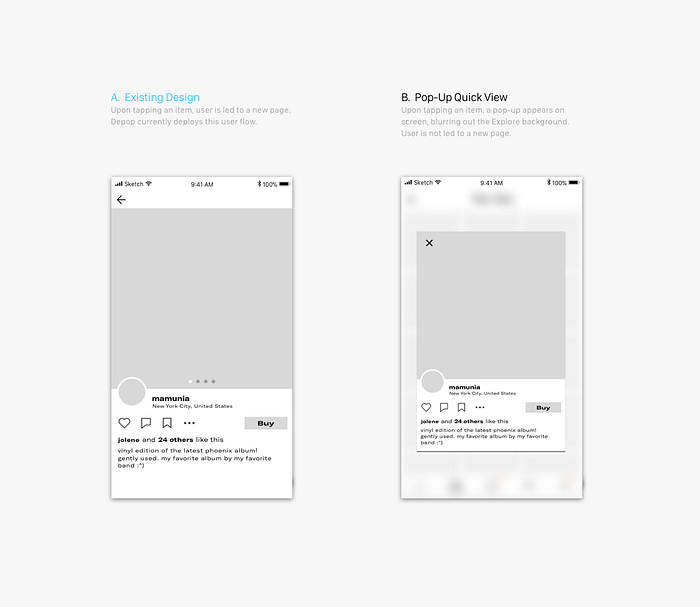
I came up with an alternative to the existing design, which I felt could be more efficient, as it deviated visually from the Home screen, thus distinguishing the Explore page as a separate entity.
However, after talking to users, I found out most preferred the existing design, as the pop-up “didn’t feel natural” to them. So I decided to maintain the existing interaction for when a user taps an item on the Explore page.
Browsing Likes of People In a User’s Network
Finally, I wondered: how might Depop display the likes of people in a user’s network?

After iterating, I came up with the above 4 options. Talking to users, I uncovered an insight I hadn’t been expecting: when users opted to explore content popular in their network, they didn’t really care about who liked the item — they just wanted to view content liked by those they follow, in general. The like of someone they follow serves as an endorsement of the liked item, and a chance they could be introduced to a new shop or trend.
Sorting likes by user also duplicates the functionality of a Depop feature that already exists: accessing the shop of a particular user allows you to view all their likes. Thus, based on these two reasons, I eliminated options A, C, and D, since they all grouped items liked by different users separately. Users preferred B because it avoided this flaw and aligned with the current system, so I went with B.
Final Interaction for Depop Explore
After completing mid-fidelity iteration process, I created a high-fidelity mockup of the final interaction.

After a few rounds of user testing, I prototyped the final interaction in Origami:
Looking Forward: So What? Why Depop Should Care
Most other social shopping apps competing with Depop lack Explore pages, devoid of a sufficiently customized approach to item exploration. Depop should strive to differentiate itself from the pack.
Depop as a business positions itself as a place where people can “buy, sell, discover, and explore the most inspiring and unique things.” Half this tagline concerns itself with discovery and exploration. Depop wants to be the place people turn to quench their thirst for “unique” creative paraphernalia.
By capitalizing on the opportunity to redesign its Explore page in this digital age of hyper-customization, Depop reinvigorates disillusioned sellers and excites buyers, moving closer to realizing its mission.
What I Learned
This was my first time conducting a design case study. Going through the entire design process—lo-fi, mid-fi, hi-fi; user research, brainstorming, iterations, and prototyping—was an immensely rewarding experience. I gained a new appreciation for product design: when you update an app, you don’t really realize just how much is happening behind the scenes. Before even the remotest feature is released to the public—even before it is developed—so much time and effort goes into designing it in such a way that responds to user needs so as to create the perfect user experience.
On another level, this experience also reinforced the importance of user testing in my mind. As a designer, I can’t consider myself to be the user—just because I think my design makes perfect sense, doesn’t mean it actually does. The final verdict lies in the opinion of the user: the user, and the user alone, holds the power to decide whether a design is intuitive.
Now when I design in the future, I will think more about how every single interaction works to achieve the final action, and how it fits in with business goals.
I also learned that the more iterations, the better. Looking back, I should have iterated even more than I did—the more time I spend exploring possible solutions, the greater likelihood that one of these possible solutions will be the right one for the user. In the future, I will spend more time exploring every stage of the complete interaction in even more depth. After all, such an all-encompassing design process is only necessary to ensure the smooth, intuitive user experience we are all striving for.