Member-only story
Design better buttons
Everything you need to know to have this important interface element go next level.
A button is an interactive element that results in an action described on it. You can bet that if it says “save” on a button, clicking it will most likely “save” something. It’s also one of the most important interactive element of any digital product.
It can lead to a purchase, downloading, sending and many other important actions. Digital buttons are also descendants from real world buttons like in the tv remote, record player or game controller.
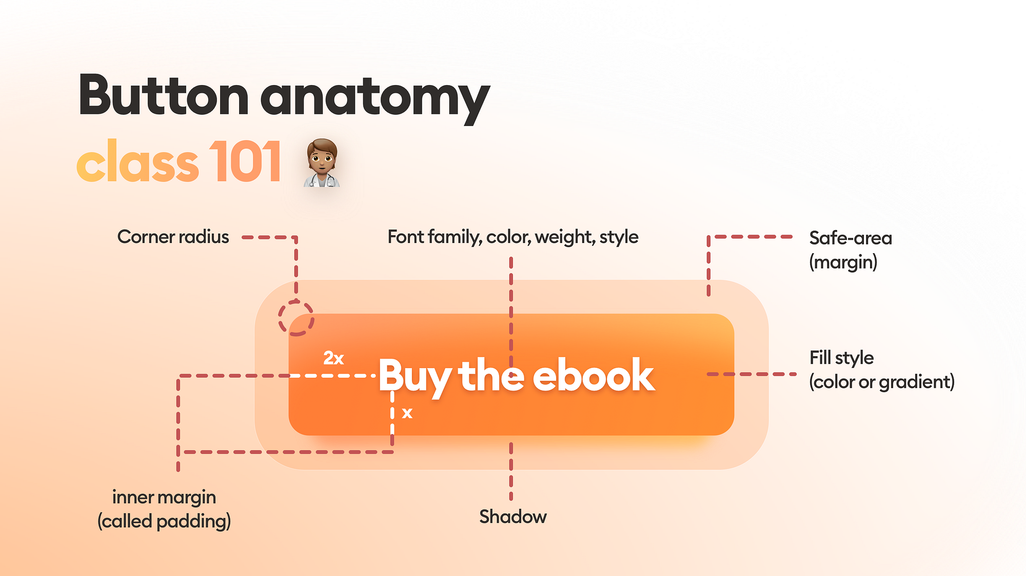
Most important thing to know.
A BUTTON SHOULD LOOK LIKE A BUTTON
The most important rule while designing a button is for it to stand out enough so it won’t be confused with anything else.
Familiar = good
We are used to certain shapes and forms that are normally associated with action. The more our button looks similar to what we associate with buttons — the better. This is why a rectangle (or a rounded rectangle) are always the safest choice for a button.
Other shapes and forms (triangle, circle, organic) are not as recognizable to the user. Proceed with caution and use them only when the general style of your product…

