Design better gradients — Dos and Don’ts
For designers, who use gradients in their works it is important to know principles which make gradients look harmonic and usable. This article focuses on common dos and dont’s of gradient design. Keep in mind that some rules here are recommendations collected from hours of working and experience.
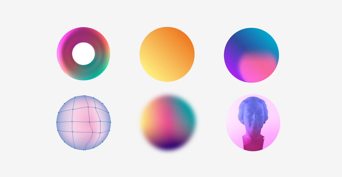
Color arrangement in an area

- Always try to use soft color transitions to get a smooth gradient
- Do not overload the gradient with too many colors
- Try to use two or three color stops
Of course, you are not limited to use for example five or six colors but it always depends on what kind of design you are working on. If you have smooth transitions as I show it in Figure 1 you are on the right point.
Always take into consideration that transition which creates harmony between colors is priceless.
Gradient with complementary colors

It is a common thing that many designers use complementary colors in their gradients, which creates a pleasant color contrast.
Often, I see on the web that some designers use only 2 color stops in their gradients which creates greyish color in the center and makes a transition unpleasant for an eye.
To fix this issue we should add a new color stop in our gradient. It is always a good choice to pick colors from the color wheel.

Gradient as a guide for a user’s eye
Often, we use gradients just for a visual side to create beautiful and harmonic backgrounds but we can use them to control the user flow in our app or website.
You should use brighter colors compared to other colors you use in your design to grab user’s attention to the exact area. In this given case we want users to start reading instructions from top-left corner and input their email addresses to register (That’s why we used bright colors top-left).

Share your ideas for the beginners
In this article, my main goal was to created little guide for the beginners who are starting a beautiful journey into a design world.
When I was starting out I always had some errors in my design and was spending hours and hours to fix them.
I know there are really good designers on the Medium (including my friends) who are in this field for a very long time and collected huge experience in Graphic Design. Please share your ideas and instructions on how to create better gradients, you will help beginners and save their time.
Don’t forget to clap and follow me for the next interesting articles!

