Design for non-designers
Tips & tricks for who wants to develop good-looking products. I have a couple of words and resources to help you.
Let’s define. I’m not a designer. I’m just a developer who interests in user interface design and developing products. I know there are lots of people who similar to me. That’s why I’m writing this post. Enjoy the reading.
Don’t Be Afraid
I have developed lots of ugly-looking products. Now, I know if my product works well, I have an explanation for the ugly-looking product.
If your product works as promised, most users will focus on the functionality. That’s why you shouldn’t afraid.
You know product development is an already long and stressful journey. Of course, everything won’t be beautiful in step one. The golden key is, take baby steps to achieve your product’s beautiful version!
Do Lots of Design Reviews
I’m reviewing every product, case study, and the design I see. I always ask these questions to myself;
- What is the problem of the product’s trying to solve?
- Who is the product’s audience?
- Why are they using this color palette?
- Why are they using this font? (If it looks good, save to bookmarks. You’ll thank me.)
- Why are they using this layout?
If you answer these questions, you’ll find the answer to that question “Why Is This Product Looks Fucking Good?”. That’s my formula.
At the below, you’ll see a section for finding good tools and resources.
The golden key is, there’s something called the internet that’s very useful.
Let’s Get Hands Dirty
When I start to develop a product after the business stuff, of course, my first step is to draw a low fidelity wireframe. It helps to understand the flow, user experience, and layout. Generally, I use Figma for drawing low fidelity wireframe but there is no right or wrong choice. If you most comfortable with pen and paper, just use it.

Every single design step is deeper than I write. My purpose is to explain basically. If you interest these topics deeper, you can find thousands of papers and sociological research.
And don’t forget, you should decide the choices according to your product’s purpose. For example, if you’re developing in the luxury fashion vertical product, your choices will be:
- Fonts: Primary is Serif style, Secondary is Sans Serif style.
- Colors: Elegant and expensive looking.
1. Find The Color Palette
You can inspire from the other products similar to your product. The most important thing is your color palette should match your product’s characteristics. Also, you should pay attention to contrast and choose powerful, vibrant colors.

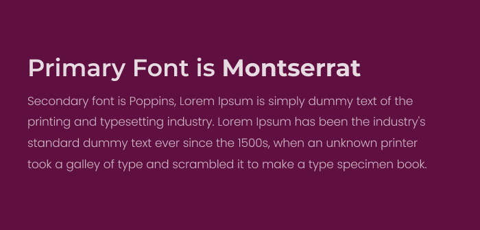
2. Find The Font
Remember your font bookmark as I mentioned before. Try the opportunities until fits your needs. The most important things are:
- Font — Message match.
- Readability
Define the base values of font size, font weight, line height, and letter spacing for being consistent of heading size, paragraph size.
It will change according to the situation but generally, I use two fonts. My secondary font is responsible for support of the primary font.
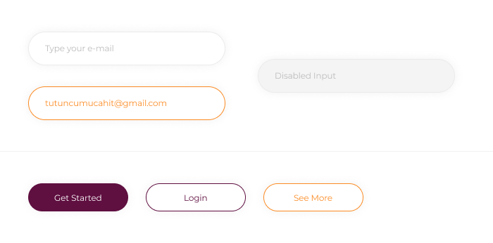
3. Start With Designing Components
Design is putting things together in harmony. In that way, I always start to design common components. It helps to build the style guide. For example:
- Form Elements
- Buttons
- Modals
- Select Box
- Menu
- Breadcrumb
- Empty States
Also, define the base height of buttons, inputs, buttons, and modals for being consistent.
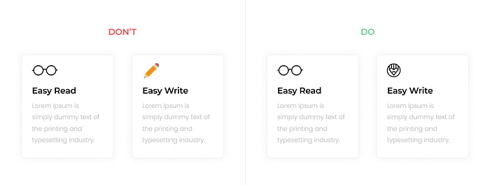
4. Use Icons and Illustrations
If you fill everywhere with texts, the user probably gets a heart attack. Trust the power of icons. Don't forget, one icon can say thousands of words.
Be consistent of the icon style use related icons. My advice is Feather Icons, Font Awesome or something like that. Those are already consistent with each others.
5. Put Things Together
Baaam! I think we’ve reached the most enjoyable part. We already decided on colors, fonts, components, and icons let’s put them together.
Look, what we've done!

Conclusion
Experience is directly proportional to practice. If you’re curious about design and if you constantly practice more combination, then you’ll design more beautiful in time.
My last advices:
- Review
- Inspire
- Practice
- Be simple
- Be modern
- Be consistent
- Repeat
Here is the resources that help you:
- ProductHunt, IndieHackers — Explore modern and new products. You'll have a chance to review lots of products.
- Dribbble, Behance —Yes, I know everyone know those products. Create an account and follow other designers, inspire what ever you want easily.
- 70+ free design tools & resources that helps to make a logo and landing page or find a illustration etc. Take a look.
- Color palette choosing tools.
- Font choosing tools.
- Steve Schoger — He's sharing design tips & tricks. Here is a Twitter Moment.
If you've a good resource, please let me know!
As a developer, I’ve tried to share my design process with you guys I hope it was helpful. Thanks for reading, don’t forget to give claps and share with your friends. Twitter: @mucahittutuncu