Design Style Guides to learn from in 2019

You don’t want to be ‘that designer’ who picks up elements from a UI kit or a free illustration. Fortunately there are a ton of style guides which can help you create beautiful, original designs. However, it’s difficult to search for the best ones, especially something that will work for your project.
I’ve gone ahead and listed down the best ones for you to follow this new year, based on what kind of project it caters to.
Functional : Marvel Style Guide

You got to strike the right balance when it comes to functional design. A balance between beauty and function. For me, I’ve always preferred using two fonts, two colors and two containers when it comes to functional design. It keeps everything simple and straightforward, which is what you want when function is key. Remember, good design enhances functionality rather than pulling it down the priority chart, “Don’t Make Me Think” is a great book to read if you want to know more about functional design and enhancing call to action.
Unlike material design, which is vast in the sense of number of colors in the palette or the styles of shadows, Marvel Styleguide is much more petite.
Call to action is at the front of any function. Clicking/tapping is the most popular way to access any function in an app or website. Marvel’s Styleguide is the perfect guide for you to start your next functional design project.

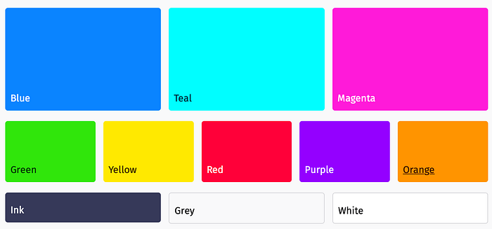
What is most attractive about this style guide, is the fact that they explain different elements from the point of view of a developer, a UI designer (like myself) and also a graphic designer. So, no matter what field you are in, understanding this style guide, will be like a stroll in the park. Also, unlike material design, which is vast in the sense of number of colors in the palette or the styles of shadows, Marvel Styleguide is much more petite. Marvel also labels its colors and elements to show where something can actually be used. Warning colors, variations of text boxes and animations are all very simply classified.
If you’re someone who likes Hierarchical Taxonomy, this is a styleguide just for you.
Information Intensive: TripAdvisor

If you’re like me, projects with a lot of information and content has always been your pet peeve. You always need to make sure there’s a ‘safe area’ for content, a conservative approach to design elements is crucial and also a check on number and level of animations and transitions. As a designer, it is hard to control one’s temptation to make everything look good. Adding something for ‘the sake of design or aesthetics’ doesn’t work very well with information intensive apps and websites.
As a user of TripAdvisor, one thing i’ve noticed is the almost intense level of consistency. One card on one page, looks the same when expanded, or when shared, or when minimised, or when being read. Images look the same when expanded, no fancy controls or share options for images. This is one of those few times, that a bare-bone design has managed to impress me.

This style guide is great for understanding the user experience, since their design is super simple, it’s crucial to understand the thinking behind the design and UX. I’d even go ahead and say that they have a UX focused Styleguide, which comes by once in a blue moon, or in this case, once in a google search result.
I’d even go ahead and say that they have a UX focused Styleguide, which comes by once in a blue moon, or in this case, once in a google search result.
It’s almost impossible to hunt for the official style guide by TripAdvisor, but God Bless Kelly Stevens for showcasing the company’s case studies and style guides online.
So if your next project is information intensive, or is specific to travel, food or reviews, then TripAdvisor’s Design Style guide and case study is a great starting point.
Here’s the link to the StyleGuide: https://bit.ly/2ELpYUS
An Alternative: Photon Design System

Let’s face it. Material design is great, but it’s often overused, and making something different with material design in mind, is a challenge in itself. Again, Material design is awesome, but humans by nature like variety.
But one thing I really like about photon’s design system, is how complete the system is. If you use this system, you don’t need to go check out anything else. It’s an A-Z guide for your entire project.
Photon by Firefox is by far the most complete design system, when looking for an alternative. I’ve been using firefox and other apps made by firefox for years now, and the design has never let me down.
Firefox’s design system takes a different approach from material. It follows flat design, as compared to the depth and shadows that material design has pioneered. But one thing I really like about photon’s design system, is how complete the system is. If you use this system, you don’t need to go check out anything else. It’s an A-Z guide for your entire project.
The color palette will remind you of the material design color palette and so will the Do’s and Don’ts. In shorter terms, if you’re familiar with using design systems like material design, then this will be a walk in the park.
Here’s the link to the StyleGuide : https://bit.ly/2T3x7CU
Something New: Mailchimp’s New Look

A while back Mailchimp got a complete design system overhaul. The company defines the new system as ‘Free and Expressive’, ‘Persistent’ and ‘Playful’. They’ve used the word expressive 4 times on the same webpage in Bold, so I guess expressive is what they’re going for.
Mailchimp’s styleguide is very web designer/developer focused.
Mailchimp calls its styleguide — Patterns and it does makes sense, since that’s the patter of design that is followed. Mailchimp has a cool set of new colors, fonts and grids which work really well with the current design trends.
One thing you’ll have to keep in mind is that, Mailchimp’s styleguide is very web designer/developer focused. It defines the html, css and javascript for every element, even its custom iconography. What I like about that is the almost bootstrap like instructions, which can get any web designer/developer started with it’s system. It also focuses on a grid system, which is very useful when creating a website or web app.
I don’t want to bore you with technical jargon, but this styleguide focuses particularly on code reusability, consistent workflow and logic.
Here’s the link to the StyleGuide : https://bit.ly/2PZVjEn
Words to Look Out for in 2019 : Expressive , Barebone , Hierarchical
Check out Last Year’s Design Style Guides to Learn from : https://medium.com/@punitweb/design-style-guides-to-learn-from-in-2018-1ae43a5c8191


