Member-only story
Make your design system accessible — Part 1: Color
Design systems are often seen as a way to improve accessibility. Some even say that you get accessibility for free by using a design system.
But what do you have to do, to make your design system accessible?
The consumers of a design system, designers & developers, do get accessible components for free. But in reality nothing is free. The work of assuring accessibility is moved from many teams to one — the design systems team.
If you are part of the team building the components from scratch, this article is for you. We begin with understanding the disabilities users may have. This helps us understand what problems our users may be facing.
Afterwards we look into how we can make our designs address those problems. In this first article, I focus on color.
Accessible or inclusive design
Accessible or inclusive design focuses on making products consumable for people with disabilities.
Inclusive design considers the following 5 disabilities.
For users these disabilities may be permanent, temporary or situational.
- visual like color blindness or low vision
- auditory like auditory processing disorder (APD) or a noisy background
- speech like stuttering or having a soar throat
- motor like a broken arm
- cognitive attention deficit or dyslexia
- seizure and vestibular disorders
Inclusive design tries to enable everyone to interact with products and services. A common argument against it is, that products are worsened for people without disabilities. Conversely improving a product’s accessibility often benefits users with and without disabilities alike.

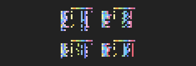
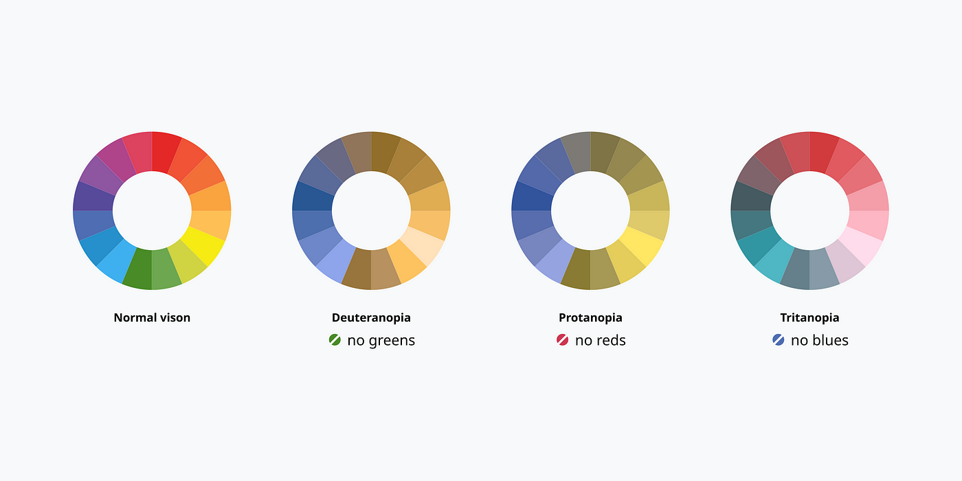
Color vision deficiency/color blindness
Approximately 300 million people, 1 in 12 men (8%) and 1 in 200 women (0.5%) worldwide have a form of color vision deficiency (CVD).
Source…