Member-only story
Design system breakdown: Buttons
Part 1 of a deep-dive series on specific design system components
I’ve been toying with the idea of more in-depth breakdowns of specific components in Castor for a while, and the humble Button seemed like as good a place to start as any. Here I break down some of the thinking, tradeoffs, and decisions that went into designing and developing our Button component. Let me know if you’d like to see more articles like this.
Design goals
The iteration of our buttons that I’ll be focussing on here is actually based largely on an earlier iteration of our design system. This first version had already done a lot to reign in the chaos of having no design system at all (pictured below), but design tools weren’t aligned with code, and many systemic and design aspects such as accessibility, dark mode, weren’t considered.

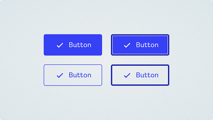
We had broadly aligned on a general visual direction in V1, which provided a solid starting point. Buttons that looked like the ones below were already implemented across a handful of our existing products, albeit inconsistently and with no shared code. The general style of the buttons below were retained, but refined and expanded.
Our goals for this phase of the project were:
- Improve consistency across products
- Raise the bar for accessibility
- Fit easily into existing products (with active development).
Accessibility
I’ll start with accessibility first, as it was forefront in my mind and ended up driving quite a lot of our key decisions.
Touch area
The biggest, and probably most unpopular decision we made was removing height/size variants from the new system. Our products span desktop and mobile, and minimum touch areas were a thing we’d been doing badly in the past. We’d had…


