Member-only story
Design system breakdown: select
Part 3 of a deep dive series on specific design system components
Castor’s Select component started with a discussion of scope. Our audit uncovered many types of inputs used for selecting options including: forms, table sorting, filters, multi-selects, country selections, searchable selects, and more.
We split out the needs into the following broad areas:
- Select — Select a single option from a list of roughly 4–8 different options, or fewer then 4 when the UI context meant minimal space usage was important.
- Combobox — Select a single option from a large list, with the ability to enter text in the box to search for the option you want.
- Multiselect — Select multiple options from a list, and manage those options (unselect/delete) in a reasonable way.
We felt trying to put all this functionality into one component would over-complicate the component from both a code and design perspective, so we chose to focus on the first use case: Selecting a single option, and build Combobox and Multiselect later on as separate components, sharing common architecture where it made sense to do so.
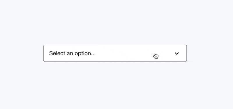
We wanted to move quickly and iterate with this component, and we decided the smallest useful thing we could ship that would get people using the component and replacing the legacy select boxes, was a version that had a custom appearance that was in line with our other Castor components, but when selected, used the native options list. This significantly cut down on the amount of interactions we needed to design and consider. We also realised fairly early on that we wanted a native variant like this anyway, to be optionally used on mobile devices where it might be the more familiar UI to people (even though my opinion is that most of these mobile select UIs are pretty poor).
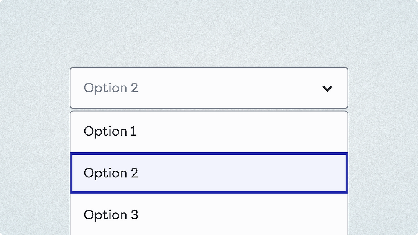
Component anatomy
The basic anatomy of the select box is pretty simple, a border and text label in the same style as our text input, and a chevron icon on the right indicating options are available on…


