You're unable to read via this Friend Link since it's expired. Learn more
Member-only story
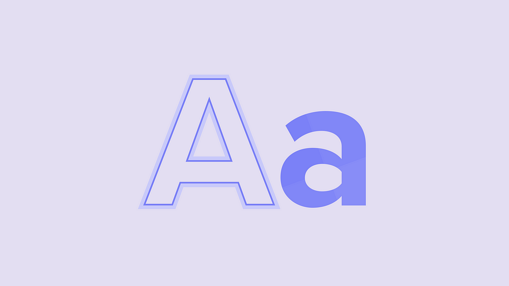
Design Systems: How to create a scalable typography stack
Typography is one of the key fundamentals of a design system. Alongside color and spacing, a solid approach to typography will help to establish the building blocks of a system on which patterns and components are composed.
A typography stack (or typographic hierarchy) is quite simply a collection of typestyles. Each style specifies values for a shared set of typography-related settings like font size and weight.
With a well-constructed stack, you can rest assured that the content in experiences that consume your design system is aligned and that any patterns composed with the foundations of the system meet your various quality indicators.
There are countless ways to approach establishing a typography stack and there isn’t a one-size-fits-all solution. Instead of proposing one, I’m going to walk you through how my team created a flexible, supportive, and accessible hierarchy.

