Member-only story
Design tokens 101
Web developers used to hard-code all of their style data. If a button needed a background color of blue, they’d assign the background color right at the source:
.button {
  background-color: blue;
}
That worked for smaller systems that didn’t need a theming layer and weren’t undergoing frequent redesign. But if you needed a large-scale redesign, this was a painful approach.
Invented by Jina Anne for the Salesforce Lightning Design System, design tokens are an approach to storing style attributes like color, typography, and spacing in a pre-determined structure. They are an alternative to directly hard-coding style data that allow designers and developers to build consistent, pleasing layouts, quickly accomplish redesigns, and add a theming layer to their applications.
If a designer uses Figma, their design tokens might be represented like this:
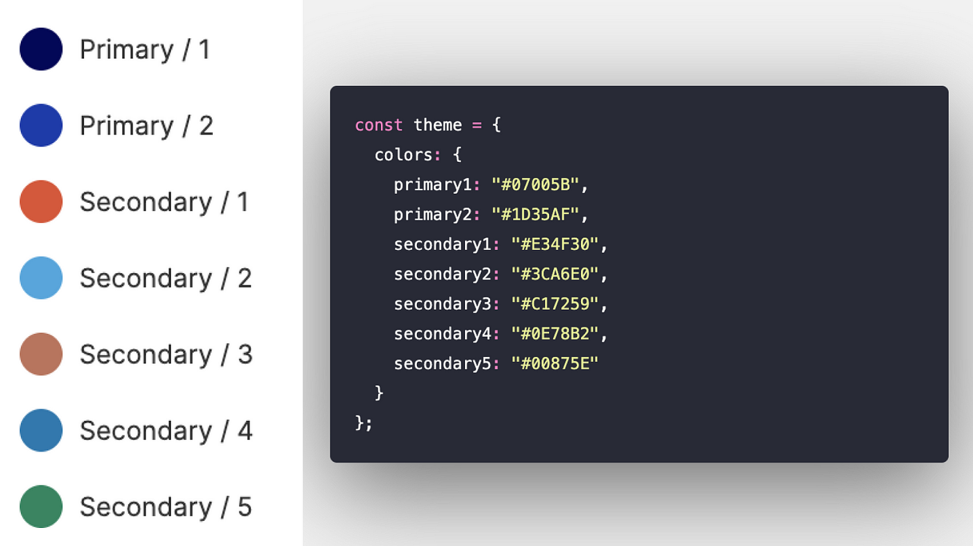
They have specific, generic names. If you changed the value assigned to `primary1`, it still makes sense!
In code, those tokens might look like this:
const theme = {
  colors: {
    primary1: "#07005B",
    primary2: "#1D35AF",
    secondary1: "#E34F30",
    secondary2: "#3CA6E0",
    secondary3: "#C17259",
    secondary4: "#0E78B2",
    secondary5: "#00875E",
  },
};
Those tokens can then be read by whatever styling mechanism we’re leveraging. For example, they could be consumed by `styled-components`.
import styled from “styled-components”;
import { Button } from “@harrysforge/button”;const PrimaryButton = styled(Button)`
  background-color: ${(props) => props.theme.colors.primary1};
`;
Levels of Design Token Usage
I’ve seen three different levels of design token usage across sites.
1. No design tokens
Sites without design tokens have hard-coded style data. There is no central location where style data is stored and managed.
2. Unstructured design tokens
In my experience, this is the most common level of design token usage. There is a central location where style data is stored and managed, but the data isn’t organized or named in a consistent way.

