Designing a better ‘Settings’ screen for your app

Not loving the look and feel? Go to Settings and change it.
Turn on the notifications? Settings.
Need help? Send a feedback through Settings.
Love the app? Rate it through Settings.
Though accessed very less compared to other aspects of your product, it’s presence is what makes the product feel complete.
Designing settings can be tricky as it does not get the needed attention and is often overlooked. But when done right, it will boost the overall experience of your app.
Our design team had a brief discussion on this recently, and here are some observations. Feel free to apply it if you find them useful. Your thoughts and critics are welcome as well.
(PS — It’s mostly about mobile, but I feel same can be applied to web settings design as well.)
Group your Categories
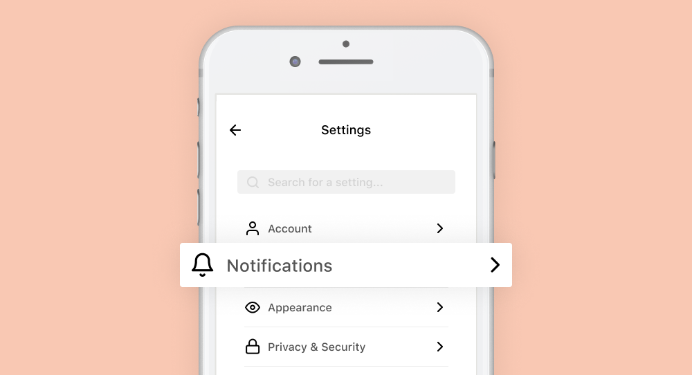
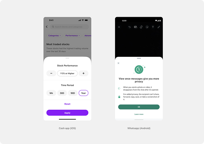
Settings are exhausting. There are now too many things under settings in almost all the day to day apps you use. The best way to make it more accessible is to group the categories. Try to keep your number of Categories minimal and generic. Refer competitors or other apps before you group the categories.(WhatsApp for android has a very good settings page where they group the items and also display what’s inside them). The ideal groups could be ( General, Account, Notifications, Appearance, Privacy, Help & Support , About)
Include a Search
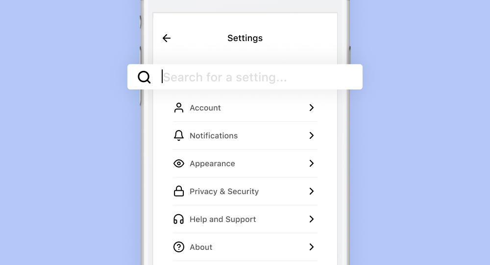
Though grouping as categories makes the accessibility easier, including a search will make it 5x better.
Consider this scenario: The user only wants to turn on a certain notification setting. The easiest way would be to search for that particular notification item, find it in the results and turn it on. If you don’t have a search and have a very long list of categories, then the user needs to scan through every item inside of the categories to find the desired setting — which is tiresome.
Prioritise the Categories

After you’ve grouped the categories the next thing would be to prioritise the list. Imagine having the category ‘About’ which has nothing but the version number and the details of the developer at the top. Let’s be honest — nobody cares. Best thing to do: analyse and collect the usage data — push the most used category to the top.
Destructive Items at Last

Objective of your business is to keep the user hooked into your app — i.e get the more out of it. Having a negative item (Logout or Delete, etc) straight up in the top of your settings page, is not recommended. The number of times the user logs out or deletes his data is going to be minimal (one time?) — having it very easily accessible at the top of the settings is going to reduce prominence of other essentials.
Essential Items at Top
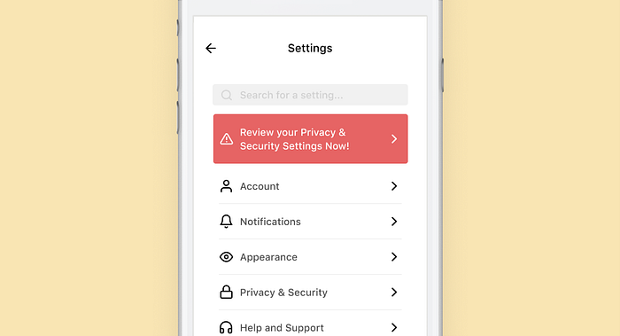
Imagine there is an important change in privacy and terms and the user needs to review it — These action items should be put up on the top so it grabs the maximum attention.
If put to good use, this top section can help increase your revenue. You can have a plan upgrade option there or display the holiday offer running through — you can stick them out to top as a banner so the users get to see it at first sight.
Some other items can be — show the number of trial days left with an option to upgrade, showing the amount of cloud storage left, etc.
Integrations and Promotions!

If you have a suite of applications that go well together — or any integrations of such, or even a totally different application but from the same development house, you have the freedom to promote it here.
WhatsApp also has ‘Tell a friend’ which is a nice addition.
You can try putting these in a separate category as well.!
Screen Time?
You would’ve seen Instagram having this — to show/pretend as if they care about the users. You could do that too — but in a good way. Show how much time the user had taken to complete his tasks, and the number of tasks he has completed this day, and maybe some tips and tricks to get the most out of your product by ‘spending very little time’. The more good you do to users, the more good they do for you and your business.