Designing a collection manager for Funko items — a UX case study
How we created an interactive and delightful experience for the collectors.
Introduction
Funko Pop! collector for almost 5 years and member of one of the largest groups of the subject on Facebook, I’ve seen countless times people looking for an efficient way to manage their wishlists and collections, including me — but tireless research over the years led me to the conclusion: there are some options in the market, but none good enough.
So I decided to do something about it, and I made it as a side project to take advantage of both my knowledge as a product designer, and my pain as a faithful collector to create an app with user-centered design and a delightful interface.
Understanding Funko
With over one thousand licensed brands and a prediction sales that says they will reach almost US $ 740 million in 2019, Funko became a fever worldwide.
Much more than collectible toys, Funko has become a way of life, understanding people’s behavior and a way to escape from reality, bringing more fun into people’s lives. As the brand slogan says “Everyone is a fan of something”, so the fact that you can buy a toy of any character you love, take it to your house and leave it on the shelf, whether it’s to admire you or play with it, is incredible.
Funko stops being just a collectible factory for a long time, they have already become part of pop culture and you can even watch a documentary about the company on Netflix, the Making Fun: The Story of Funko.

The challenge
Even being such a big company and having such wonderful products, there is still a missing piece. For collectors, isn’t just buy a new piece and put it on your shelf — they want to talk about, show their collection, see others shelves, and be in touch with this universe.
With a growing reach and number of collectors, it's expected that the consumers also will desire a collection manager and an official channel to talk about. Thinking about it, we imagined a lot about how to translate the whole story of the brand with our knowledge in a single application, to define our goal.
How might we create a fun and delightful collection manager with interaction among collectors?
Phase 1 — Discovery
To start the project, we made a survey about what we really know about the project or we suppose to know through the CSD Matrix (Certainties, Suppositions, and Doubts), and based on the result of it, we decided to investigate more about our users and their needs in order to prove and/or refute hypotheses in order to make the necessary adjustments and prepare a proposal that fits the needs of the target audience.
- Determine the profile of our users, their needs, expectations and what motivates their use.
- Analyze the collecting market and the use of collection manager, in addition to evaluating the competitors and their functionalities.
- Identify user pain points and what difficulties they face in using a collection manager.
Surveys
The first step was through an online form, released in national and international groups linked to the public collector. The first round of the survey had a lot of responses, with users from various locations in the world.
- 75% are interested in interacting with other collectors.
- 85% are very frustrated with the design of the current options.
- 78% uses the smartphone as the main access to the collection manager.
The main complaints of the users in the custom field in the form were the lack of interaction with other collectors in the current options in the market.
Interviews
With the user base created in the online form to participate in the second stage of the survey, it was possible to select some users for the interviews phase, so we set up an interview guide to fill in the gaps with some qualitative data.
During the interviews, it was possible to verify that the pain points presented in the survey were the same, but we also better understand where the feelings that create these needs come from.
Phase 2 — Define
Pain points
With the results of the research and interviews, we collected several points of pain from the users. There are so many points to improve that the list got huge, so we selected the most relevant.
- Lack of social interaction, and personal timelines.
- Charts with information from the collection x wishlist according to the months.
- Receive achievements based on the use of the app or collection/wishlist.
- Search or scan an item’s barcode to add it in the collection.
- Filter search results by collection, license, and exclusivity.
- Add custom items and individual items from a pack.
Other points include fixing bugs, reduce the delay to including newly released items, a friendly design with a strong identity and create and organize custom lists.
Design opportunities
- Create a social network for collectors (post timeline, follow friends, post videos/photos/texts, etc).
- App gamification (including achievements for the collection and medals for using the app).
- Include charts and lists (like top 10, cool down, heat up, etc).
- Include custom items option and individual items from a pack.
Phase 3 — Ideate
Benchmarking
As pointed in our survey, the two most relevant competitors on the market today are the Stashpedia and PopPriceGuide. Both were installed and used for a few weeks, so we could give proper opinions about them.
Stashpedia — Favorite for having a mobile app, usually have dubious values, but there are options to follow your friends and many options to sort the collection or wishlist.
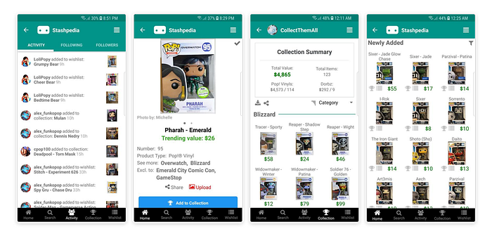
Pop Price Guide — Pop Price Guide is most recognized and respected by collectors and powered by HobbyDB. It has great information architecture and is usually fast to include the releases, but it doesn’t have a mobile version or app.

Others — Other applications available on the market are Funko (Beta) which does not contain market values just the collection and wishlist, Covetly, which makes available various brands of collectibles and The Pop Directory which is only available for Android.
Brainstorm
To start this process, we met with collectors, designers, and developers and for a round of brainstorm that brought us a flood of ideas for creating the application.
Feature Prioritization
With all the ideas in individual post-its, we rank by priority on a MoSCoW board: Must Haves, Should Haves, Could Haves and Won Haves, as an MVP should be as simple as possible and contain only what is needed to provide to customers a realistic experience of how the product would work, we could not include all of our possibilities for fun.
Sitemap
With the features chosen through the MoSCoW board, we have selected all Must Haves and some of the “Should Haves” line. With this, we begin to sketch and layout the wireframe bringing purpose to each page created.
Phase 4 — Prototype
Sketches
Before beginning to design the wireframe, several rounds of paper sketches were made to create all the screens and find the best way to display all the content and establish a basic structure with the use of the sitemap.
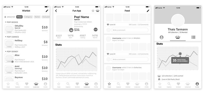
Wireframes
With the sketches in hand, we started the low-fidelity prototype to run user tests quickly without worrying about changes in the application’s visual appearance, and before this incorporating the points raised until we arrive at a medium-fidelity model. These then went through several iterations until we had eliminated any inconsistency in the flow.
Styleguide
Inspiration Board — The inclusion of various features, the massive amount of content and use of many images for the catalog led us to make the choice of minimalist design for the app (especially since our competitors are considered “simple” and “easy to use”) with cards to display information individually.
While being simple has become one of our goals, having a delightful interface remains one of our objectives, so we decided on a flat and clean design with gradients to create contrasts.

Color Palette — Choosing blue as the main color for the app has become an obvious choice to refer to the brand Funko, but beyond this main reason, there are several for which this tone of blue was chosen too.
Each color has formed its unique meaning and connotation in the long run of human life, but lately, blue became the most “reliable” color, and now is the most commonly used for Apps or sites for cultivating user confidence and being accepted.
To create an even more harmonic design, we used the “color golden ratio”, a principle with the best proportion to reach balance among color, that consists of using only three main colors. The app uses 60% of white + 30% of blue + 10% of yellow for the alerts.

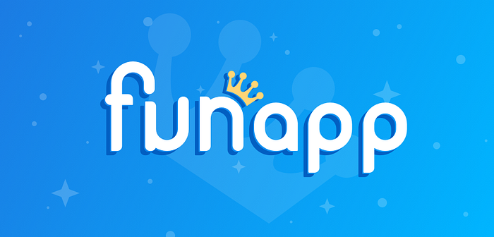
Naming & Logo — Taking advantage of the fact that Funko comes from the term “Fun Company”, we decided to follow the same concept to create the name of the application: FunApp.
The logo was designed with reference to the biggest current product line of the brand: the Pops!. Big heads with a tiny body and well-rounded corners define this type of product well, so we tried to create the typography that matches perfectly the style.
Even though it is a typographic style quite different from that used by Funko, the colors, crown and auxiliary elements help to create the connection with Funko.
This way we create a clear reference that it is all about Funko products, and show to users that they also could have fun with the app, which is one of our goals — to create an interactive and delightful experience for our users and expect them to have fun with it.
Typography & Icons — Although we have already delivered a beautiful interface, the focus of the first version was to test the navigability and see if we achieved the goal of having an app with more interactivity between users.
For lack of time, we chose to use icons from the Material Design Icons and the San Francisco font, currently the iOS standard. For upcoming releases, a typographic study will be done and custom icons will be created.
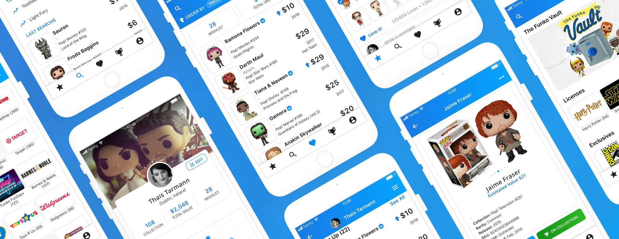
Prototype
As discovered in the survey, a big part of our target audience uses Apple devices, so we designed the Beta version for iOS. The prototype was designed for a 16:9 ratio screen (as iPhone 8), but already thought for bigger applications and its version in android as well.

Onboarding — Easy start for our users: Sync all your old accounts, fill in the rest of your profile, and understand the key features of the app in just a few steps.
Profile — Profile card with the number of items in the wish list and collection, and the total value of the collection and chart with the collection relationship x wishlist through the months. Reduced list with items that increased in price (Heating Up), decreased (Cooling Off) and Top 10 in the collection.
Feed — Check out what your friends are adding to collections, wishlists, and all the latest releases in a simplified timeline based on relevance according to usage and interactions with the application.
Explore — Access the Funko Vault (a list of items that are no longer produced) and see lists of all products, licenses, exclusives, lines, and collections.
Search — Search for an item (or friend) or scan the code for easy access. On the page, you can see the most searched items, your latest searches and a list of shortcuts to the main application lists.
Wishlist & collection — Page with complete list of wish list or user collection, total quantity, and value. You can sort the list by price, category, name, exclusivity, added, posting, and numbers.

Phase 5 — Testing
In order to verify that the efficiency of design and usability in the user interface corresponded to the objective, we did some face-to-face tests (and remote tests are the next step). A test list was created to identify possible navigational problems within the user’s task flow and preferences.
From the results of the usability test, one reiterates some points discovered regarding navigation and usability and we adjust the project.
- Users were very happy to know of creating an app thinking of collectors.
- There were no errors in the main flows.
- Time taken to understand how the app works were very minimal.
- Is necessary to improve the social part of the app.
- Users prefer easy eye-catching information in the design.
- Custom groups may be more necessary than imagined initially.
- An A/B test should be done to verify that “explore” and “search” should be on separate tabs (and the profile be included in the menu).
Conclusion
Although the project has already become very large, unfortunately, the idea has not become a viable product yet for a lot of reasons, but we still will not give up the idea. I hope big companies will see and be inspired by the project to make the community better — and I’d love to be a part of it.
Next steps and features
Create the website design — Although almost 80% of our users prefer to use our app on their smartphones, we can’t exclude the rest of the user just for lack of a website as robust as this, so the next priority is to make the website viable.
Include feature of adding custom items — One of the big requests from users in the survey and interview was to include the feature to add customizable items into the collection, so this becomes a priority for us.
Include features to post photos, videos, and texts — Although we have already done everything in relation to the social part of the app, we need to include the features to post photos, videos, and texts in the next release.
Include in-app gamification — More challenges and a little competition always make it more fun, right? To increase the number of times the app is used, we want to include gamification mechanisms.
Final thoughts
With the article published and the first version finished, I feel very accomplished with all the work done. Although I had the support of a developer to create everything, and the help of several people, the whole project of UX and UI were completely created by me, between lunchtimes, a bad nights sleep and a lot of coffee.
Joining two things that I really like (Pop Funkos and design) into one project was very significant to me. I feel that I have been able to work with passion and commitment, and I am very proud of this project.
Special thanks to Gabriele Talaia, the official tester and biggest supporter of the project and Mario Toledo, the developer who supported me and clarified a lot of technical doubts during the design process.
Want to see more of this project?
Update
Funko launched a new app in partnership with Stashpedia on March 10, but as the project was already finished, it was not included during the research.