Member-only story
Designing a robust right-to-left UI in Arabic, Hebrew and Farsi
Secret tips and tricks for UI and UX designers.

There are more than 7100 languages spoken around the world today. While some have more unusual and complex linguistic rules than others, there’s one common feature uniting the vast majority of them — they’re all written from left to right. That’s why designers can design an interface that accommodates several languages simultaneously without extra effort.
There is, however, a small group of languages that require more in-depth research before jumping straight into UI design — languages written from right to left (in this article I will simply address them as RTL). The majority of RTL language speakers speak Arabic — about 700 million people. Another 110 million speak Persian (also called Farsi), while 9 million speak Hebrew. That adds up to the number of approximately 820 million people.
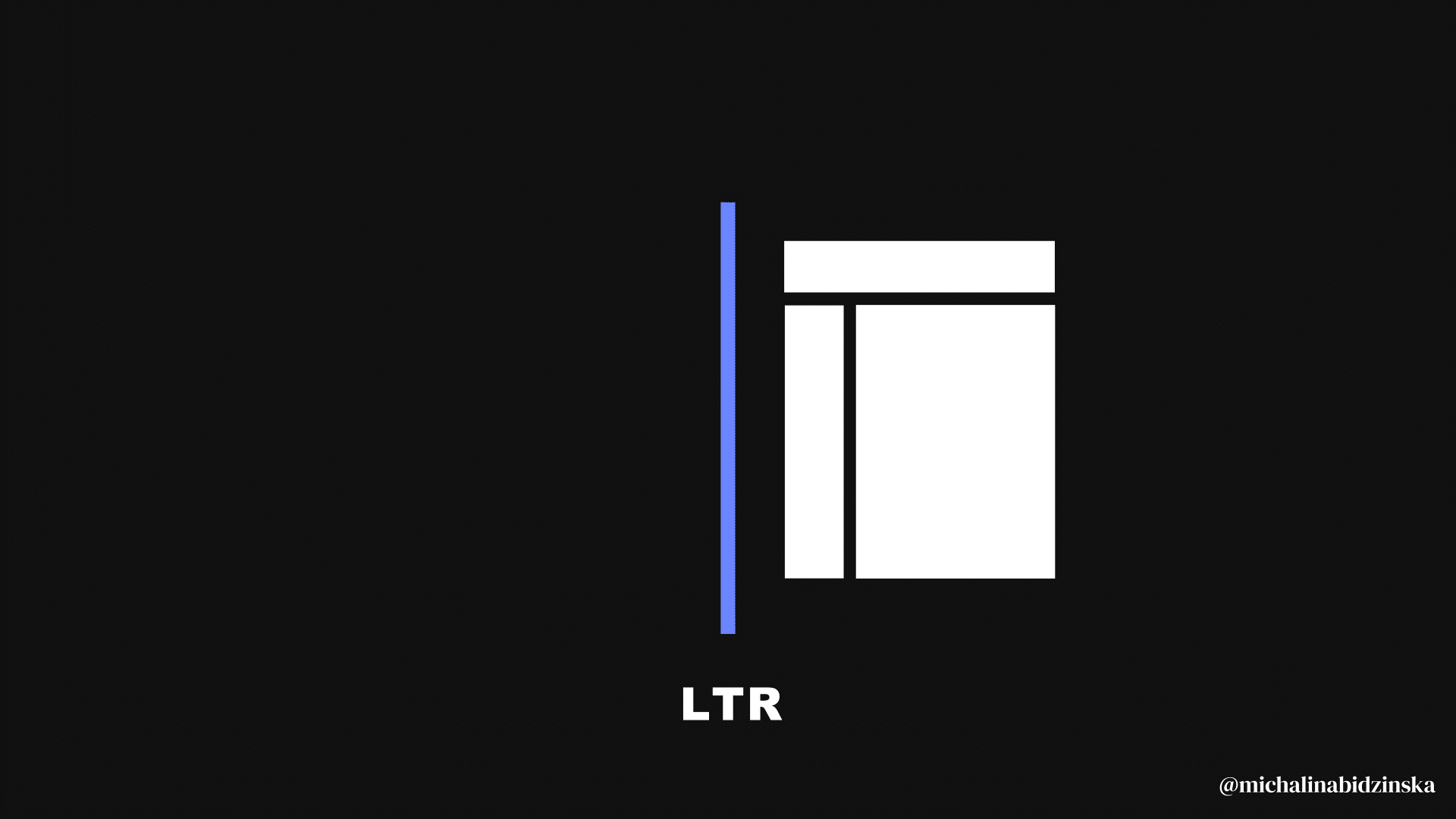
As a general rule, all functional elements in RTL graphical interfaces have to be mirrored from left-to-right to right-to-left. Although it sounds confusing at first, once you grasp all the basic rules, working on RTL designs isn’t much different from designing an app or website in English. The logic behind is the same — but mirrored.
What you will learn from this article
I had the pleasure of working on an interface for a RTL language users, and I know how demanding the discovery phase was because of the limited number of resources describing how to do this right. That’s the reason that motivated me to share some of my key insights in this article. At the same time, while I was browsing and comparing various interfaces dedicated to both LTR and RTL audiences, I also noticed that it’s not uncommon to run across various mistakes and misalignments between design systems and websites. That’s why you should collect as many references as possible during your discovery phase so that you’re better equipped to work on your guidelines and designs later on, and I hope that this article will be one of them.